

Picking the right kitchen cabinet color can make your space feel bigger, cleaner, and easier to live in. The best choice is not only about trends. It is also about light, counters, hardware, and how your kitchen is used each day.
In this guide, you will find kitchen cabinet color ideas based on real, lived-in scenes. Think soft sage green cabinets with creamy quartz, deep navy lower cabinets with subway tile, and matte black lowers with ivory uppers. Each section includes simple styling ideas you can copy.
If you came from Pinterest, use this post to match a photo you love to a paint direction that works in your home. You will also get practical notes on finishes, pulls, and how to make a color feel calm, warm, or modern.
At the end, there is a quick FAQ to help you choose between warm white, greige, taupe, mushroom, and bolder options like forest green and buttery yellow.
1 Soft Sage Cabinets in a Family Kitchen
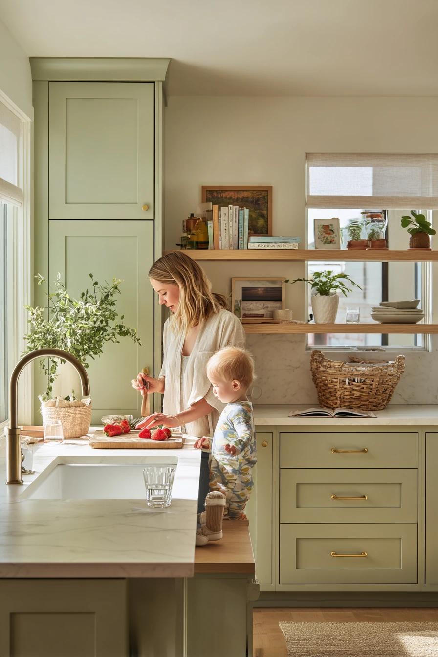

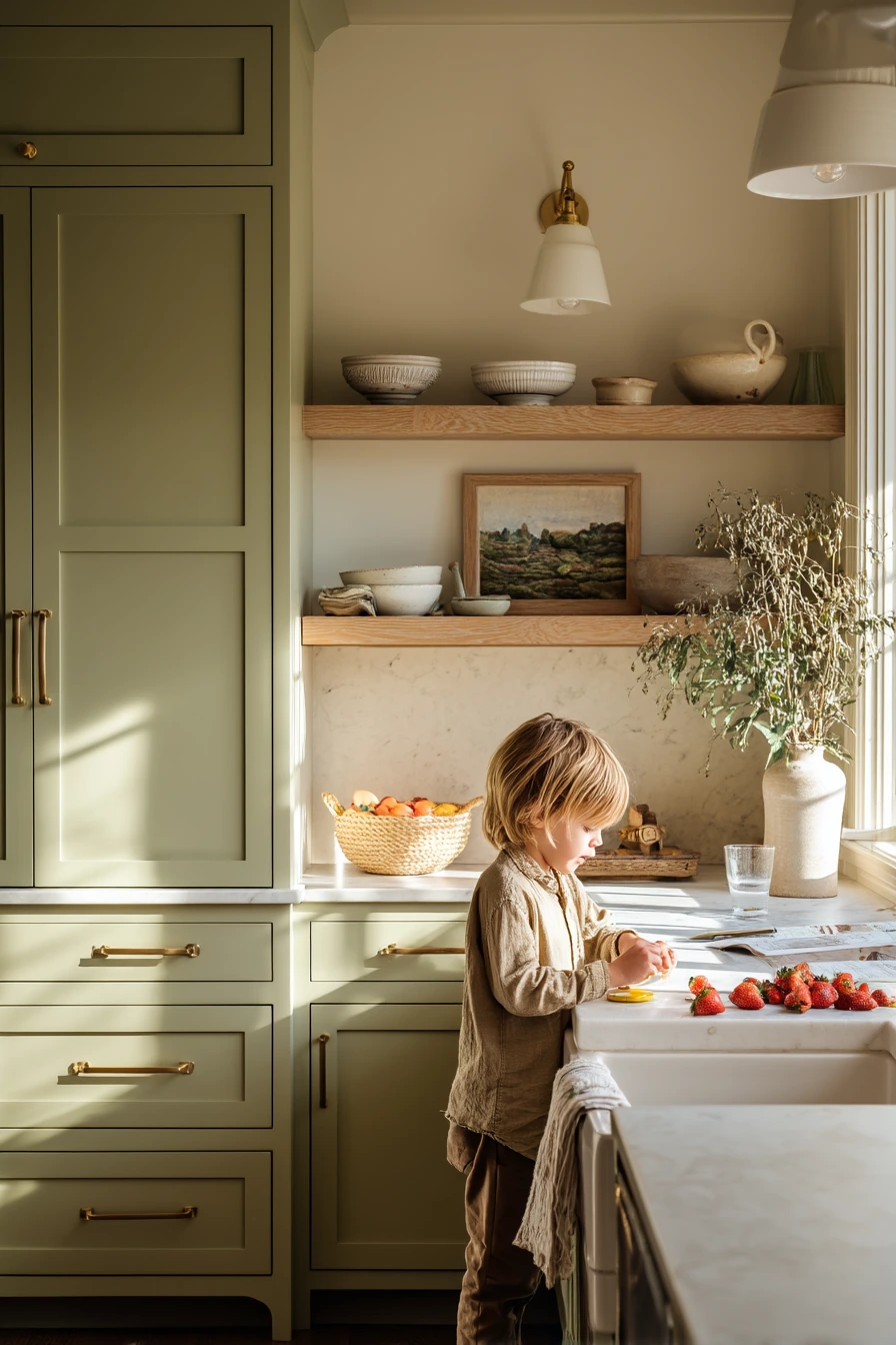
Soft sage green cabinets are a steady, easy color that works well in a busy family kitchen. The green reads gentle in natural morning window light, and it pairs well with creamy quartz counters because both feel soft, not harsh. Add pale oak open shelving to bring warmth, and keep the look relaxed and lived-in with a few everyday items like a water glass, a cookbook stack, or a fruit bowl on the island.
This color is especially good if your kitchen gets a lot of sun, because sage stays balanced instead of turning too yellow. Brushed brass pulls add a warm glow without looking shiny. A shallow farmhouse sink fits the calm, classic feel and helps the space look welcoming, even when life is happening, like a parent cutting strawberries while a toy basket sits nearby.
To style sage cabinets, keep the rest of the room light and natural. Choose off-white walls, light wood tones, and a few green plants so the cabinet color feels connected, not random. If you want a cleaner look, hide cords and daily clutter in trays or baskets, but do not try to make it perfect. This color looks best when it feels real.
- Pair sage cabinets with creamy quartz or warm white counters for a soft contrast.
- Use pale oak shelves to add warmth and break up solid cabinetry.
- Choose brushed brass pulls for a warm metal that still feels calm.
- Add woven baskets for kid items and snacks to keep counters clearer.
- Style with simple ceramics and a small plant for gentle texture.
Pro Design Tip: Test sage paint on two cabinet doors, one near the window and one in a shadow corner, because sage can shift from green to gray depending on light.
Budget Considerations: If new open shelving is pricey, remove one or two upper doors and paint the inside a warm white for a similar airy look.

2 Warm White Cabinets for a Tiny Apartment
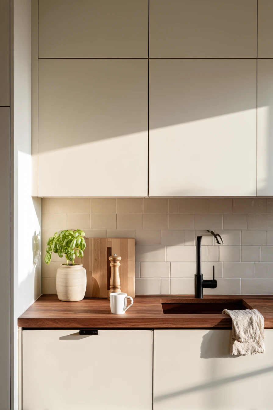
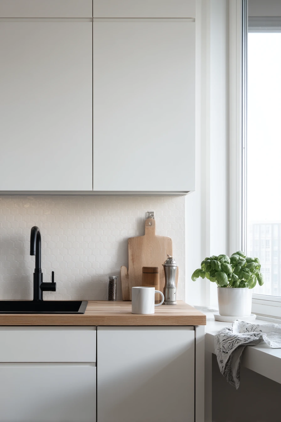
Warm white cabinets are a smart choice for a compact city kitchen because they bounce light and help the room feel open. In a small space, warm white reads softer than bright white, so it feels cozy instead of sterile. A matte beige backsplash keeps the look calm and reduces glare, especially with natural side light from one window.
To keep warm white from feeling plain, bring in contrast in small, useful ways. A slim black faucet adds a clean outline and helps the sink area look crisp. Add walnut accents like a cutting board or a narrow breakfast shelf to warm up the palette. Real-life details like a single mug, a mail pile, a pepper grinder, and a wrinkled dish towel make the space feel livable, which is what Pinterest visitors often want to copy.
For styling, aim for “uncluttered but real.” Keep counters mostly clear, but let one or two items stay out on purpose. A small basil plant near the window adds color and makes the kitchen feel fresh. If your cabinets are warm white, choose hardware in black or brushed nickel so the look stays simple and modern without too many finishes competing.
- Pick warm white cabinets to make a narrow kitchen feel brighter and wider.
- Use a matte beige backsplash to soften the space and hide splashes.
- Add a black faucet for contrast that still feels minimal.
- Bring in walnut or wood tones to keep warm white from feeling cold.
- Style one corner with a small herb plant for easy color.
Pro Design Tip: Use the same warm white on trim and cabinet doors, but choose a slightly different sheen, like satin for cabinets and eggshell for walls, to add depth without adding more colors.
Budget Considerations: If you cannot replace the backsplash, consider a peel-and-stick beige tile panel behind the sink area only for the biggest visual change.


3 Deep Navy Cabinets with Brass Hardware

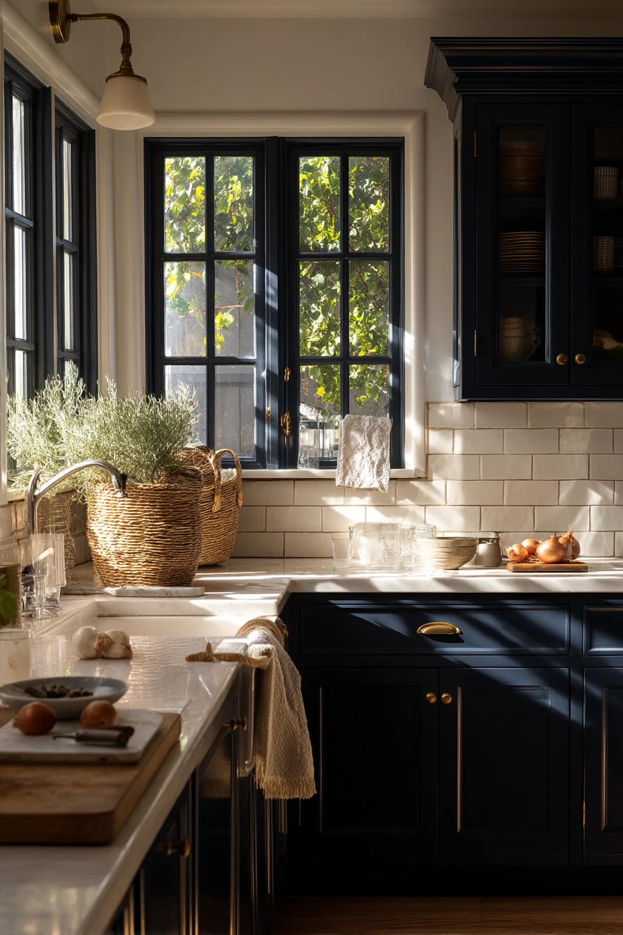
Deep navy lower cabinets add weight and style without making the whole kitchen feel dark. Pairing them with creamy uppers is a classic move that keeps the room bright at eye level. This mix looks great with white subway tile and butcher block accents, because the tile feels clean and the wood brings warmth.
This color combo fits a kitchen that is polished but not precious. It works in real life, even with dinner prep happening, onions on a board, folded grocery bags, and a wine glass on the counter. Navy hides scuffs better than many light colors, which is helpful near traffic areas. Aged brass hardware gives navy a softer, more traditional edge than chrome, and it looks good in warm practical lamp glow mixed with fading window light.
To style navy lowers, keep countertop decor simple. Use a few pieces that repeat warm tones, like a wood board, a tan linen towel, or a brass utensil crock. If you have pets, like a dog bowl near the back door, choose a bowl in a neutral tone so it blends in and does not feel like visual clutter. For paint, choose a navy that leans slightly warm, not purple, so it pairs better with butcher block and brass.
- Use navy on lower cabinets to ground the room while keeping it bright.
- Choose creamy uppers instead of stark white for a softer look.
- Pair with white subway tile for a clean, easy backdrop.
- Add butcher block accents to warm up the dark base color.
- Use aged brass pulls to make navy feel richer and less cold.
Pro Design Tip: Keep the uppers a creamy white with a similar undertone to your counters, so the two-tone look feels planned instead of like a mismatch.
Budget Considerations: If painting all cabinets is too much, paint only the lower boxes navy and leave uppers as-is, then swap to budget brass-look pulls for a similar effect.


4 Greige Cabinets in a Rental-Friendly Update
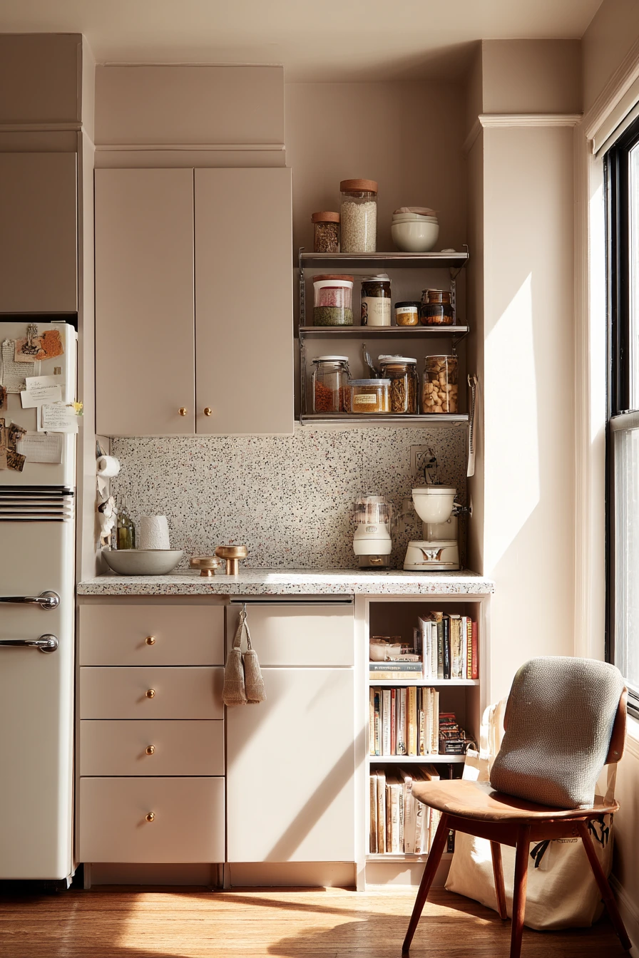

Greige painted cabinets are a top rental-friendly choice because they sit between gray and beige. That makes them easier to match with many floors, counters, and wall colors you cannot change. Greige also feels calm in soft afternoon window light, and it hides everyday marks better than bright white.
To make greige feel updated, add a peel-and-stick terrazzo backsplash. Terrazzo has small specks of color, which helps the kitchen feel more layered without adding busy patterns. Slim vintage-style knobs work well here because they fit the relaxed, adaptable vibe and are usually easy to install. A freestanding metal shelf with pantry jars adds storage without drilling into walls, and it makes the kitchen feel like yours.
For styling, lean into real life details. Keep cookbook notes, a ceramic bowl, and a few refrigerator magnets. Add a tote bag by a chair to show the space is used. To keep it from looking messy, group items into zones. Put papers in a tray, keep the shelf jars all in similar shapes, and choose one accent color, like olive, rust, or black, to repeat in towels or small tools.
- Choose greige cabinets for a neutral that works with many fixed finishes.
- Use peel-and-stick terrazzo to add pattern without a full remodel.
- Swap to slim knobs for an easy, renter-friendly upgrade.
- Add a freestanding shelf for pantry storage and styling space.
- Keep counters simple and group papers and notes in one tray.
Pro Design Tip: Match the backsplash specks to one or two items you already own, like a towel color or a bowl, so the terrazzo looks intentional.
Budget Considerations: Many rentals allow hardware changes; save the old knobs in a labeled bag so you can reinstall them when you move out.


5 Black Lower Cabinets, Bright Upper Balance


Matte black lower cabinets create a clean, modern base that still works in a lived-in home. Pair them with soft ivory uppers to keep the kitchen from feeling heavy. This mix looks sharp with honed stone counters, because the surface has gentle texture and does not reflect too much light. With natural morning light from a side window, matte black looks smooth, not shiny.
For a balanced look, bring in light wood like a light oak stool. That small warm element keeps black from feeling too stark. A restrained mix of ceramic and glass works well here, because the materials add interest without adding clutter. Real life items like a coffee pour in progress, sunglasses on the counter, a folded newspaper, and a kid’s snack cup by the sink help the space feel practical, not like a showroom.
To style matte black lowers, choose hardware carefully. Brushed nickel or black pulls keep it modern. If you want it warmer, use brushed brass but keep it consistent across the room. Add a simple runner or a woven mat to soften the look underfoot. Keep one “catch-all” spot, like a tray near the coffee area, so daily items have a home and counters stay calmer.
- Use matte black on lowers to hide wear and create a modern foundation.
- Pair with soft ivory uppers to keep the room light and open.
- Choose honed stone counters for low glare and a calm look.
- Add light oak seating or shelves to warm up the black.
- Use trays to hold daily items like glasses, keys, or snacks.
Pro Design Tip: Use the same black on cabinet toe kicks so the base reads like one solid line and the kitchen looks more custom.
Budget Considerations: If replacing counters is not possible, matte black cabinets can still look great with laminate; keep the palette simple and upgrade lighting and pulls first.


6 Dusty Blue Cabinets in a Coastal Starter Home


Dusty blue cabinets are a safe color choice when you want something softer than navy but more interesting than gray. In a starter-home kitchen, dusty blue feels relaxed and friendly. It pairs well with a shell-white backsplash because the white keeps the room bright, while the blue adds calm color that does not overpower the space.
This palette works well with pale butcher block counters and nickel pulls. Nickel has a clean look and fits many styles, from modern to classic. Add a woven runner to bring texture and to make the kitchen feel warmer. A real breakfast scene, like two plates on the counter, an open laptop, a charging cable, and a grocery receipt, fits this look because dusty blue does not demand perfection. It looks best when it feels easy and used.
To style dusty blue cabinets, repeat the blue in small ways, like a dish towel stripe or a bowl. Keep your countertop items simple and functional. Use one wood board, one crock for utensils, and one small plant if you have good light. Warm daylight through sheer curtains makes dusty blue feel “salt-touched” and soft, so try not to add harsh cool lighting in the evening. Use warm bulbs to keep the color steady.
- Choose dusty blue for a calm color that is not too dark.
- Pair with a shell-white backsplash to keep the room bright.
- Use nickel pulls for a clean finish that matches most appliances.
- Add butcher block for warmth and an easy-to-style surface.
- Layer a woven runner to soften the room and add texture.
Pro Design Tip: Use warm white light bulbs (around 2700K) so dusty blue stays soft and does not turn gray at night.
Budget Considerations: If you cannot change counters, add a large wood cutting board and a woven runner to bring in the warmth that butcher block would add.


7 Buttery Yellow Cabinets for a Cheerful Morning


Buttery yellow cabinets bring a sunny, homey feel without the sharpness of a bright lemon yellow. This color works well with cream tile and rounded cabinet edges, which help the kitchen feel softer. It is a great choice if you like a bit of retro style, especially when you add a vintage-inspired enamel kettle and a few classic tools.
This kitchen color shines in natural window light, especially during weekend moments like baking. Flour dust, mixing bowls, and recipe cards all look natural against yellow, because the color already feels warm and welcoming. A potted mint plant near the window adds a fresh green contrast that keeps yellow from feeling too one-note. If you worry about yellow feeling too bold, keep counters and walls in creamy neutrals so the cabinets stay the main color.
To style buttery yellow cabinets, focus on simple, cozy materials. Use wood utensils, stoneware bowls, and cotton towels. Pick one metal finish and stick to it, like brushed nickel for a cleaner look or aged brass for more vintage warmth. Keep open storage tidy, because yellow draws attention. If you have kids, a small spoon left on the counter fits the look, but try to corral the rest in a bin or drawer so the space still feels calm.
- Use buttery yellow for a warm kitchen color that feels soft and inviting.
- Pair with cream tile and rounded details for a gentle retro look.
- Add an enamel kettle or vintage-style pieces to support the theme.
- Style with mint or other green plants for fresh contrast.
- Keep walls and counters neutral so yellow does not feel too loud.
Pro Design Tip: Choose a yellow with a creamy base (not neon) and test it next to your tile, because warm tiles can make some yellows look too orange.
Budget Considerations: If painting all cabinets feels risky, paint just the lowers or a single bank of cabinets yellow, then keep the rest a warm white.


8 Forest Green Cabinets with Warm Wood Accents


Forest green cabinets create a grounded, collected look that feels cozy and mature. This color pairs naturally with warm oak open shelving, blackened steel accents, and a stone backsplash. The overall effect is earthy and tactile, especially in late-afternoon window light with deeper shadows.
Forest green works well in a kitchen that is used every day, not staged. A solo cook chopping herbs, a tea mug steaming, stacked bowls, and a grocery bag can all sit out without ruining the look. Green hides small messes better than many light colors, and it adds mood without needing dramatic decor. A thick wood prep table is a strong match here because the wood grain softens the dark cabinet color and makes the kitchen feel welcoming.
To style forest green cabinets, keep your palette natural. Choose warm whites, clay tones, and wood. If you want more contrast, add black accents in small touches, like a faucet, light fixture, or shelf brackets. A blanket draped over a chair can make the kitchen feel like part of the living space, which works well in open layouts. Keep your open shelves simple with matching bowls and clear jars so the green stays the focus.
- Choose forest green for a deep color that still feels natural.
- Pair with warm oak shelves to balance the darker cabinets.
- Add blackened steel accents for a simple, sturdy contrast.
- Use stone backsplash textures to keep the look rich and not flat.
- Style shelves with repeated shapes, like stacked bowls and jars.
Pro Design Tip: Use a slightly lighter green on the island or a pantry run if your kitchen is small, so you get the mood without shrinking the room.
Budget Considerations: Open shelving can be done with basic wood boards and simple brackets; stain them warm to match oak without buying new custom shelves.


9 Crisp Taupe Cabinets in a Minimal Family Kitchen


Crisp taupe cabinets are a strong pick when you want a minimal look that still feels warm. Taupe sits between beige and gray, but in a cleaner, more modern way than traditional greige. In a family kitchen, taupe hides fingerprints and small marks better than white, while still keeping the space light. Soft cloudy daylight helps taupe look smooth and even, without harsh glare.
Slab-front doors and pale limestone counters create a simple, architectural look. A hidden appliance nook keeps toasters and tools out of sight, which is helpful when the kitchen is busy. The “gently lived-in” part comes from everyday items, like lunchboxes on the island, a scooter helmet by the wall, a half-read novel, and a lemon squeezer near the sink. Taupe supports that real-life feel without looking messy.
To style taupe cabinets, work in soft layers. Use light wood stools, white or sand-colored dish towels, and a few black details for definition. Keep wall art minimal and choose storage that blends in, like matching canisters or a closed bin for kid items. If you want the kitchen to look calm fast, clear the island and leave just one object group, like a bowl of lemons and a simple tray.
- Pick crisp taupe for a warm neutral that suits modern slab fronts.
- Pair with pale limestone counters for a light, quiet palette.
- Add a hidden appliance nook to reduce visual clutter.
- Use light wood and black accents to keep taupe from feeling flat.
- Create one tidy island vignette for a calm, everyday look.
Pro Design Tip: Choose taupe with the same undertone as your floors (warm or cool) so the cabinets look clean instead of muddy.
Budget Considerations: If a built-in appliance garage is not possible, use a matching counter-height cabinet or a simple door-front cart to hide small appliances.


10 Mushroom Cabinets with Vintage Texture


Mushroom-toned cabinets are a cozy neutral that feels warmer than gray and softer than brown. This color is great if you like a calm kitchen but still want depth. With white zellige tile, mushroom cabinets look textured and layered, not flat. Aged bronze pulls bring in warmth and fit the mellow, slightly vintage feel.
This look works best when it stays simple and real. Morning details like toast crumbs, a dish rack drying by the sink, reading glasses, and an open sketchbook all fit naturally. Plant shadows on the wall add movement without extra decor. If you have a small freestanding pantry, it can add storage and charm, and it keeps the kitchen from feeling too built-in or formal.
To style mushroom cabinets, choose a few materials and repeat them. Use warm wood cutting boards, cream linens, and simple ceramics. Let the zellige tile be the star texture, and keep other patterns low. If you mix lighting, like window light plus a warm lamp, use warm bulbs so the cabinet color stays true. Keep countertop items in small groups so the space looks lived-in but still tidy.
- Choose mushroom cabinets for a warm neutral with more depth than greige.
- Pair with white zellige tile for soft texture and gentle shine.
- Use aged bronze pulls to warm up the palette and add character.
- Add a freestanding pantry for storage and a casual, flexible layout.
- Style with warm woods, cream linens, and simple ceramic pieces.
Pro Design Tip: Use grout that matches the tile (not a high-contrast color) so zellige looks calm and the cabinets stay the focus.
Budget Considerations: Zellige can be expensive; try a zellige-look ceramic tile for a similar texture at a lower price.


These kitchen cabinet color ideas show that the best palette depends on your light, your counters, and how you live in the space. Soft sage, warm white, navy, greige, black, dusty blue, buttery yellow, forest green, taupe, and mushroom can all work when the supporting finishes make sense.
If you want an easy next step, pick one cabinet color direction, then choose one wood tone and one metal finish to repeat. Keep styling simple, and let a few everyday items stay out so your kitchen feels real.
FAQ
What kitchen cabinet color is most timeless? Warm white, soft cream, and light taupe are usually the most timeless because they match many counters and floors.
Are dark lower cabinets a good idea? Yes. Navy, black, and forest green on lowers can hide scuffs and add contrast, especially when paired with lighter uppers and good lighting.
How do I choose between greige and taupe cabinets? Greige often reads softer and more casual. Taupe can look cleaner and more modern, especially with slab doors and stone counters.
Do brass pulls work with green cabinets? Yes. Brushed brass and aged brass pair well with sage and forest green and help the color feel warmer.
What backsplash looks best with warm white cabinets? Matte beige tile, soft white subway tile, or light stone backsplashes keep the look calm and reduce glare in small kitchens.
How can I update cabinets in a rental? Try peel-and-stick backsplash, swap knobs (save the originals), add a freestanding shelf, and use trays and baskets to control clutter.
Should my cabinet color match my walls? Not exactly. It is better if they share a similar undertone. Use wall paint that supports the cabinet color without being identical.