

Choosing a paint color can change how your whole living room feels. The right shade can make a small apartment look open, help a family room hide daily mess, and make your furniture look more pulled together.
This guide shares living room color ideas you can copy from real, lived-in spaces. You will see warm neutral paint colors, soft sage green, deep blue-gray, blush, terracotta, creamy walls, olive green, dusty lavender, soft white, and muted mustard.
For each color, you will get simple styling ideas, what to pair it with, and small fixes for everyday items like toy baskets, charging cables, books, and throws. These are the details that make a room feel calm and real, not staged.
Use this post to pick a color that fits your light, your furniture, and your budget. Then save your favorite look and build it step by step.
1 Warm Neutrals for Everyday Family Living
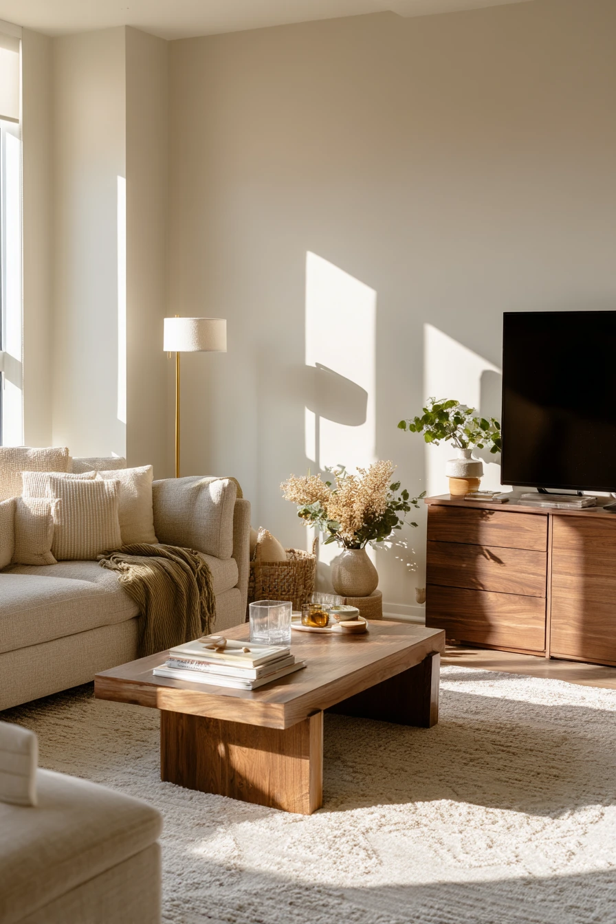

Warm neutral paint colors are a safe choice, but they do not have to look flat. Sandy beige walls create a soft backdrop that works with an oatmeal sofa, a textured cream rug, and warm walnut wood. This kind of palette feels calm, even when the room is busy with family life.
To keep beige from looking dull, mix textures. Add a slightly wrinkled throw, a brass floor lamp, and a few soft olive accents. Everyday items can be part of the style, like a toddler toy basket near the sofa, stacked picture books, and even one water glass on the coffee table. When the room has sun-drenched window light, plant shadows on the wall add natural depth.
If your space feels too yellow, bring in cooler pieces like cream, ivory, and light oak. If it feels too cool, add more walnut tones and warm metals. Keep your main items simple, then let small accessories add the “lived-in” feeling.
- Choose a sandy beige with a warm base so it pairs with walnut and brass.
- Use an oatmeal or cream sofa to keep the room bright.
- Add one olive pillow or vase for a soft color pop.
- Layer a textured cream rug to break up large beige areas.
- Use baskets for toys and books so clutter looks tidy.
Pro Design Tip: Pick one “bridge” color that connects warm beige to your accents, like soft olive or caramel, and repeat it 2 to 3 times around the room.
Budget Considerations: If new rugs are costly, try a neutral flatweave jute base and add a smaller plush rug on top for texture.


2 Soft Sage for a Quiet Apartment Reset


Soft sage green is a strong choice for a small city apartment because it adds color without feeling loud. It looks clean in morning window light and still feels cozy when the day gets darker. Pair it with a compact linen loveseat to keep the room airy.
To style sage walls, lean into light woods and calm materials. Pale oak nesting tables, woven curtain panels, and a ceramic lamp work well because they add warmth but keep the look simple. This color also hides day-to-day moments, like a charging cable near the sofa, an open notebook, a half-read novel, and a mug with tea rings on a side table.
If your room does not get much light, choose a sage that is lighter and more gray than green. If you get a lot of sun, you can go a little deeper. Finish with a few black or dark bronze touches so the space has shape, like a small frame, a tray, or a narrow shelf.
- Pick a soft sage with a muted tone to avoid a neon look.
- Use linen upholstery to keep the color story relaxed.
- Choose nesting tables so you can shift surfaces as needed.
- Hang woven curtains to add texture without heavy color.
- Corral small clutter with a tray on the side table.
Pro Design Tip: Use “tone on tone” styling with sage by adding one darker green item and one lighter green item so the wall color looks intentional.
Budget Considerations: If you cannot buy new curtains, add woven-style texture with affordable bamboo shades or even a simple linen-look panel.


3 Moody Blue for Evening Conversation

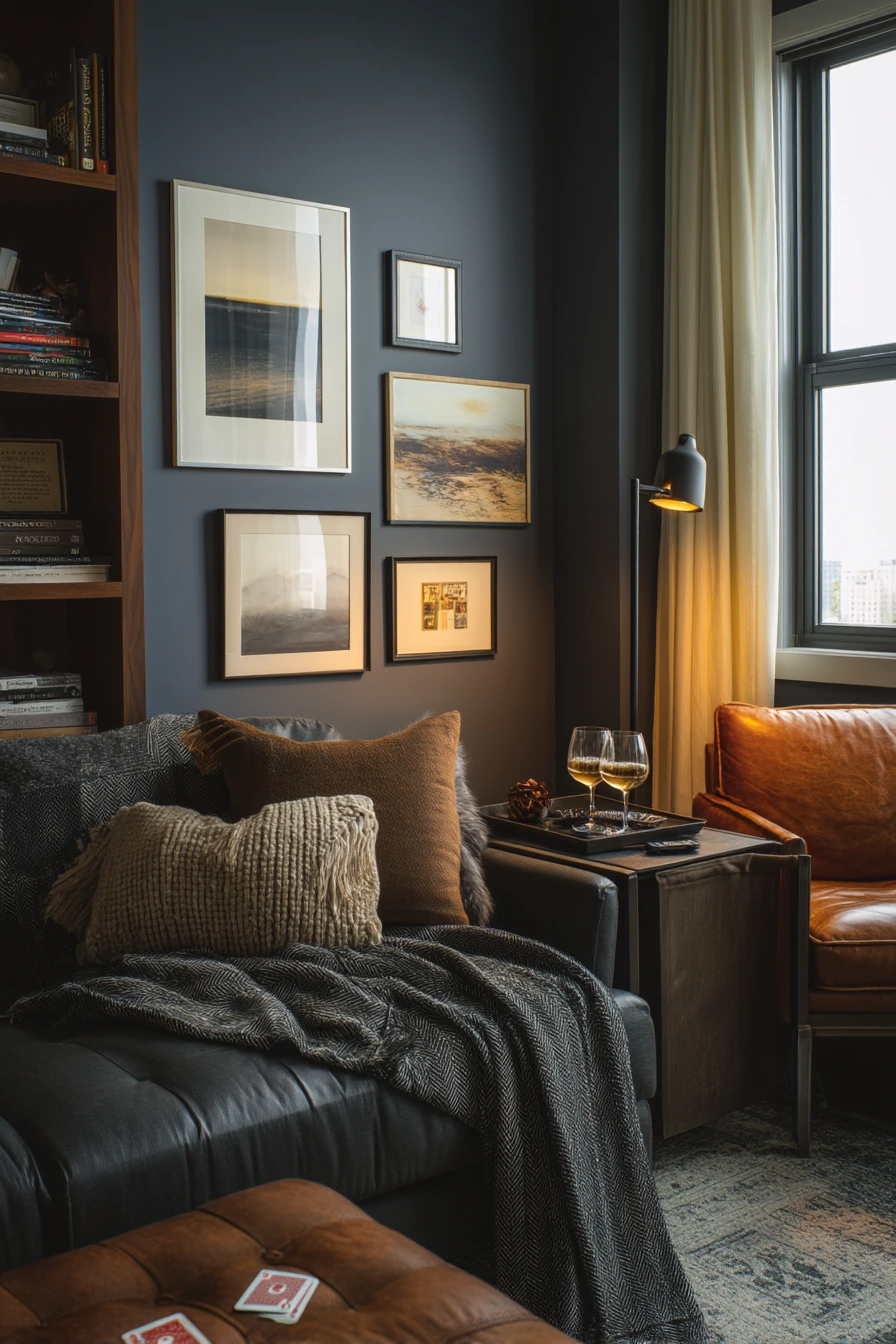
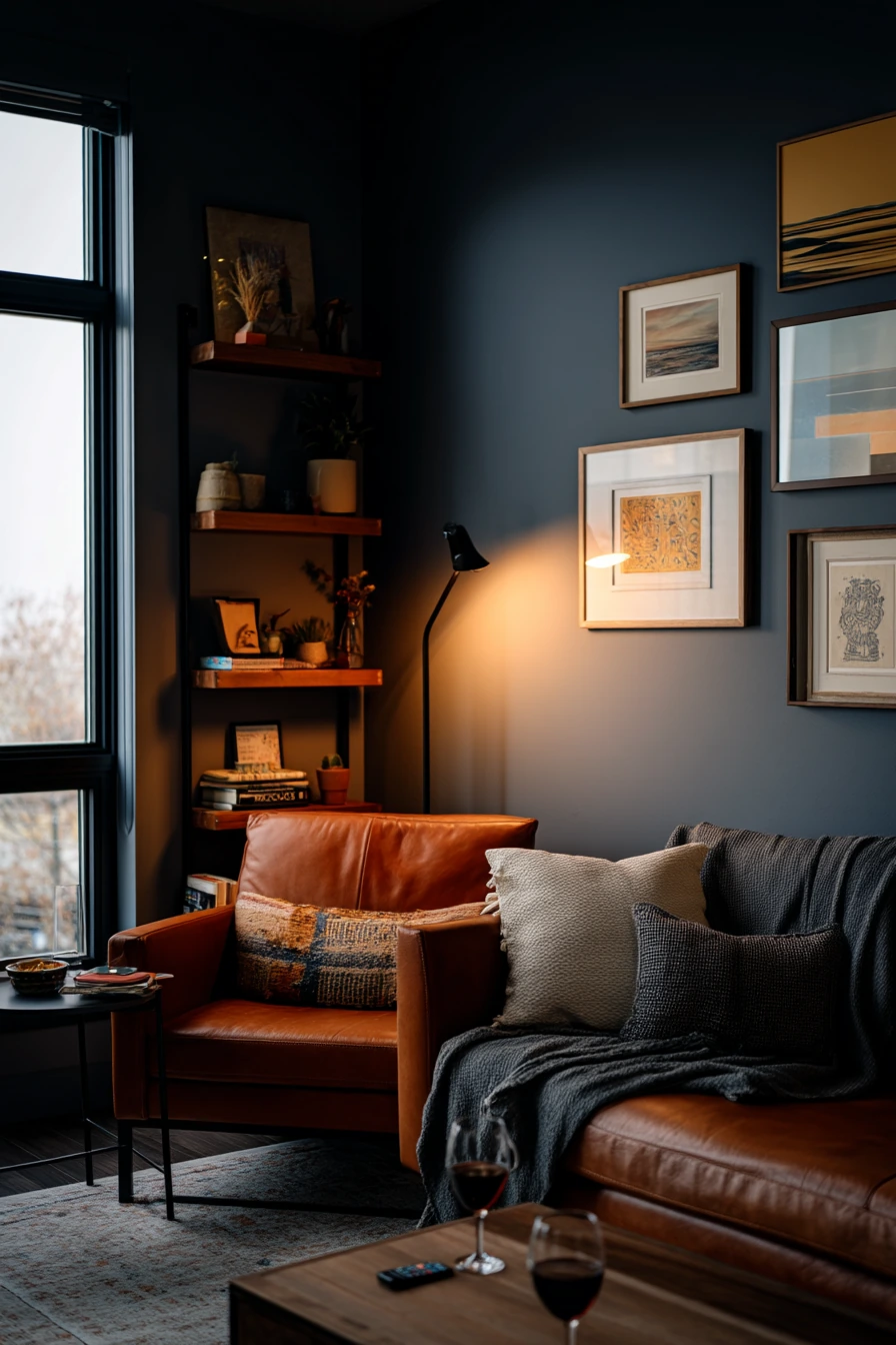
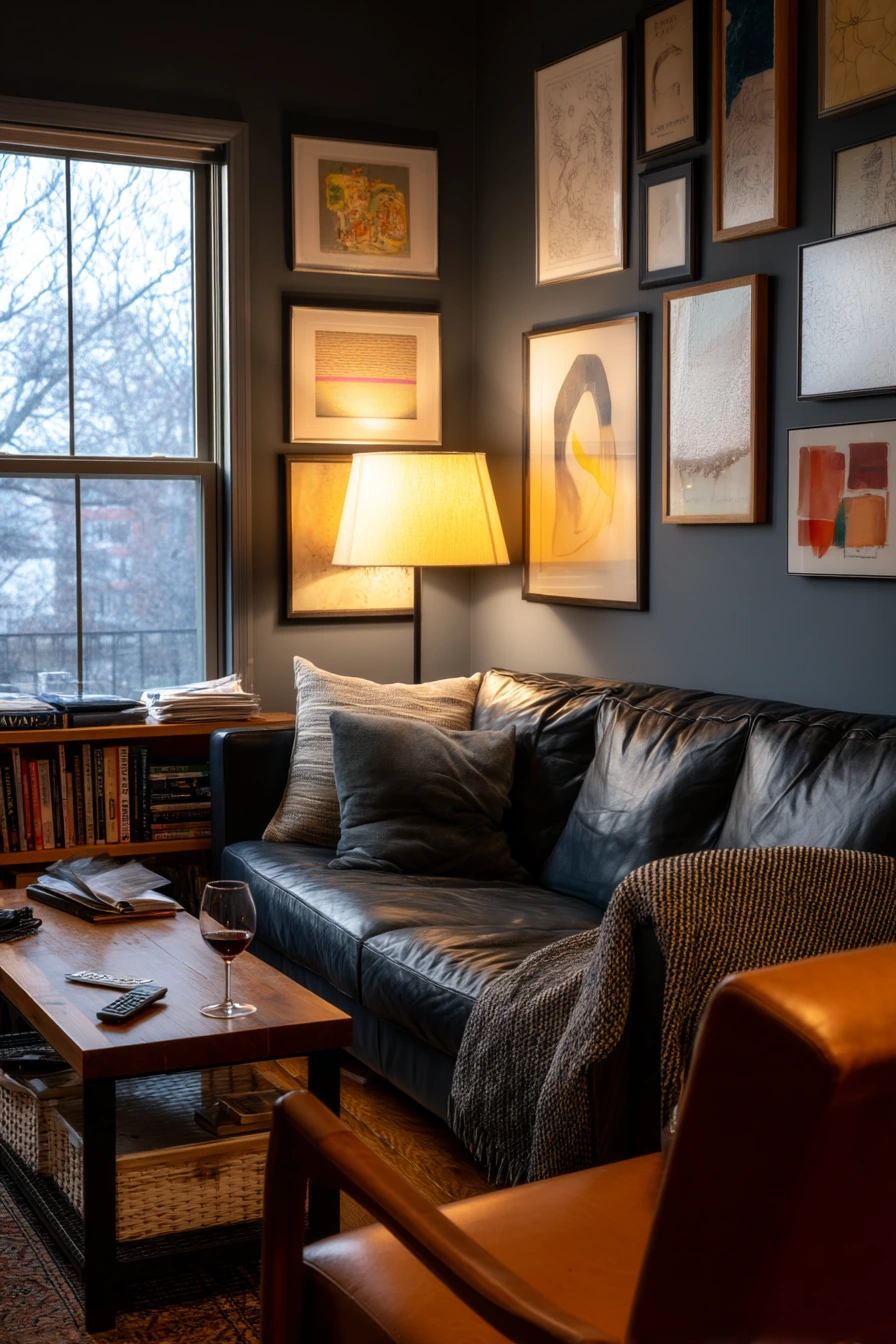
Deep blue-gray paint creates an intimate living room that still feels modern. It pairs well with a charcoal sofa and looks rich next to warm walnut shelving. The key is to balance the dark wall color with warm lighting and a few lighter details.
Add contrast with a cognac leather chair and black metal side table. These pieces break up the blue-gray and keep it from feeling heavy. Layered art prints help too, especially if they include cream or tan. In the evening, warm lamp light mixing with dusk window light makes the room feel hushed and cozy.
This color also works well in a real home where the room is used daily. A deck of cards, two wine glasses, a folded blanket, and a remote on the cushion fit the mood and keep it honest. To avoid a cave feeling, keep the ceiling and trim lighter, and choose one reflective item like a glass frame or a soft sheen lamp base.
- Choose blue-gray with a touch of warmth so it plays well with walnut.
- Bring in cognac leather or camel accents to add heat to the palette.
- Use warm bulbs in lamps to soften the dark walls.
- Mix black metal in small doses for crisp edges.
- Include art with light backgrounds to brighten the wall area.
Pro Design Tip: When using a dark paint, repeat your lightest color at three heights: rug, art, and pillows, so the room feels balanced.
Budget Considerations: If a leather chair is pricey, look for faux leather or a secondhand chair and refresh it with a simple leather conditioner.
4 Blush and Clay in a Bright Rental
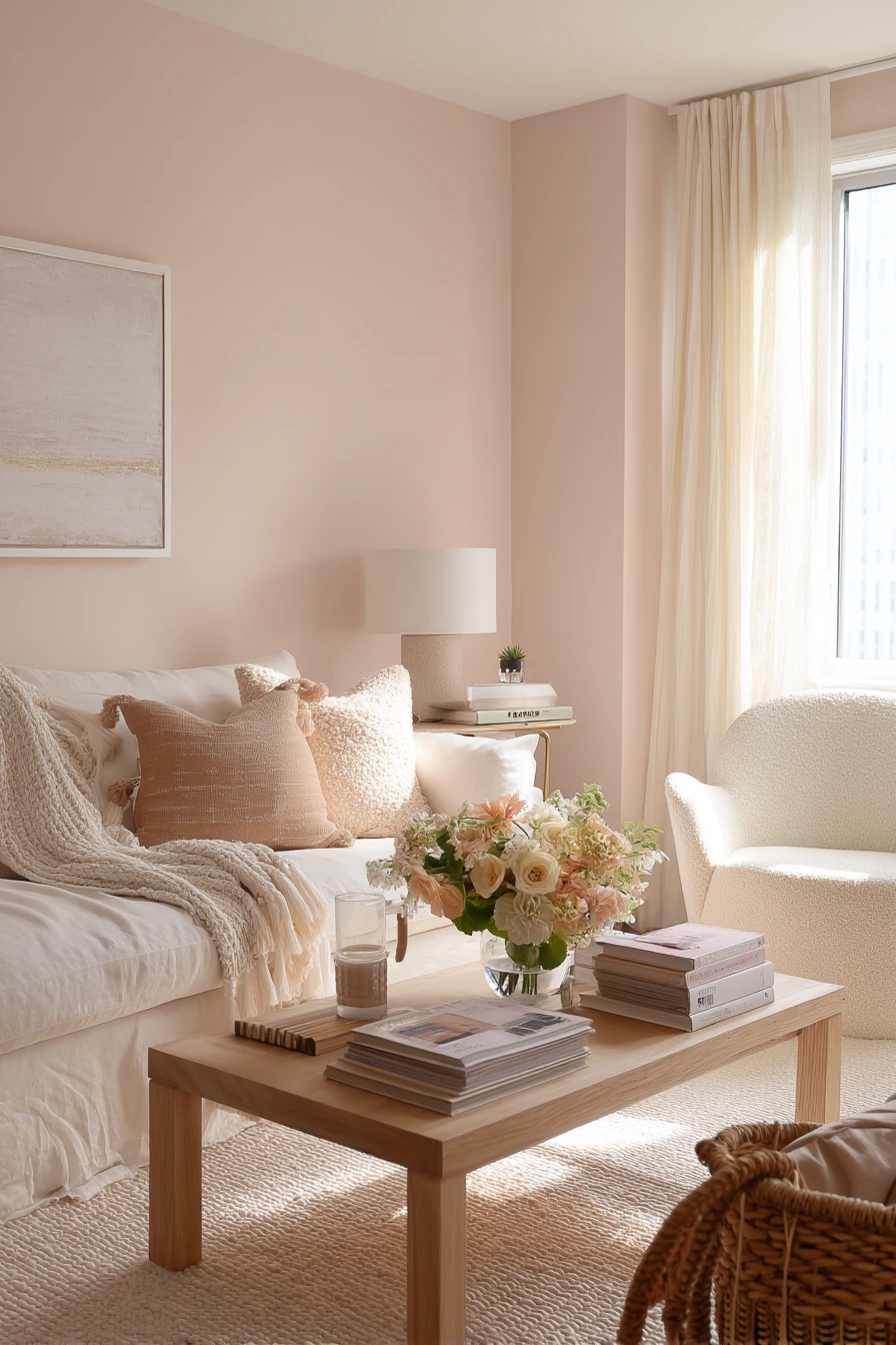
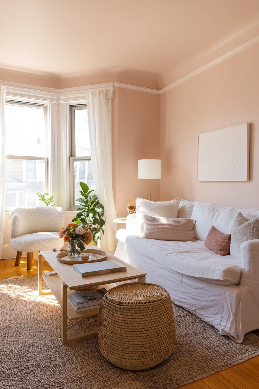
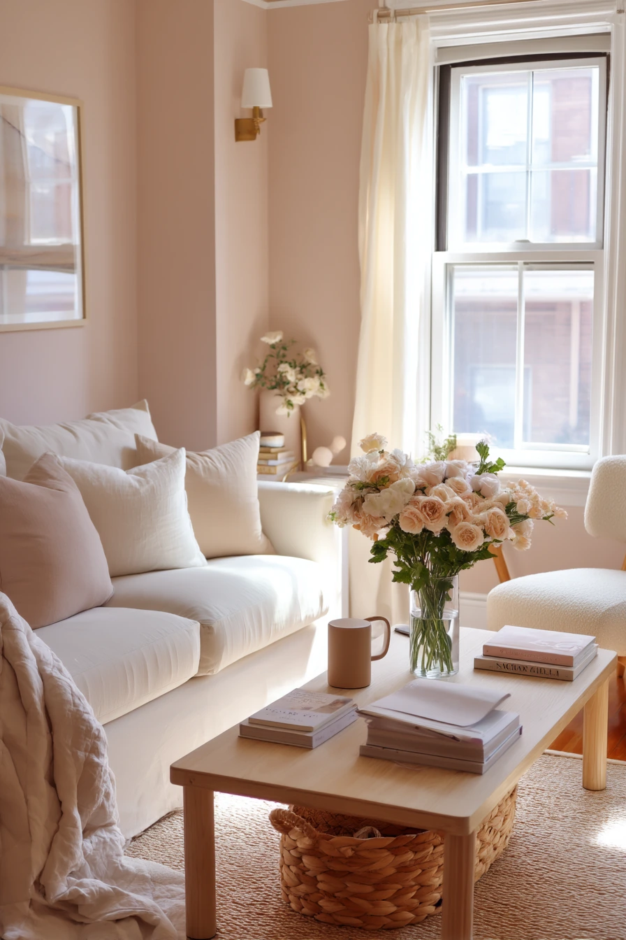
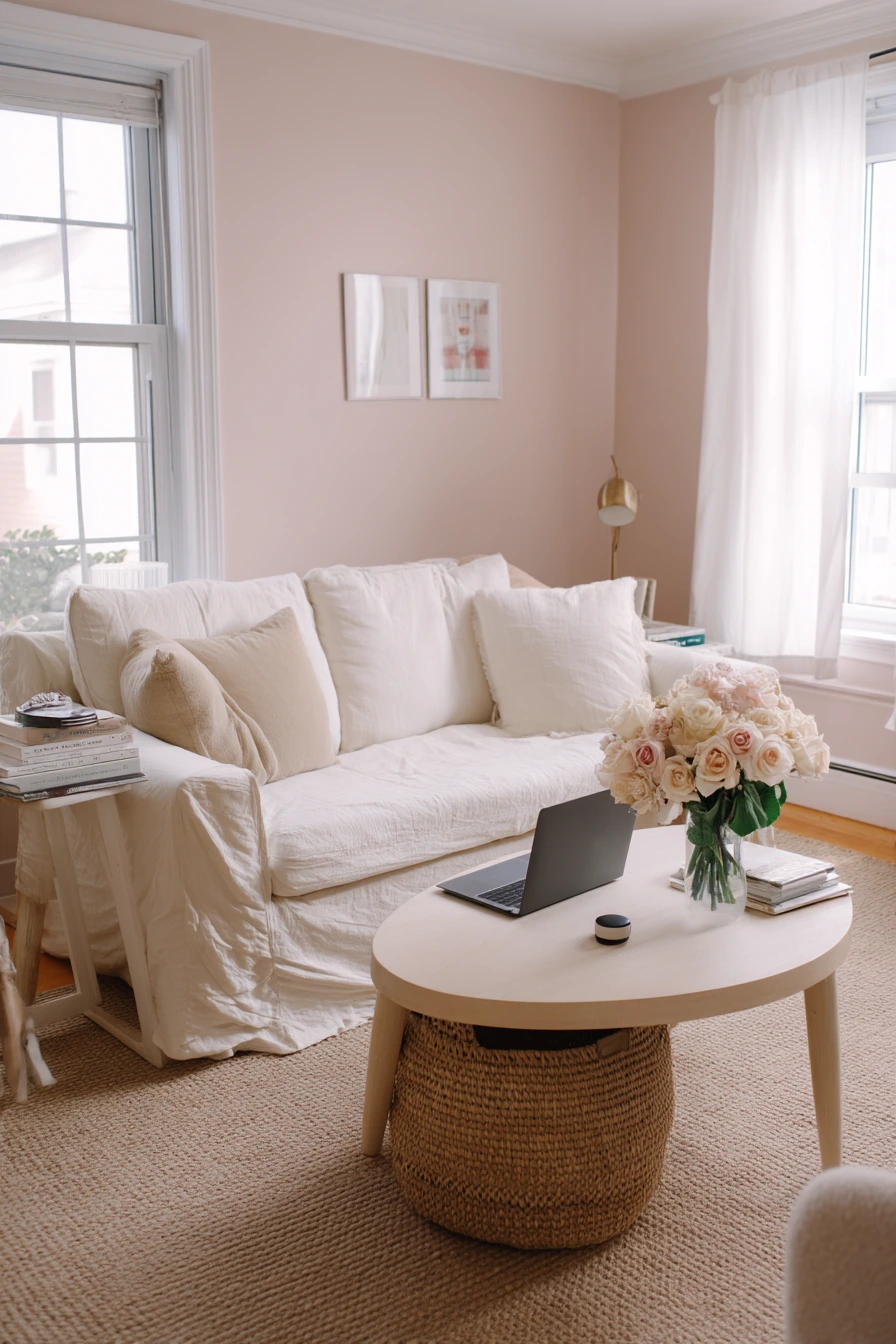
Blush walls can look soft and grown-up when you pair them with clay-toned accents and light oak furniture. This is a good renter-friendly color idea because it brings warmth without making the room feel dark. It also works well with slipcovered seating, which is practical for daily use.
To keep blush from feeling too sweet, focus on texture and simple shapes. Add a light oak coffee table, a boucle accent chair, and woven basket storage. Use removable wall art so you can change the mood without paint drama later. Real-life items like a laptop charger trailing from the side table, fresh flowers, and a mail stack can stay out, as long as you group them neatly.
If you want a more modern look, add a small amount of black, like a thin frame or a metal tray. If you prefer a softer feel, stick with warm whites, sand, and terracotta tones. Blush also looks good in soft afternoon window light, so it is a nice pick for rooms that get gentle sun.
- Choose a blush with a muted base, not bubblegum pink.
- Pair it with clay and terracotta decor for a calm, earthy mix.
- Use slipcovers to keep seating easy to wash and update.
- Try removable art and peel-and-stick hooks for renters.
- Store paper clutter in one basket to keep surfaces clear.
Pro Design Tip: Balance blush walls with warm neutrals in larger pieces, then add clay accents in small items like vases, pillows, or a throw.
Budget Considerations: Peel-and-stick art prints and thrifted frames can create a full wall look for less than one large canvas.
5 Earthy Terracotta for a Sunlit Corner
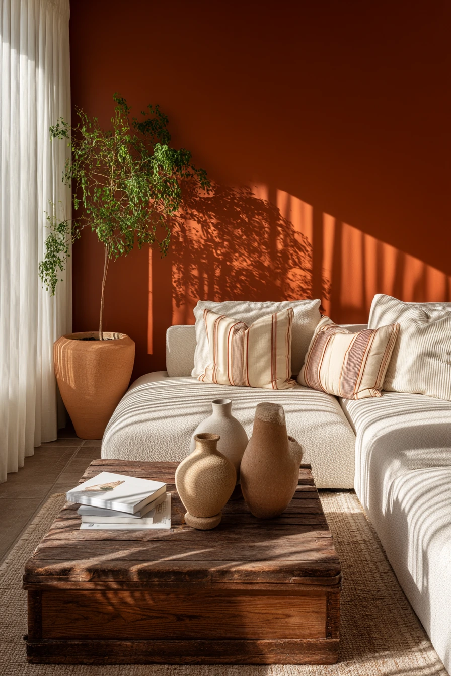
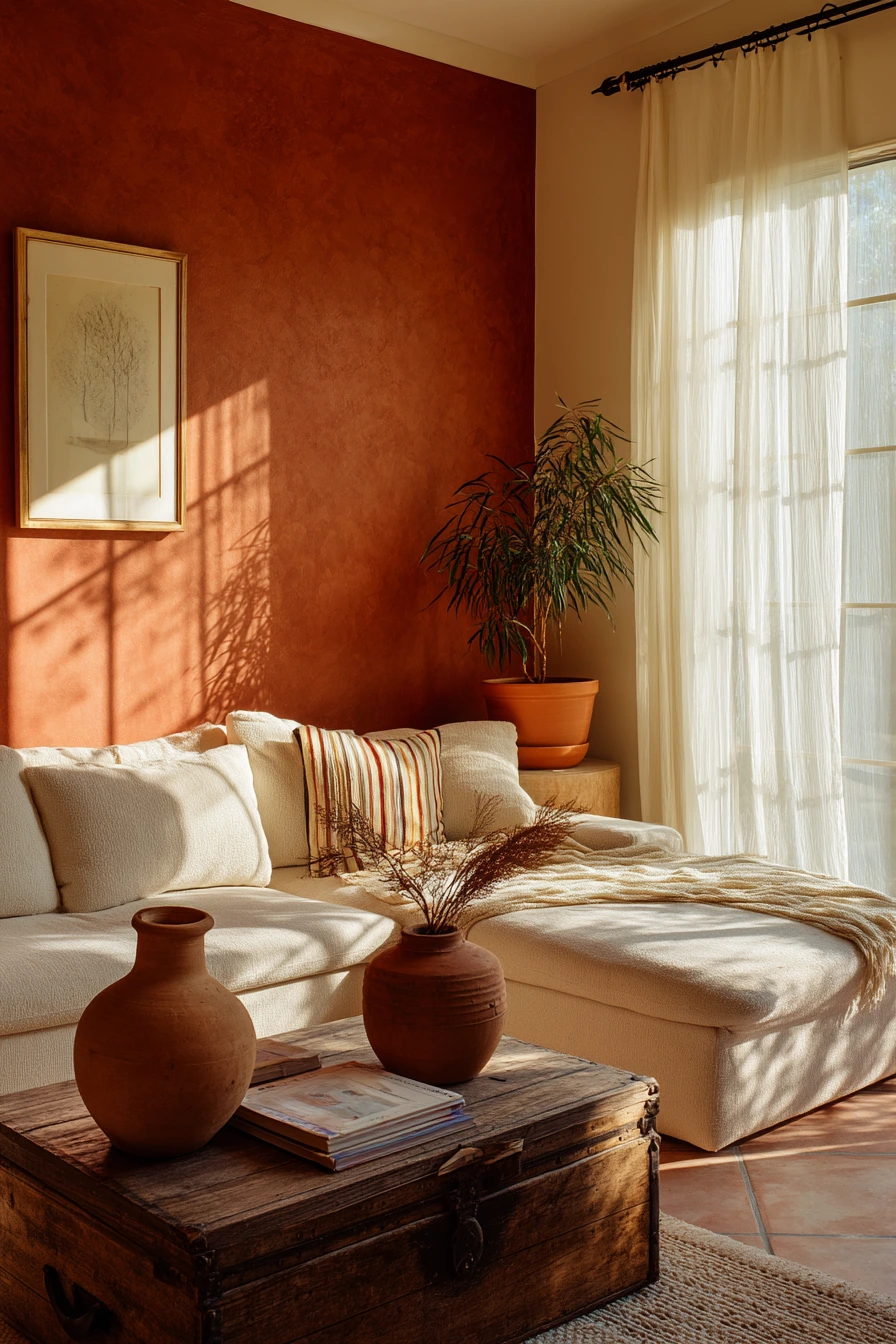
A terracotta accent wall adds instant warmth, especially in a sunlit living room. It feels grounded and friendly, and it pairs well with a cream sectional. This color is strong, so using it on one wall can give you the look without making the whole room feel heavy.
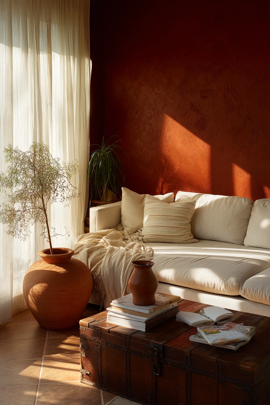
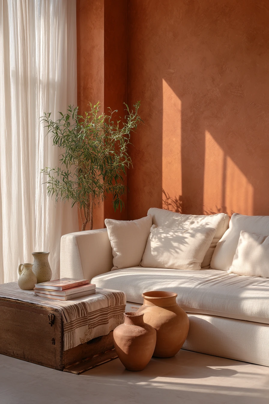
Terracotta looks best with natural textures. Rough ceramic vases, a vintage wood trunk as a coffee table, and a striped throw create a relaxed style. Real items like paperback books and a child’s sketchbook fit the vibe and keep the room from looking too perfect. When late morning light comes through sheer curtains, plant shadows stretching across the floor make the color feel even richer.
To style terracotta, keep the rest of the palette simple. Use cream, warm white, and light wood as your base. Add small black details if you want a modern edge, or lean into brass and aged wood for a vintage feel. If you are unsure about the shade, test a large swatch in both morning and evening light before you commit.
- Use terracotta on one wall to create a focal point.
- Pair with a cream sofa to keep the room bright.
- Add ceramics and natural fibers for an earthy feel.
- Use a wood trunk or tray to hold books and daily items.
- Layer a striped throw to break up large solid blocks of color.
Pro Design Tip: Match your terracotta to an existing warm element, like a wood tone or a rug accent, so the wall color looks connected to the room.
Budget Considerations: If painting feels like too much, try a terracotta peel-and-stick mural or removable wallpaper on one wall.
6 Cream and Charcoal Contrast for Modern Calm
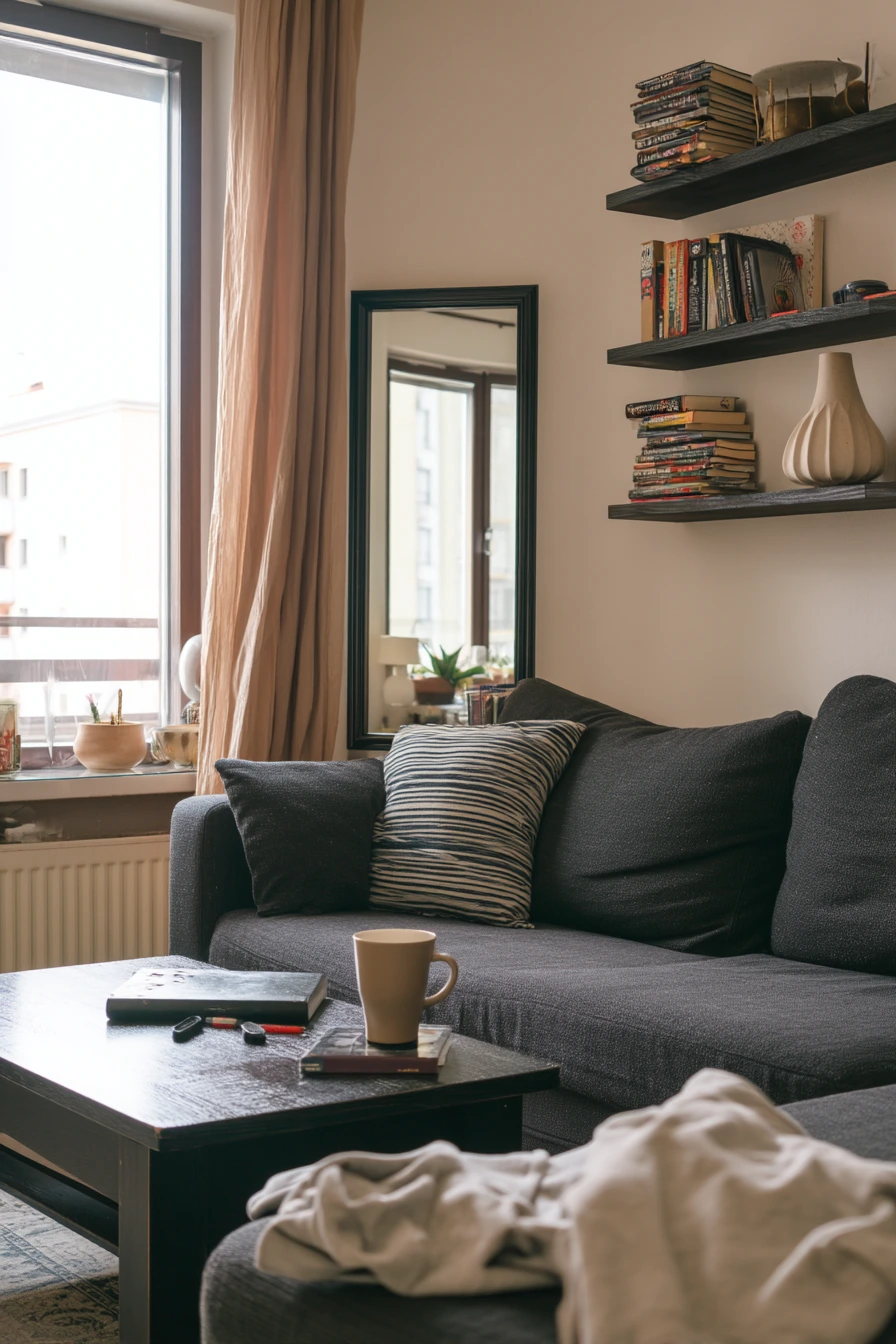

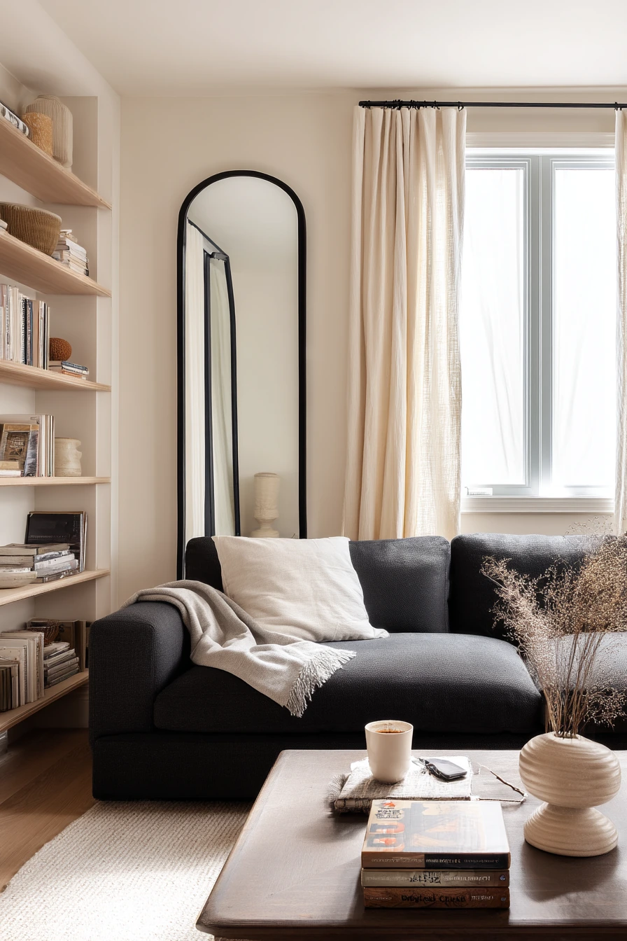
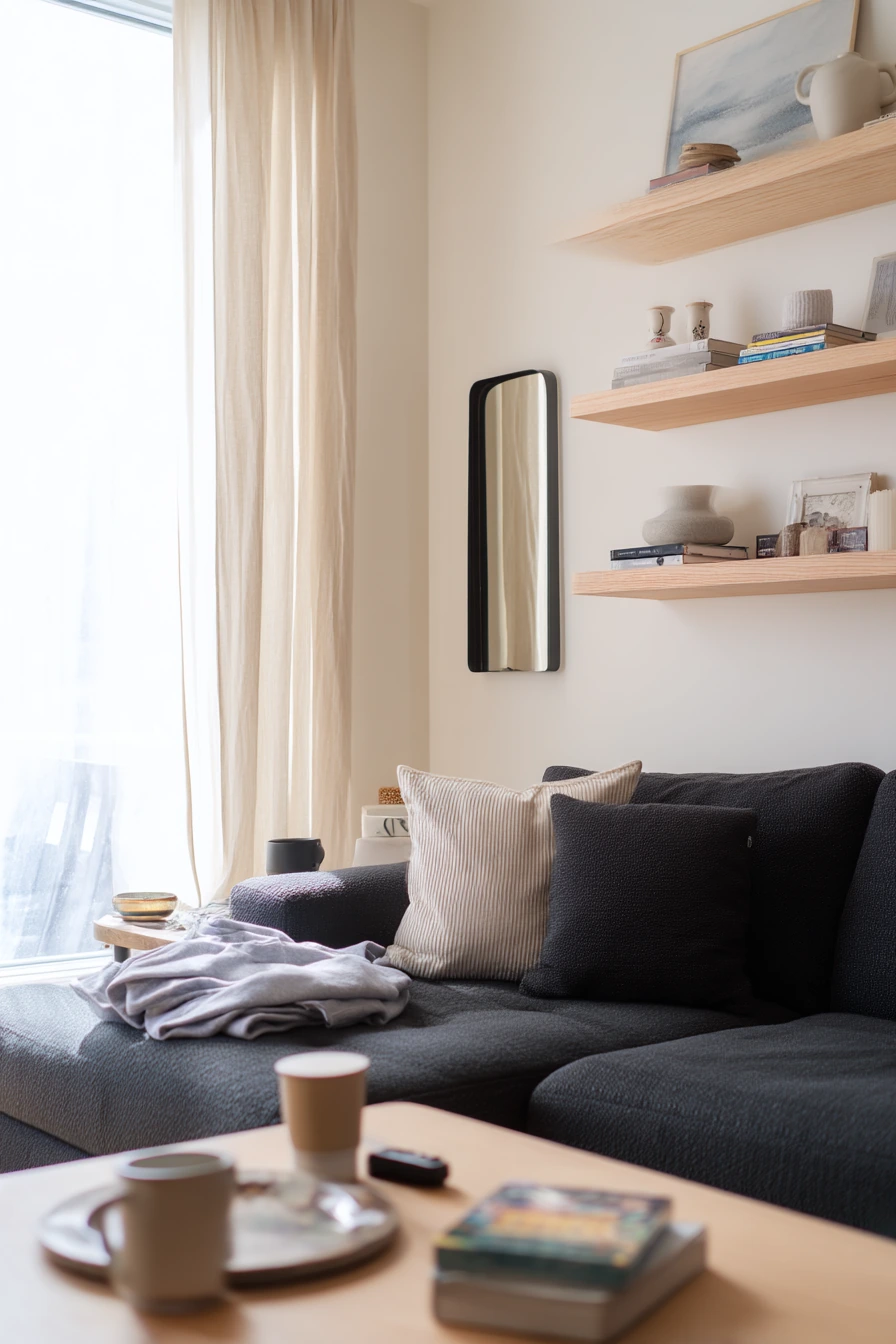
Creamy walls are a classic base for a modern living room. They look clean in soft overcast window light and work with almost any style. With a charcoal sofa, the contrast feels crisp without being harsh, which is great if you want a composed look that still feels livable.
Style this palette with ash wood shelves, a black-framed mirror, and ribbed ceramic decor. Linen drapes soften the lines and keep the room from feeling too sharp. Everyday life can stay visible here, like a folded sweatshirt on the armrest, a coffee cup, a phone cable, and a small stack of board games. The trick is to give those items a “home,” like a basket, a tray, or one shelf section.
If your creamy paint looks too yellow next to your sofa, add cooler whites in pillows and art mats. If it looks too stark, bring in warmer wood and a soft beige rug. This color scheme also makes it easy to switch accents by season, since the base stays neutral.
- Pick a creamy wall color with a soft undertone, not bright white.
- Use charcoal upholstery to ground the room.
- Add ash wood shelving for light, modern warmth.
- Hang a black-framed mirror to echo darker furniture and add light.
- Store cables and games in baskets so surfaces stay calm.
Pro Design Tip: Repeat black in at least three spots, like a mirror, a lamp, and a frame, so the charcoal sofa feels intentional.
Budget Considerations: A large mirror can be expensive; try a thrifted mirror with a simple black spray-painted frame.
7 Olive Green for Slow Weekend Mornings
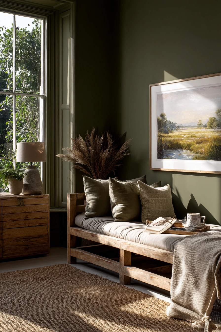
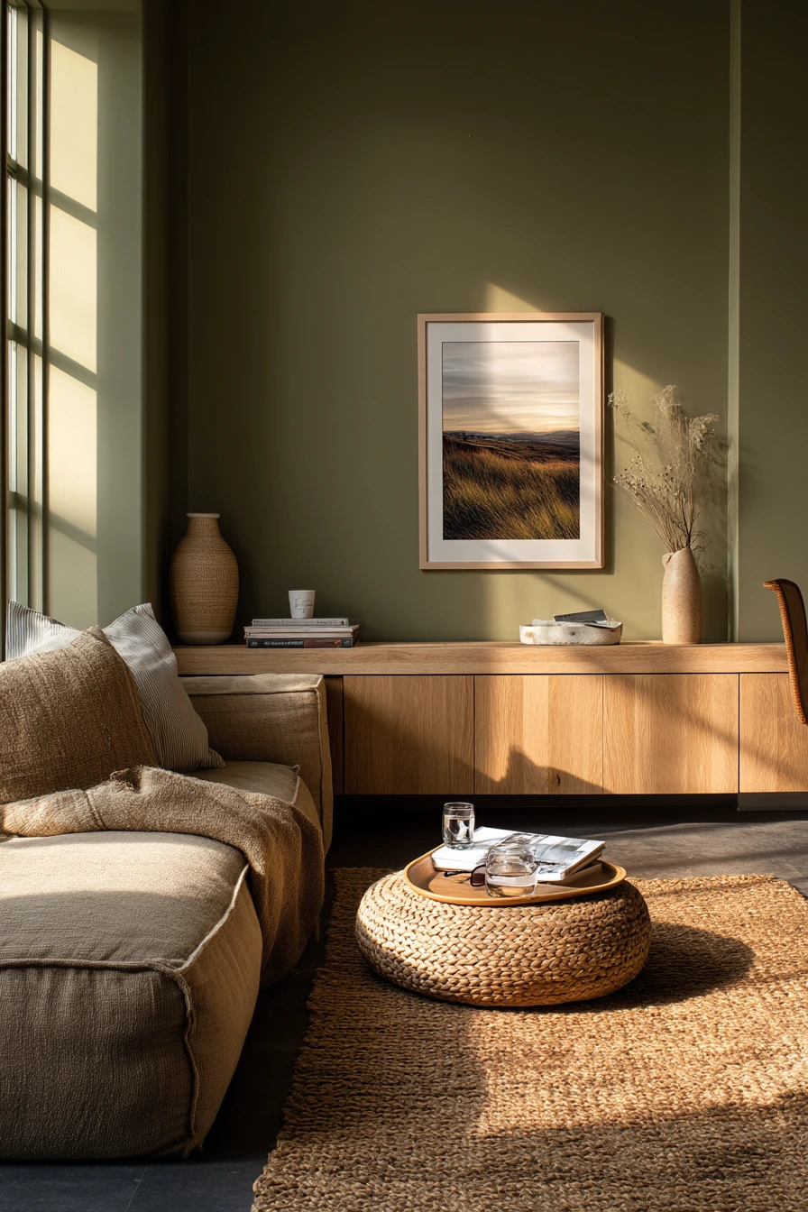
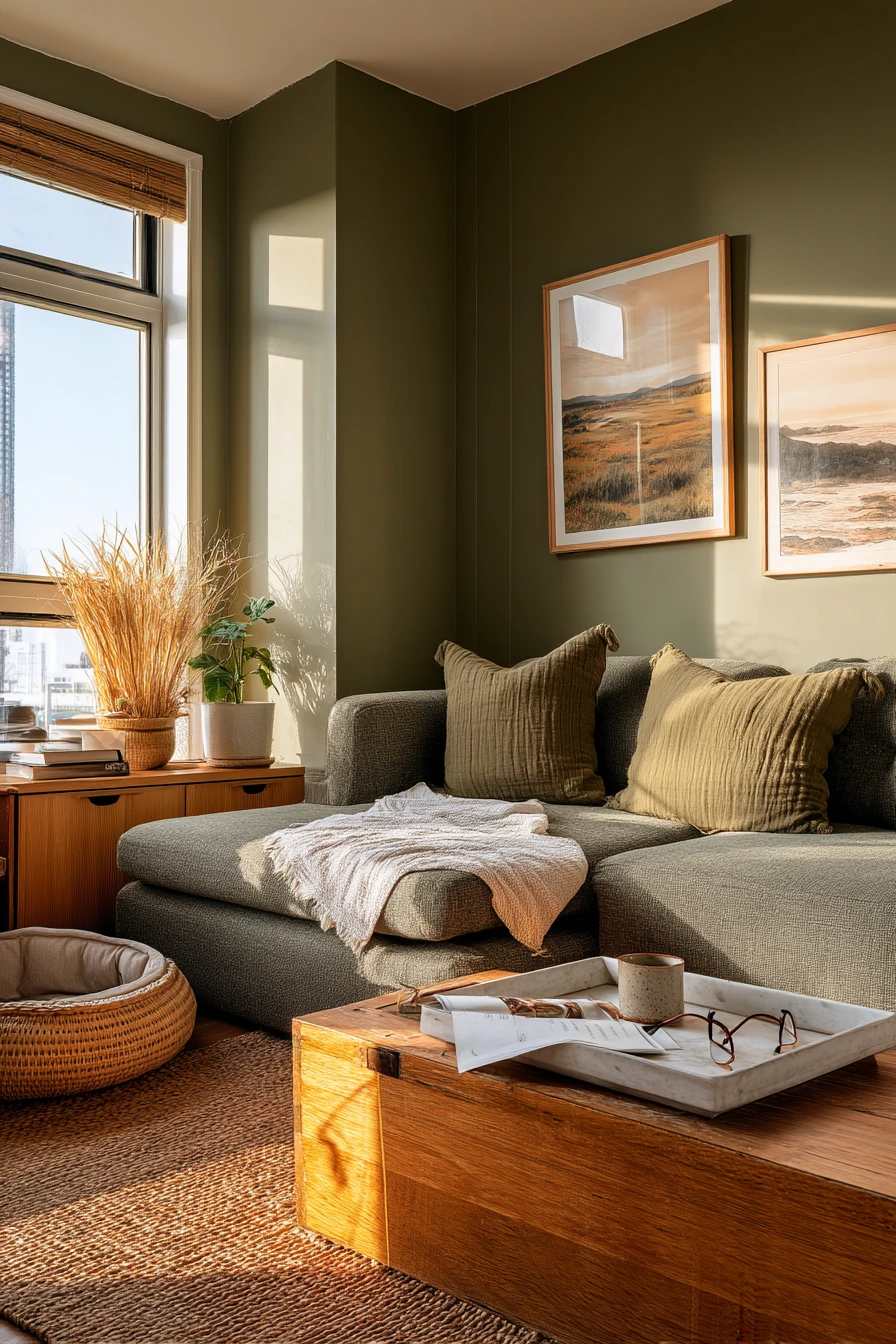
Olive green walls create a restful living room that feels tied to nature. This color works well with a low modular sofa, natural oak storage, and a woven jute rug. It is a smart option if you want a cozy look that still feels fresh.
Olive pairs best with warm neutrals and simple patterns. Add framed landscape art to support the earthy mood. Small “morning life” details, like a ceramic breakfast tray, an open book, and reading glasses, look right at home with this shade. A pet bed tucked beside the chair can blend in too if you choose a neutral cover.
To keep olive from feeling too dark, use lighter textiles like cream pillows and a light throw. If you want more contrast, add black in small pieces, like a thin lamp base or a picture frame. Olive also looks great with brass, but keep metal accents limited so the room stays soft.
- Choose an olive that leans warm, not neon green.
- Pair it with oak furniture for a calm, natural mix.
- Add a jute rug to bring texture and help hide wear.
- Use landscape art and soft cream textiles to lighten the walls.
- Pick a pet bed cover that matches your main neutrals.
Pro Design Tip: Use “high and low” styling with olive walls by adding one tall plant or lamp and one low, long piece like a sideboard to balance the room.
Budget Considerations: Jute rugs are often affordable, but they can feel rough; layer a smaller cotton rug on top where you sit most.

8 Dusty Lavender for a Soft Creative Home
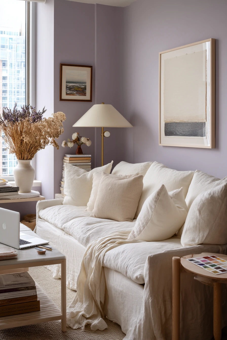
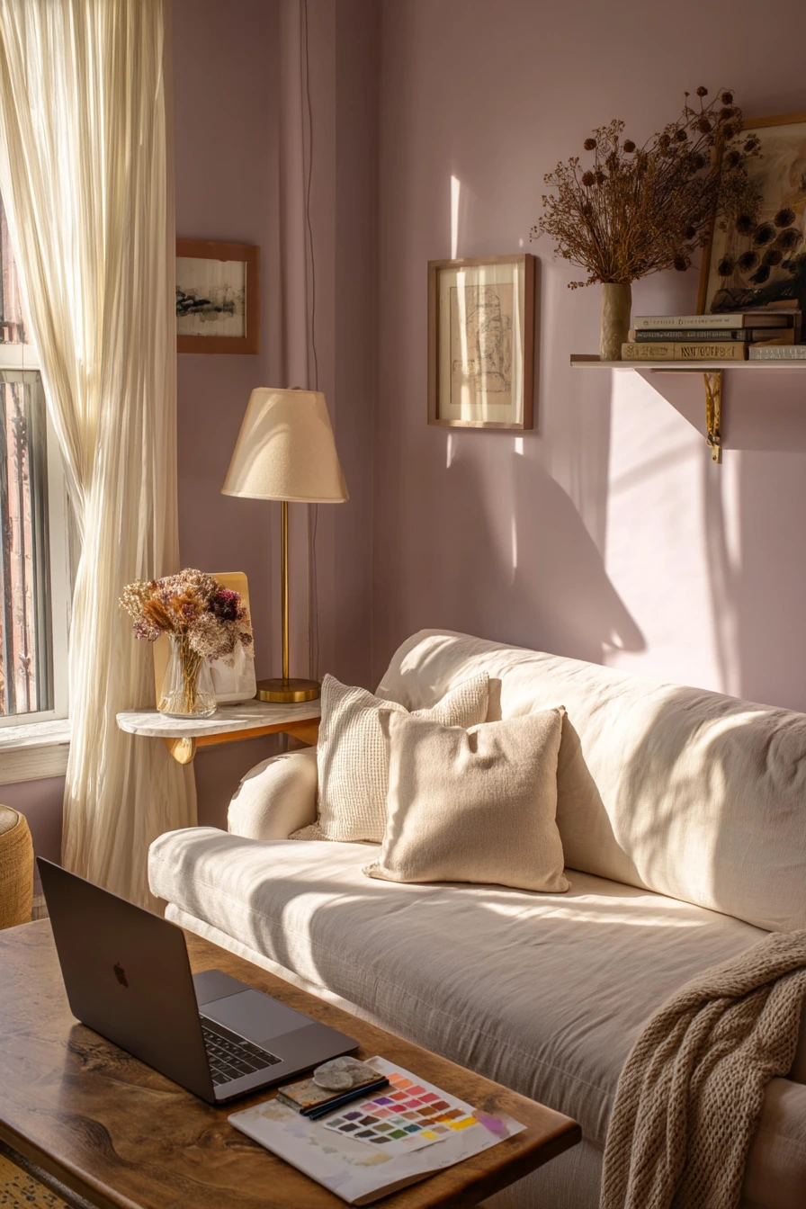
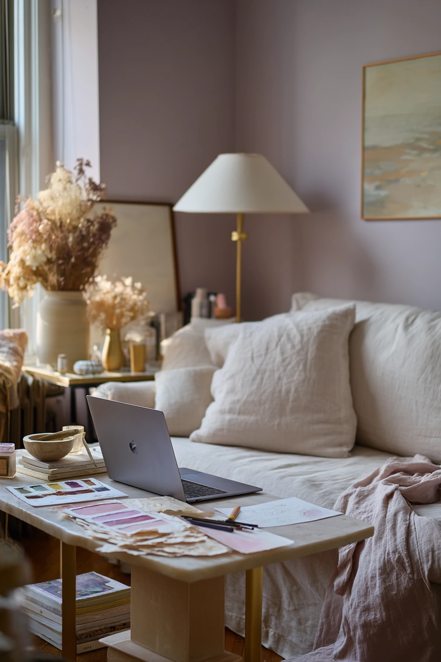
Dusty lavender is a soft color that can still feel grown-up. It is a good fit for a creative apartment living room because it adds personality without being too bright. With a cream linen sofa and pale birch tables, the room stays light and easy to live in.
To style lavender walls, focus on warm metals and calm details. A brass table lamp and dried florals give gentle warmth. A slim gallery shelf keeps art flexible, which is helpful if you like to change prints. This color also makes space for real work life, like paint swatches on the side table, a laptop, sketch pencils, and a wrinkled throw draped over the arm. It looks relaxed, not messy, when you keep the surfaces edited.
Lavender can shift in different light, so test it in early afternoon and at night. If it looks too pink, add cooler grays and whites. If it feels too cool, bring in tan, brass, and warm wood. Keep patterns small and simple, like a thin stripe or tiny check, so the wall color stays the main feature.
- Pick a dusty lavender with gray in it to keep it muted.
- Use cream upholstery to prevent the room from feeling dark.
- Add brass accents for warmth and a clean finish.
- Style a gallery shelf so you can swap art without new holes.
- Use a tray to hold swatches, pencils, and small tools.
Pro Design Tip: Pair lavender with one “quiet” neutral like cream and one “warm” neutral like tan so the color reads soft, not cold.
Budget Considerations: Instead of buying new art, print your own designs and use matching frames to make the shelf look cohesive.

9 Classic White with Warm Wood Layers

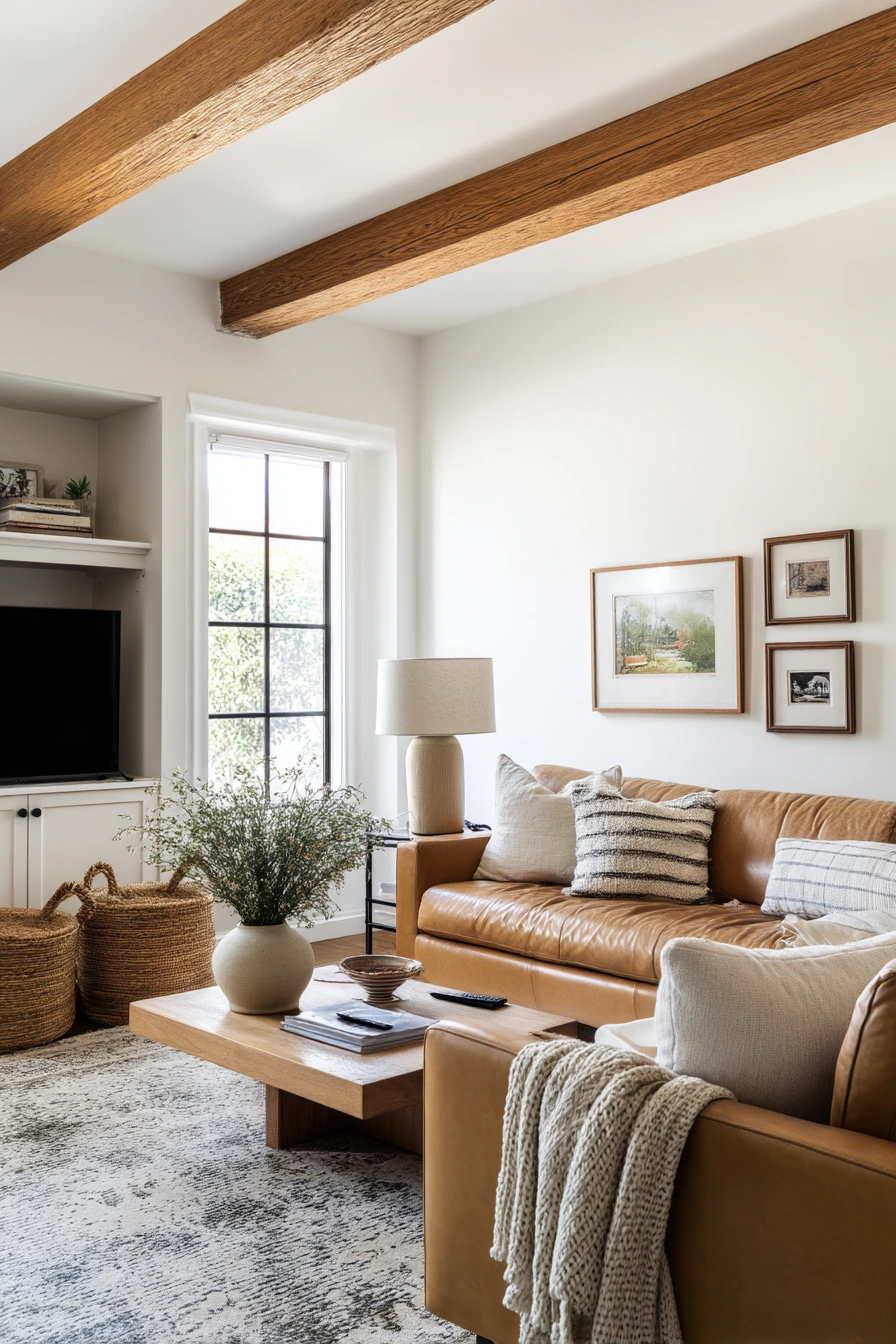
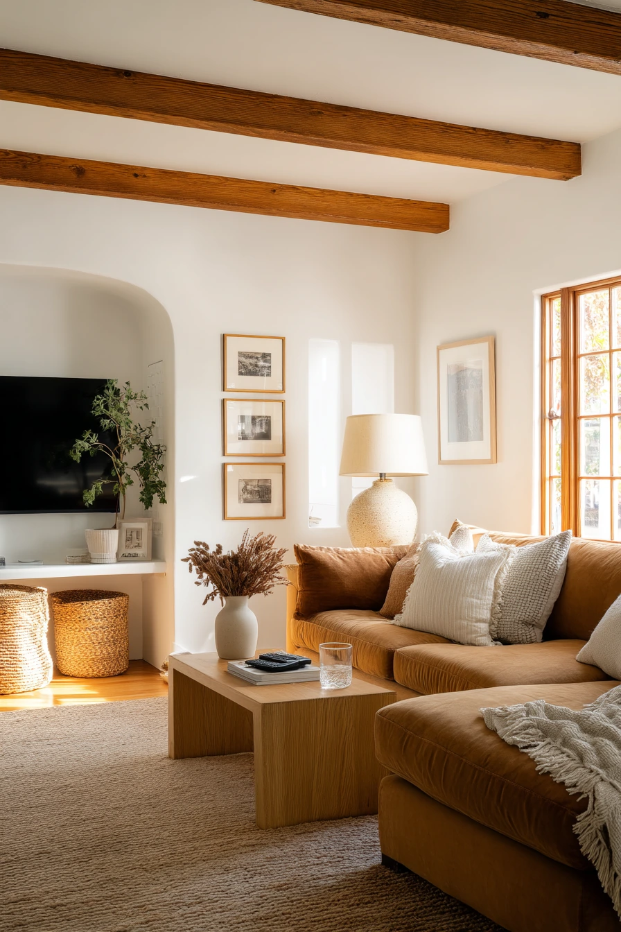
Soft white walls are a clean backdrop that lets warm wood beams shine. This look feels bright but still grounded, especially when you add a camel sofa and an oak coffee table. Soft white is also forgiving, since it works with most rugs, art, and accent colors.
To keep white walls from feeling plain, bring in texture and personal items. A textured ceramic lamp, woven baskets, and framed family photos add warmth. Everyday pieces like a water glass, a TV remote, and a blanket half-folded after use fit this style because the room is about comfort over showroom polish.
When choosing a white, avoid a stark, icy shade unless you have lots of warm wood. A white with a gentle warmth helps balance the beams and wood furniture. If your room gets strong sun, a slightly warmer white can still look bright without glare. Finish with a few darker accents, like a brown leather tray or a black picture frame, so the space has definition.
- Choose a soft white with a warm undertone to match wood beams.
- Use a camel sofa to add warmth and hide daily wear.
- Add baskets for storage so the room stays tidy fast.
- Mix ceramics and textiles to keep white walls interesting.
- Group photos in simple frames for a personal gallery feel.
Pro Design Tip: In white rooms, use at least five textures (wood, woven, ceramic, linen, and wool) so the space feels layered, not flat.
Budget Considerations: If built-in beams are not an option, add warm wood with a simple mantel shelf, secondhand side table, or peel-and-stick wood-look detail.

10 Muted Mustard for a Happy Eclectic Space
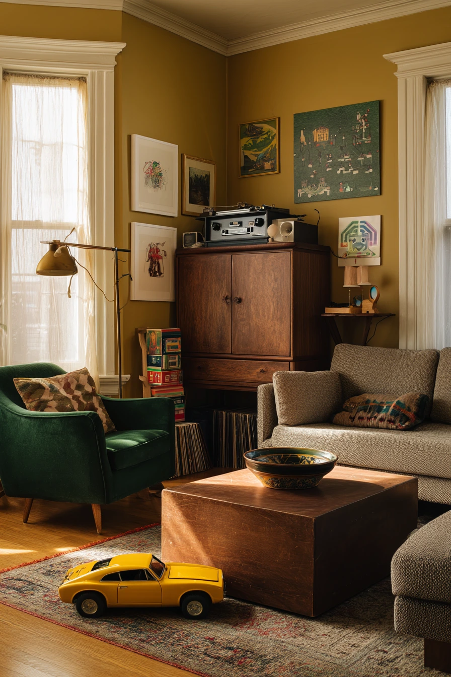
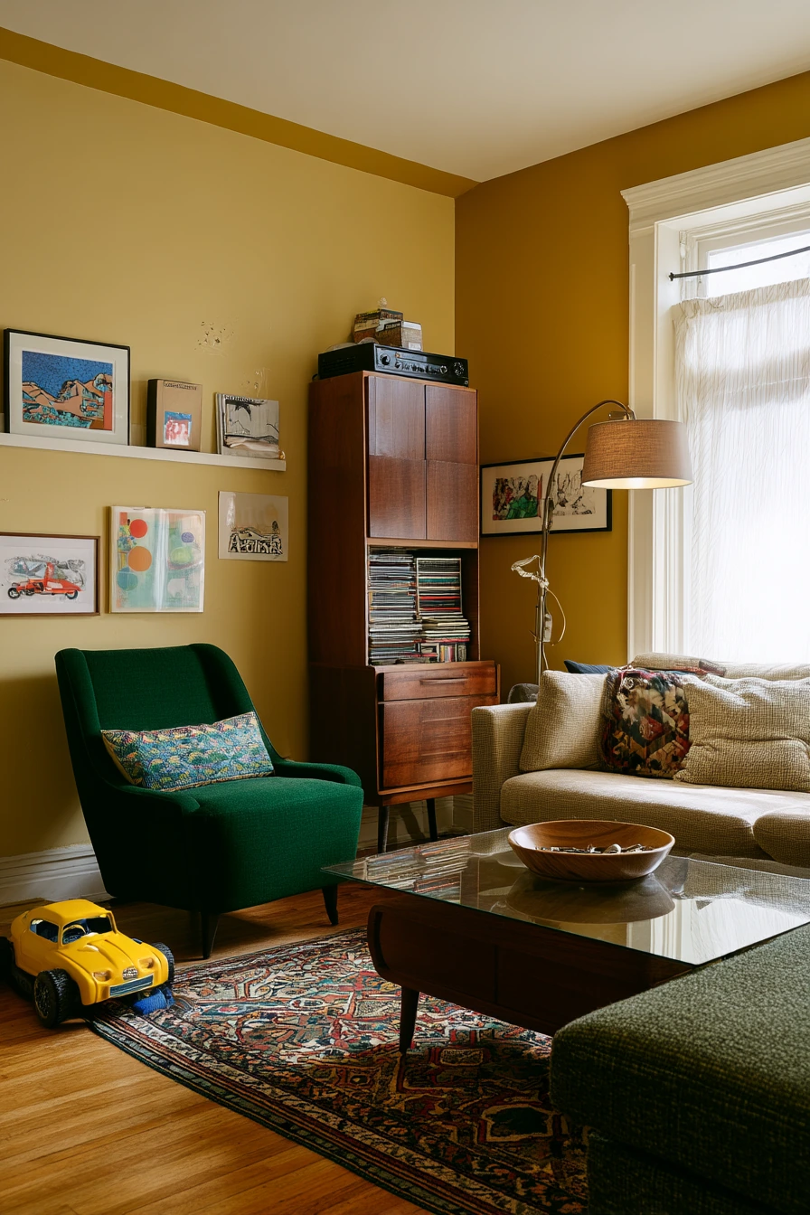
Muted mustard walls bring warmth and character, making them a good match for an eclectic living room. The color feels cozy in late-day window light, and it looks even better when you add soft lamp glow. It also works well with mixed furniture, like a neutral sectional and a deep green armchair.
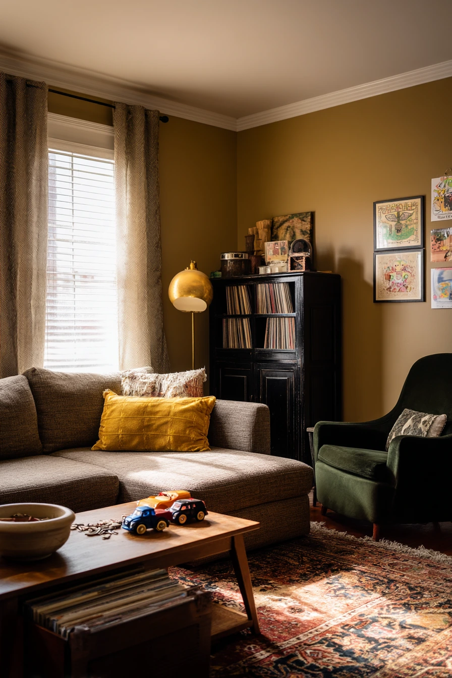
To keep mustard from overpowering the room, ground it with natural wood and neutrals. A vintage walnut cabinet adds depth, and a patterned rug ties the colors together. Style the space with real family details, like stacked records, kids’ art on the wall, a toy car under the coffee table, and a bowl of keys by the entry spot. These items fit the lived-in mood, as long as they are placed with care.
Mustard pairs well with dark green, brass, and walnut, but you can also add small hits of cream to brighten. If the room feels too heavy, choose lighter curtains and add a light throw. If it feels too busy, keep the walls simple and let the rug carry the pattern.
- Choose a muted mustard, not a bright yellow, for a softer look.
- Pair it with deep green seating to calm the warmth.
- Add walnut wood to make the palette feel rich and settled.
- Use one patterned rug to connect mustard, green, and neutrals.
- Create a “drop zone” bowl for keys and small clutter.
Pro Design Tip: Limit bold colors to three (mustard, green, and one neutral) and repeat each color at least twice so the eclectic mix still feels planned.
Budget Considerations: Vintage-style rugs can be expensive; try a washable printed rug for the same look with easier cleanup in a family space.

These living room color ideas show how paint can support real life, from toy baskets and cables to books, throws, and family photos. Start by picking the shade that fits your light and the furniture you already own.
If you are stuck between two colors, test both on large poster boards and move them around the room for a full day. Then use simple styling steps, like warm wood, layered textiles, and a few matching accents, to make the color feel finished.
FAQ
1) What is the best living room paint color for resale? Soft whites, warm greige, and light beige are usually safe because they work with many styles and feel bright.
2) How do I choose a color for a small living room? Pick lighter, muted shades like soft sage green or creamy white, and use mirrors and light curtains to help bounce light.
3) Do dark colors make a living room look smaller? Dark shades like deep blue-gray can feel more intimate, but they can still work if you add warm lighting, light rugs, and lighter trim.
4) How can I make beige walls look more modern? Add contrast with black accents, mix textures like boucle and ceramics, and use warm wood like walnut or oak.
5) What colors go well with terracotta? Cream, warm white, tan, walnut wood, and small black accents all pair well with terracotta.
6) What is a renter-friendly way to add color? Use removable wallpaper on one wall, swap in colorful curtains or pillows, and hang removable wall art with damage-free hooks.
7) How do I keep colorful walls from feeling too busy? Keep large furniture neutral, limit patterns to one main item like a rug, and repeat accent colors in small doses around the room.