

Looking for kitchen backsplash ideas that look good in real life, not just in perfect photos. The right backsplash protects the wall, makes cleanup easier, and can change the whole feel of your kitchen.
In this guide, you will see 10 backsplash styles based on lived-in homes: busy family mornings, small rentals, tiny galley kitchens, and cozy coffee corners. Each idea includes simple ways to style it so it stays functional.
You will also get practical notes on durability, grout, and maintenance, plus a pro design tip and a budget note for every look. Use this to pick a backsplash that matches your cooking habits, your light, and your daily mess.
Save your favorite sections for later, then come back when you are ready to plan tile size, color, and where the backsplash should start and stop.
1 1. Textured White Tile for a Busy Family Kitchen

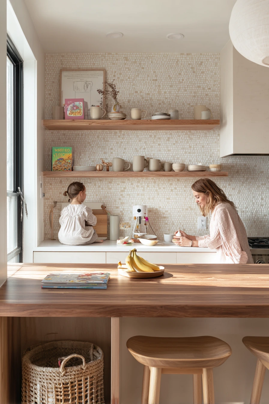
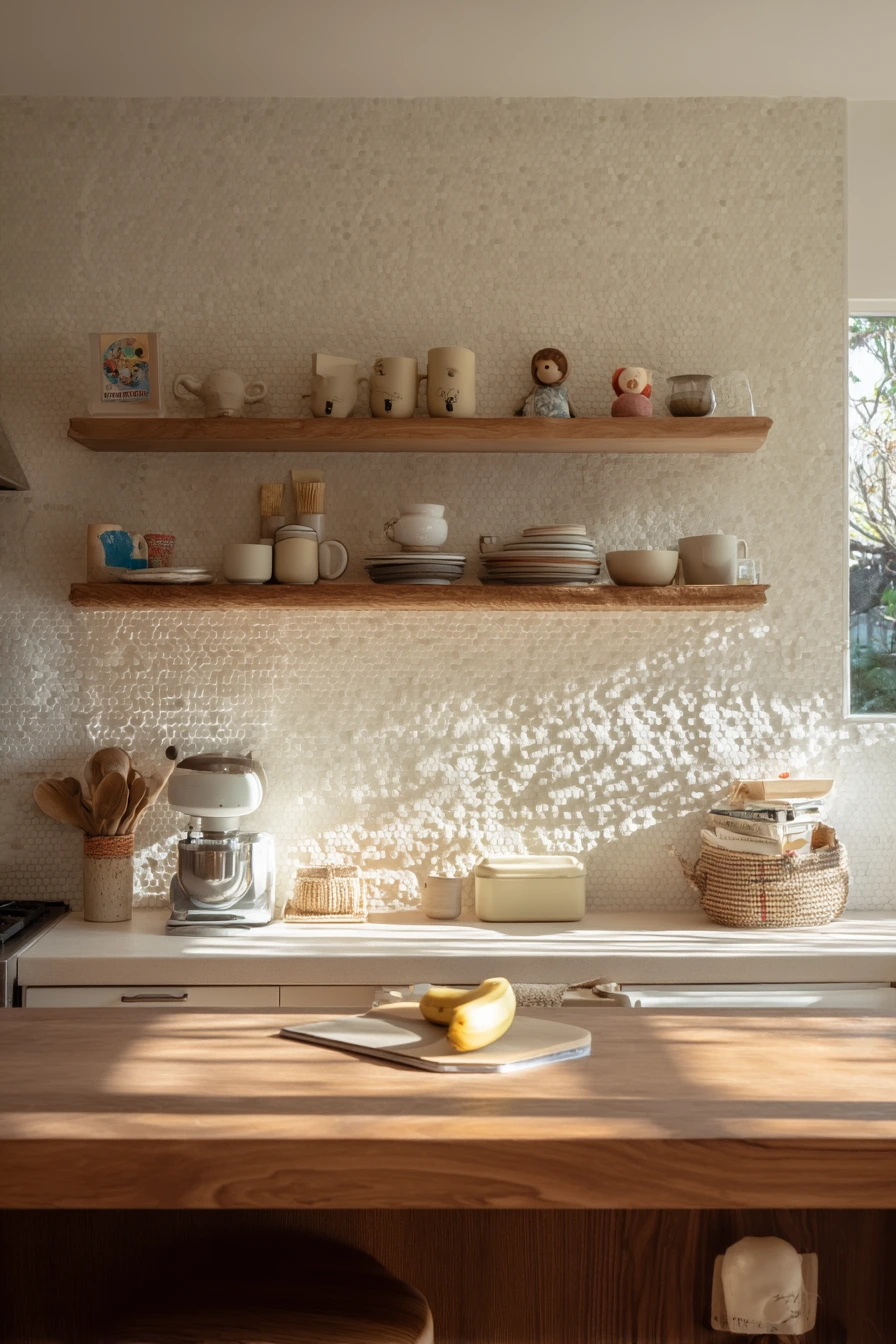
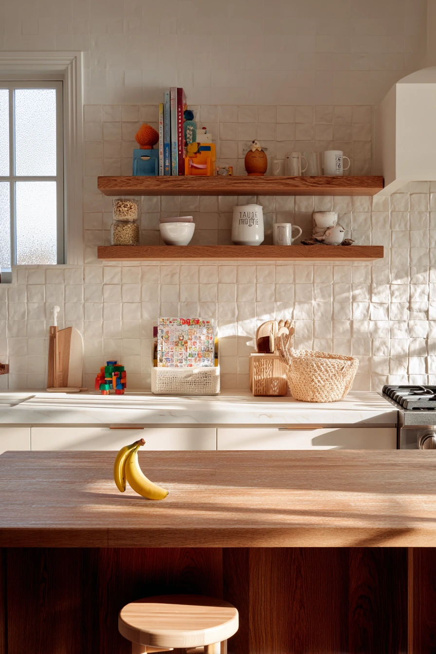
A textured white zellige backsplash is a strong fit for a family of four because it adds softness without feeling precious. The surface has gentle variation, so it hides tiny splashes from weekday breakfast and it still looks clean in natural light. With walnut counters, the warm wood keeps the white tile from feeling cold, and the whole space reads calm even with a half-peeled banana on the island and mugs on open shelves.
To style this look, keep the shelves simple and repeat a few shapes. Stack cereal bowls, add everyday mugs, and leave some breathing room so it does not look crowded. If you have kid items like a toy basket near the stool, pick one with a natural fiber texture so it blends with the backsplash and wood tones. Small real-life details, like a charging cable by a cookbook, are easier to live with when the background is quiet.
For maintenance, choose a grout color that matches the tile or is slightly warm white. That helps the backsplash look seamless and it avoids harsh grid lines. Zellige can have uneven edges, so a skilled installer matters. Seal the tile if recommended by the manufacturer, especially behind a sink or coffee area.
- Pair white zellige with walnut, oak, or maple to warm it up.
- Use warm white grout to reduce visible lines and make cleanup feel easier.
- On open shelves, limit colors to two or three so the wall stays calm.
- Add one tactile item, like a linen towel, to match the handmade tile feel.
- Keep counter items in a tray so daily clutter looks intentional.
Pro Design Tip: Run the zellige to the underside of the shelves and align the top edge carefully; a clean termination makes handmade tile look polished.
Budget Considerations: Handmade zellige costs more and needs careful installation; for a similar look, use a zellige-look ceramic tile with a glossy, uneven surface.
2 2. Budget-Friendly Peel-and-Stick in a Renter Kitchen
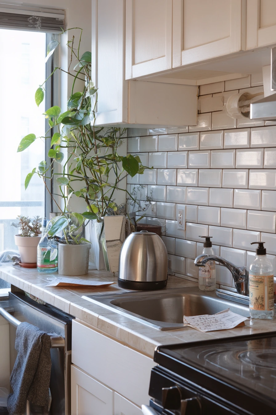
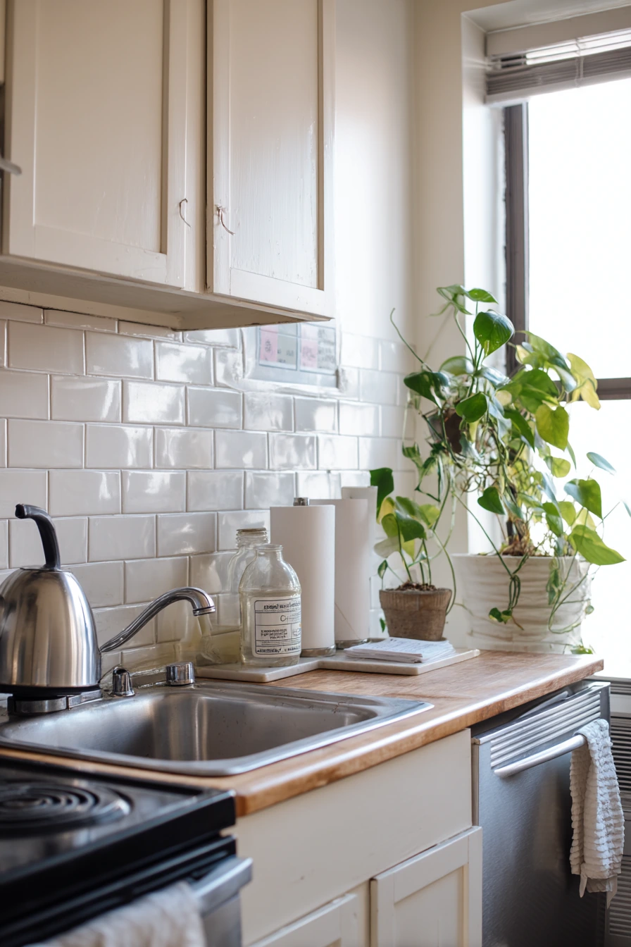
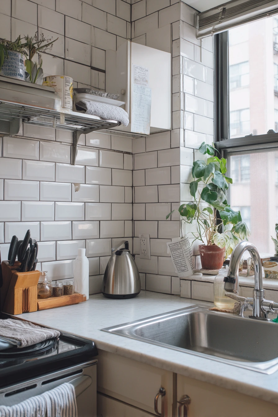
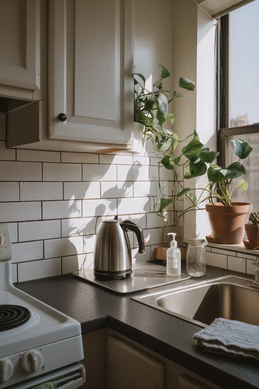
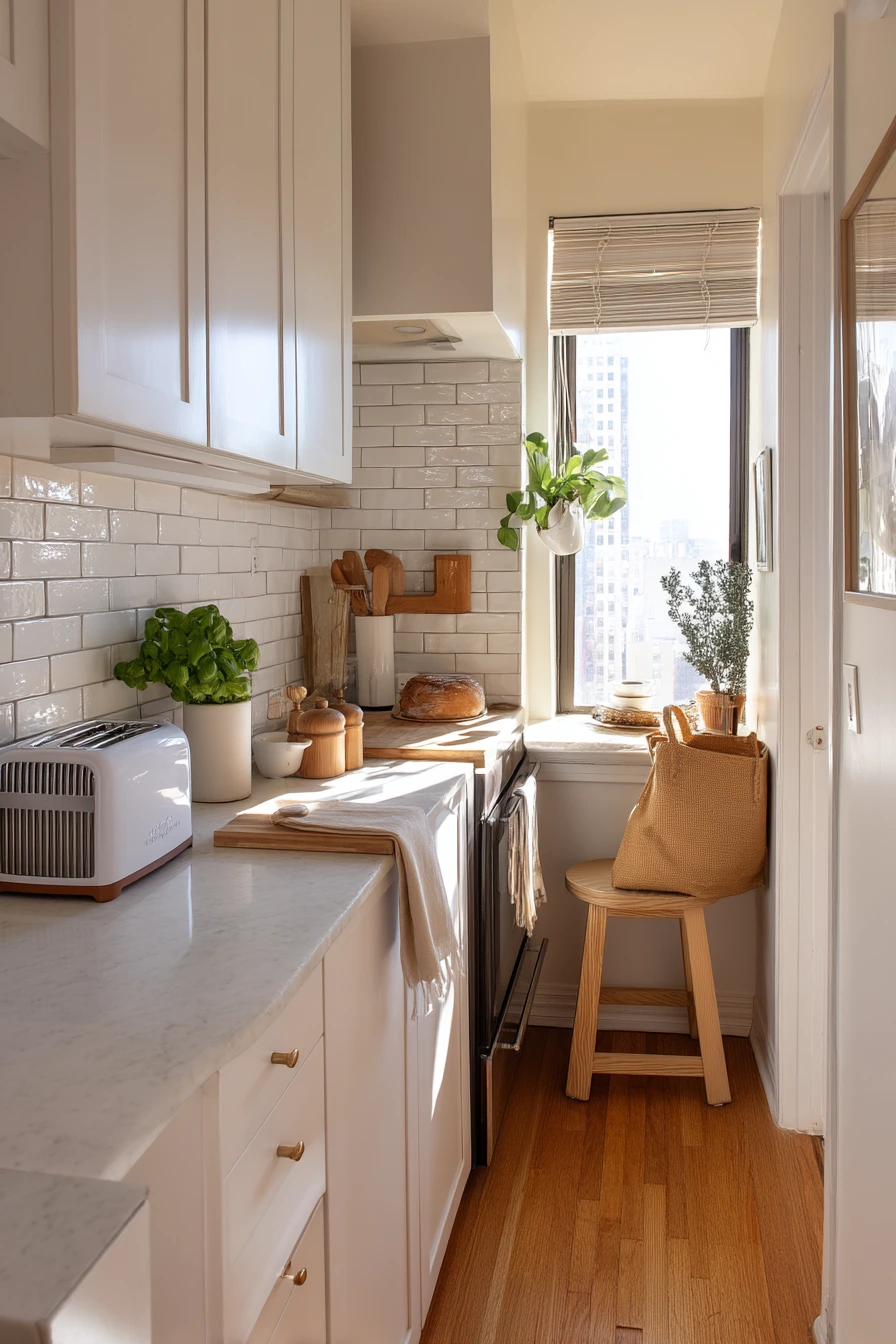
If you need kitchen backsplash ideas for a small rental, peel-and-stick subway tile can give you a clean update without permanent work. It is a good match for compact sinks and busy counters because the simple shape reads tidy even when the dish soap, kettle, and towel are out. In a small apartment, that visual order matters.
To style it, keep the palette light and repeat stainless and white. A pothos cutting in a glass jar adds life without taking counter space, and it fits the airy, soft morning light most rentals get. Let the space look used, not staged, but try to corral papers like a grocery receipt into a small catch tray so the backsplash stays the star.
For the best results, prep the wall well. Clean the paint with a degreaser, let it dry, and avoid installing over heavy texture. Most peel-and-stick tiles do not love heat, so do not place them right behind a high-output range unless the product is rated for it. In a rental, the goal is a quick wipeable surface and a fresh look, not a forever install.
- Pick a matte or satin finish to avoid a plastic shine.
- Use a light grout-look pattern to keep the wall brighter in a small kitchen.
- Trim edges with removable caulk or a peel-and-stick border for a neat line.
- Style with one plant and one towel color for a simple, lived-in look.
- Keep items low around the sink so the backsplash reads open and clean.
Pro Design Tip: Start from the most visible corner and use a level line, even if the counter is slightly off; the eye follows the tile, not the countertop.
Budget Considerations: Peel-and-stick is usually the lowest-cost option; buy one extra pack so you can replace a damaged section later without mismatched dye lots.
3 3. Warm Stone Slab for a Calm Chef’s Kitchen
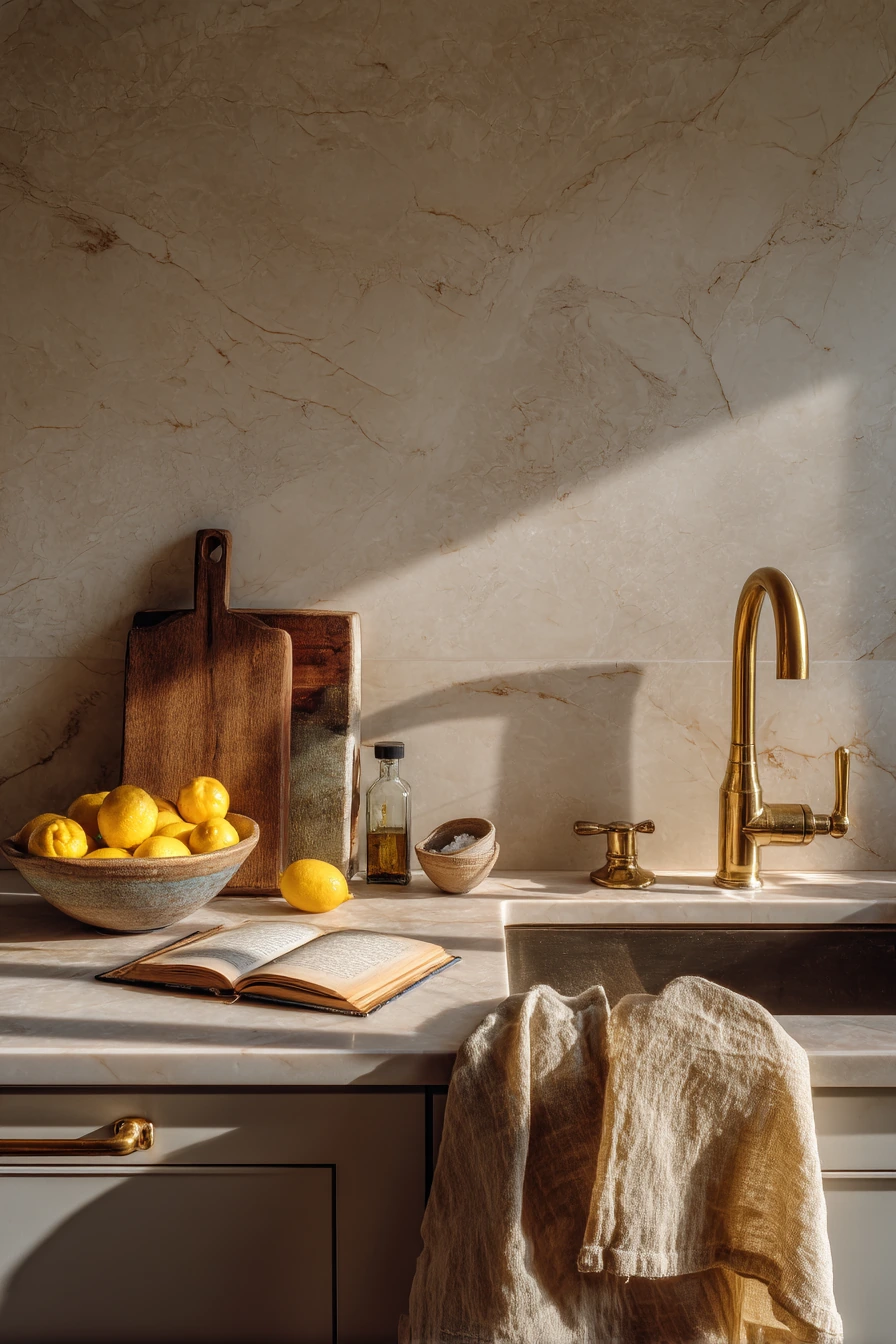
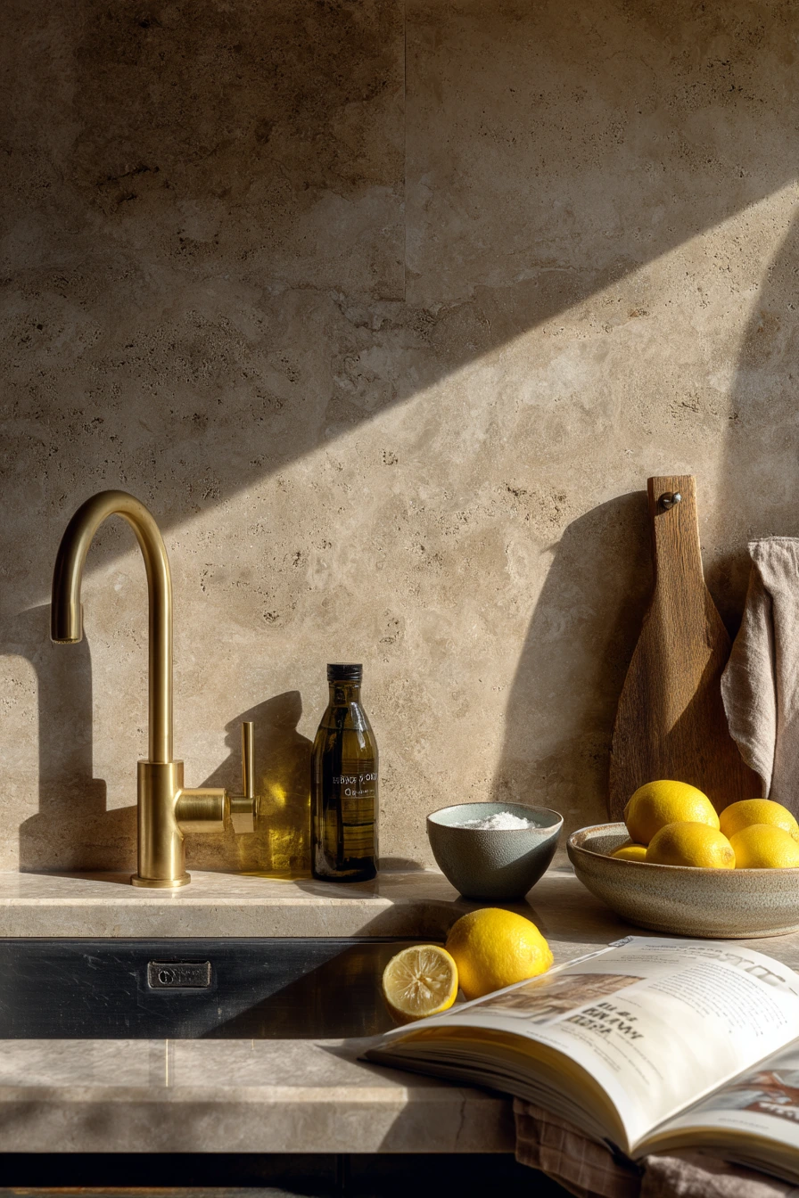
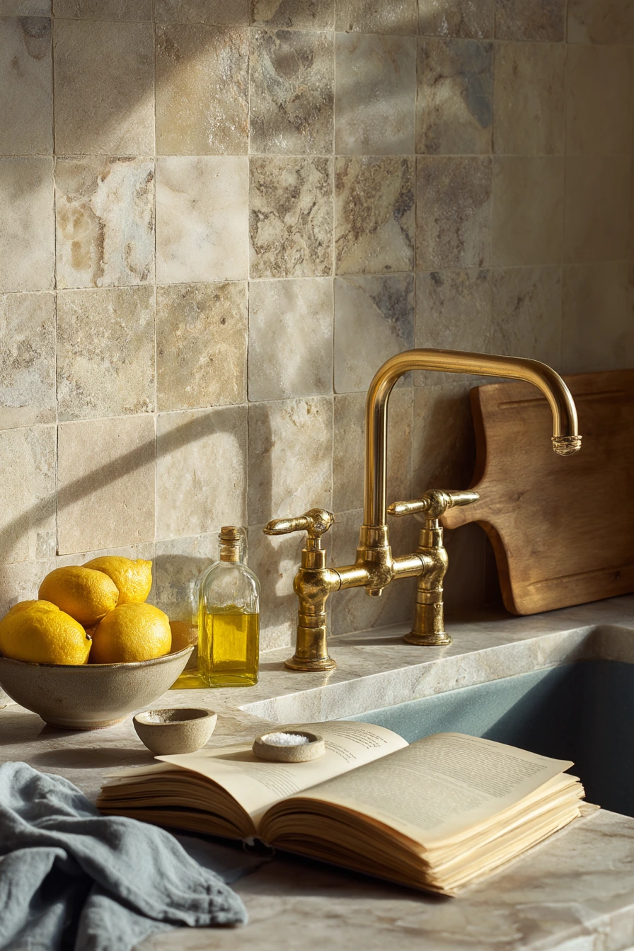
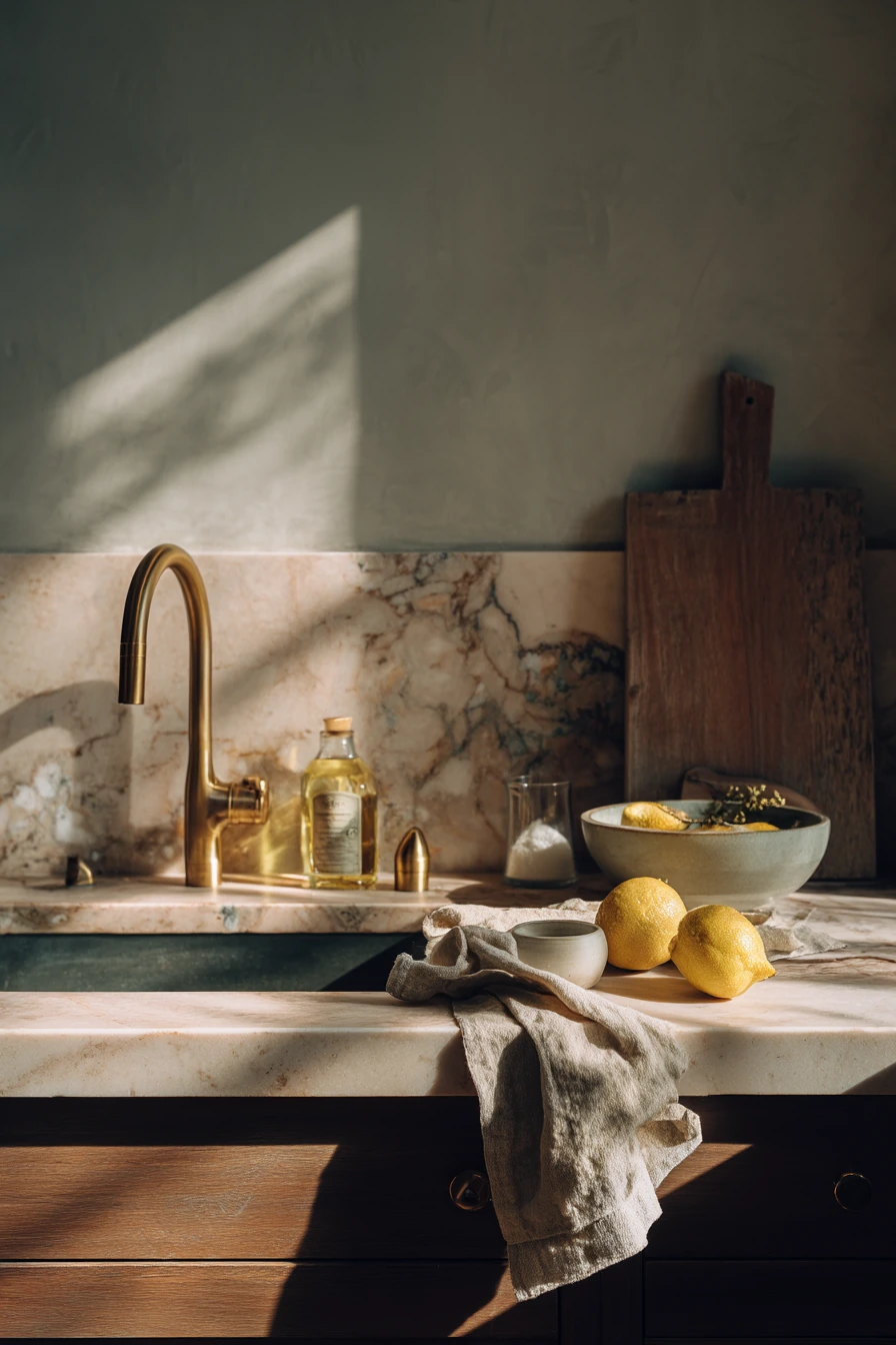
A full-height warm stone slab backsplash creates a grounded, mineral-rich look that works well for an avid cook. Because it runs from the counter up the wall, it protects a large area from sauce splatter and steam, and it feels seamless compared to small tiles. With a brass faucet, cutting boards, lemons in a bowl, and an open cookbook, the kitchen looks calm but clearly in use.
To style this backsplash, lean into natural materials. Leave a wood cutting board propped near the slab to echo the stone’s warmth. Keep olive oil, salt, and a pinch bowl in a small cluster so they look like a cooking station, not clutter. A damp tea towel can sit on the counter and still look fine because the slab acts like a quiet background.
Think about stone choice and finish. Honed stone hides fingerprints and water spots better than high polish. If you love marble-like movement, consider quartzite for better durability in many kitchens. Ask your fabricator about sealing and about the location of seams, especially if the wall is long. The slab will show everything, so good lighting and clean edges matter.
- Choose a honed finish for a softer look and easier daily maintenance.
- Match the slab tone to your countertop or go one shade warmer for contrast.
- Use a simple utensil crock so the stone stays the focus.
- Add brass or warm metal hardware to bring out the stone color.
- Wipe splashes quickly to prevent stains, even on sealed surfaces.
Pro Design Tip: Plan the slab layout so the most dramatic veining lands behind the range or sink; it makes the wall feel designed, not random.
Budget Considerations: Full-height slabs are premium due to material and fabrication; a budget-friendly alternative is large-format porcelain panels with a stone look.
4 4. Handmade Tile Behind an Espresso Nook
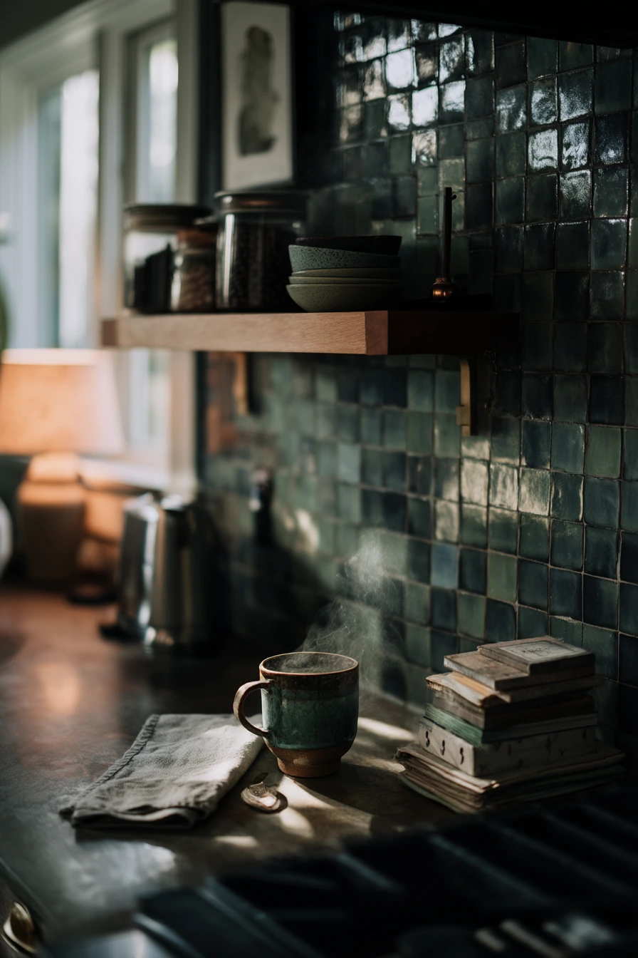

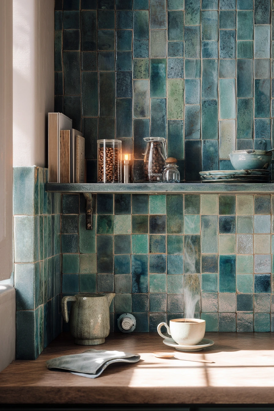
A morning espresso nook feels special with a handmade blue-green tile backsplash that has subtle variation. This type of tile adds depth in a small zone, so you get color without overwhelming the full kitchen. The cool tones look great with soft window light, and a warm lamp glow keeps the corner feeling cozy, not chilly.
Styling is about keeping the countertop tight. Use a compact shelf for beans, cups, and a small grinder, and leave one spoon on the counter like a real moment. A folded linen napkin adds texture that matches the handmade tile. If mail tends to land nearby, add a slim tray at the edge so papers do not creep into your coffee station.
For function, make sure the tile is easy to wipe, especially near steam and drips. Handmade tile can have pits and edges that catch grime, so choose a grout that is not bright white. Consider a satin grout sealer and keep a soft cloth near the nook for quick cleanup. This is a small project that can still look custom if you finish the edges neatly with trim or a clean return.
- Pick a blue-green shade that repeats elsewhere, like in a mug or art print.
- Use warm bulbs in the lamp to balance the cooler tile color.
- Keep the coffee tools grouped on a small tray for easy cleaning.
- Add one linen item to make the corner feel softer and more tactile.
- Choose a mid-tone grout to hide coffee splashes and daily dust.
Pro Design Tip: Tile only the coffee wall and stop at a natural edge, like a cabinet side, so the nook looks intentional and not like a leftover accent.
Budget Considerations: Handmade tile can add up fast; limit it to a small espresso zone and use a simpler tile elsewhere to control costs.

5 5. Easy Maintenance Slab for a Pet-Friendly Home
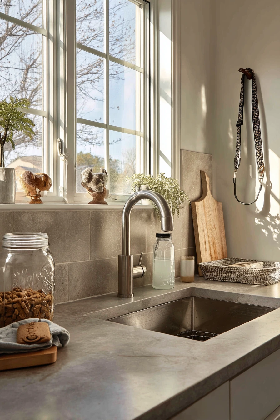

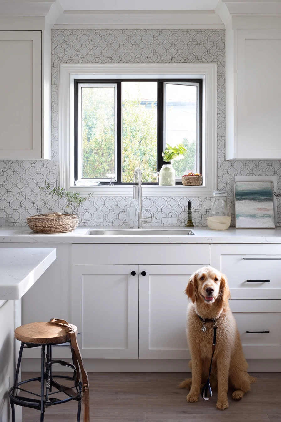
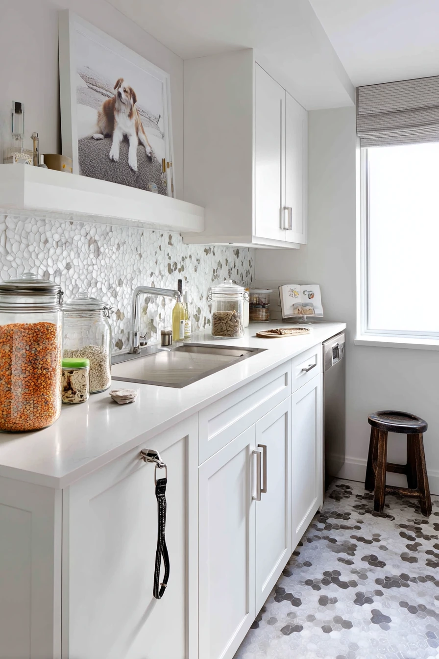
In a pet-friendly home, durability matters more than perfect styling. A large-format quartz backsplash behind a family sink gives you a crisp look that stands up to daily mess. It pairs well with a dish rack in use, a reusable bottle, and the kind of real-life details you cannot avoid, like a leash hanging from a stool and faint muddy paw prints nearby.
To style this space, keep it relaxed but controlled. Choose one or two countertop organizers so the dog treat jar, sponge, and soap do not spread out. Quartz reads modern and clean, so add warmth with a wood brush, a neutral towel, or a small plant that can handle humidity. If you have open shelves, keep pet items off them so the backsplash area feels calmer.
Quartz is easy to wipe, but the success of the look is in the details. Ask for a tight seam and a simple backsplash height decision: either standard height with a shelf, or full height for maximum protection. Pair it with a durable faucet finish and a sink that can handle heavy use. If the kitchen gets late-day window light, quartz can reflect it nicely without the busy pattern of small tile.
- Use a quartz pattern that is subtle so it hides water spots and splashes.
- Keep pet items in one zone so the sink area stays efficient.
- Add one warm wood element to soften the sleek surface.
- Choose a darker towel if muddy paws are common in your home.
- Wipe down the backsplash daily with mild soap to avoid streaks.
Pro Design Tip: Continue the quartz up behind the faucet line and keep the caulk joint clean and thin; a tidy seam makes the whole sink wall look higher-end.
Budget Considerations: Quartz slabs and fabrication can be mid to high cost; a budget option is quartz-look porcelain tile in large rectangles with minimal grout lines.
6 6. Colorful Tile for a Creative Apartment Kitchen

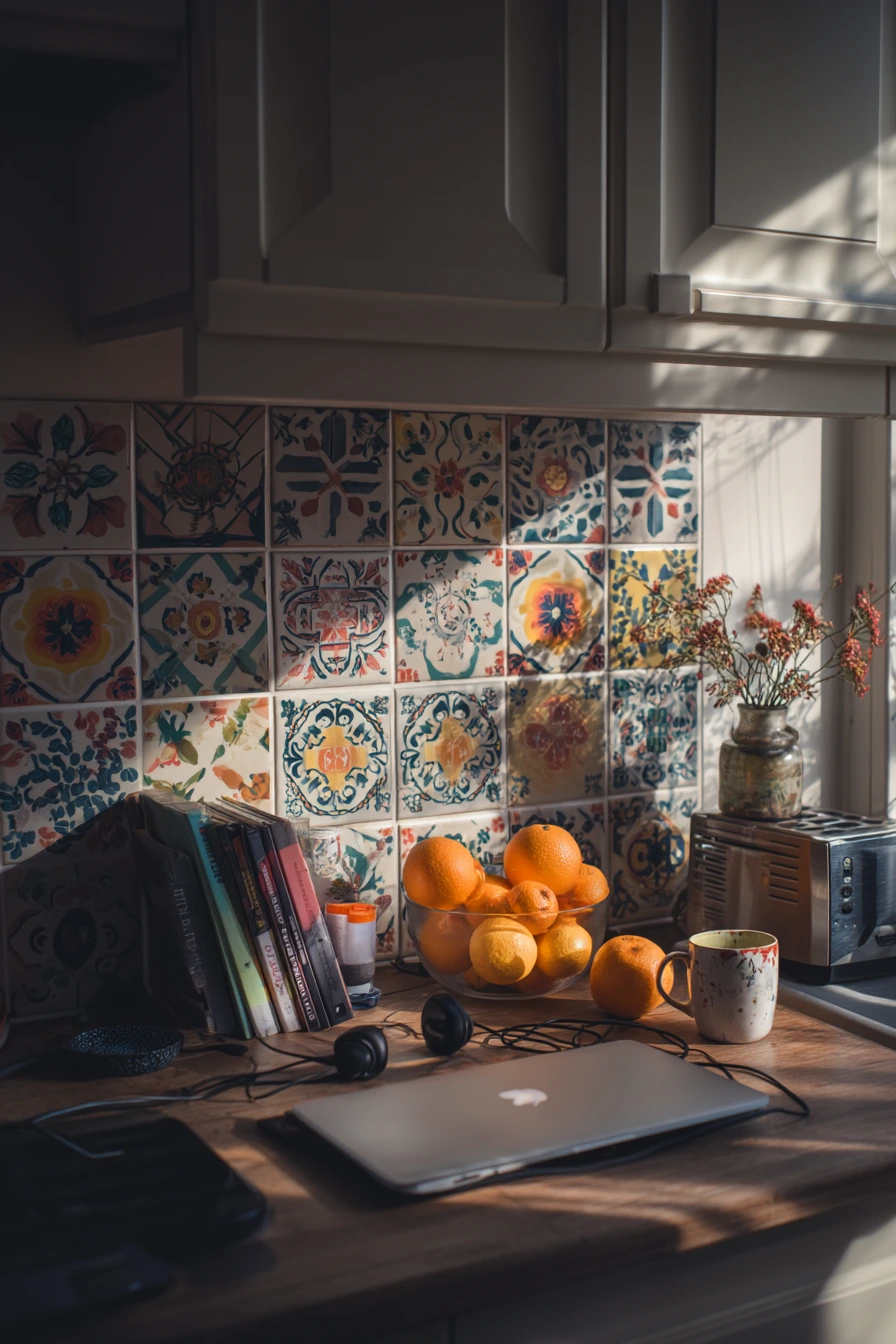
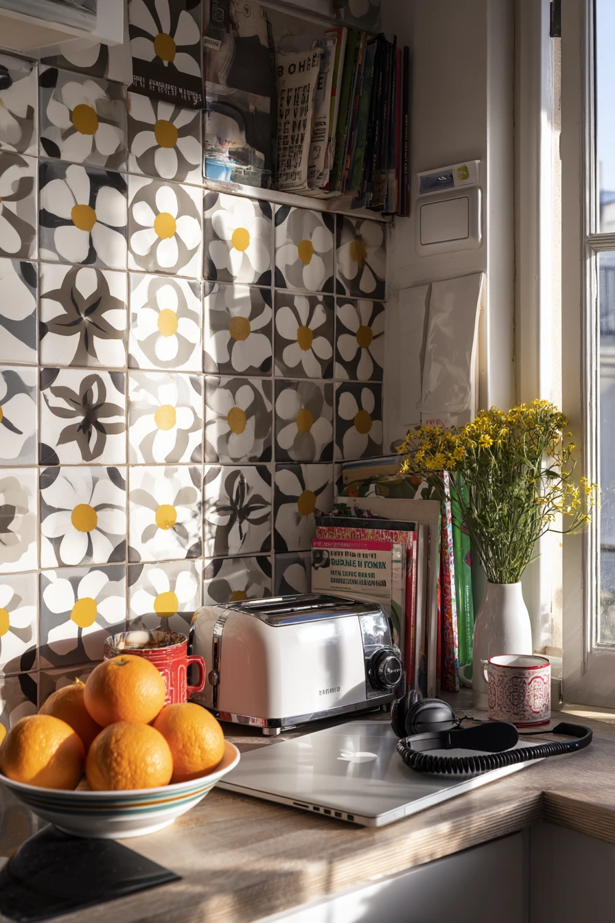
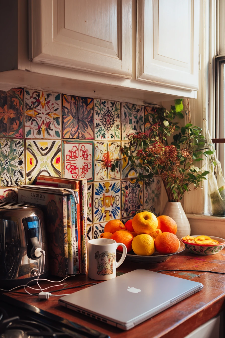
A creative apartment kitchen can handle a playful patterned backsplash with handmade graphic tiles. This is a good choice when the kitchen is also a workspace, with art books near the toaster, a paint-stained mug, and a laptop half-open beside a bowl of oranges. The backsplash brings structure to the visual energy, so the room feels designed even when it is a little messy.
To style patterned tile, pick a few anchor colors from the design and repeat them. Fresh flowers in a chipped vase can match one of the tile tones, and neutral countertop tools keep the pattern from competing. Hide the worst clutter in boxes or a drawer, but let a charging cable and headphones exist. In a real home, the goal is balance, not perfection.
Patterned tile works best when the rest of the finishes are calm. Use simple cabinet hardware, a plain countertop, and one consistent metal finish. If the tile has strong contrast, choose a grout color that blends into the background color of the tile. That reduces the grid look and keeps the pattern readable. Good task lighting helps, since bold designs can create shadows and make the area feel darker.
- Repeat two colors from the tile in small decor, like towels or a vase.
- Keep the countertop mostly solid colors so the pattern stands out cleanly.
- Use simple wood cutting boards to add warmth and reduce visual noise.
- Choose grout that matches the tile background to calm the overall look.
- Limit other prints in the room so the backsplash stays the main feature.
Pro Design Tip: Mock up the tile layout on the floor first and center the pattern on the sink or range; symmetry makes playful tile feel intentional.
Budget Considerations: Handmade graphic tile can be expensive; consider using it as a framed panel behind the stove and use a basic field tile for the rest.
7 7. Tiny Kitchen Vertical Tile Solution
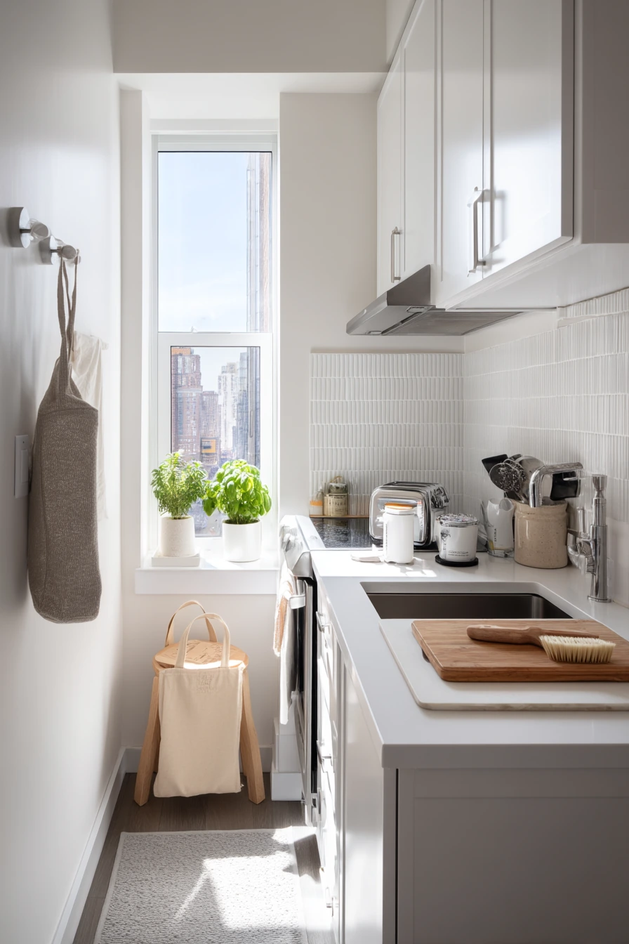
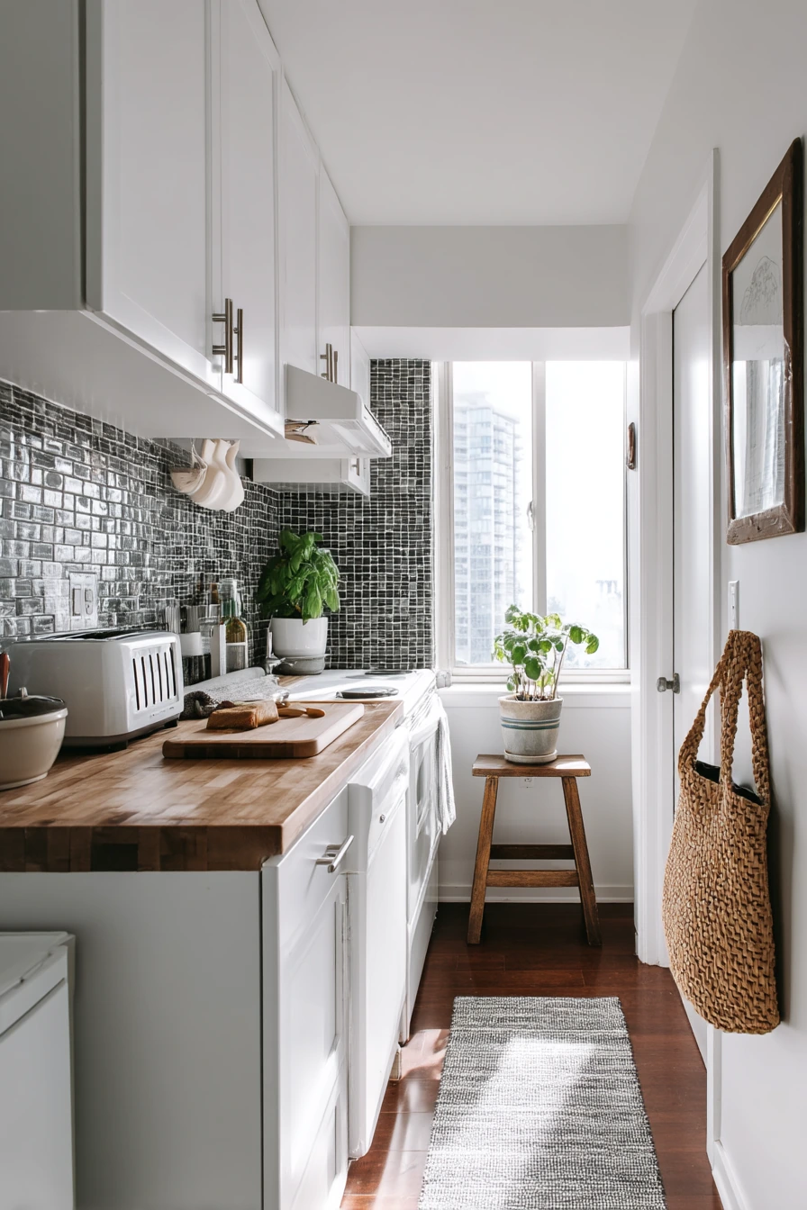
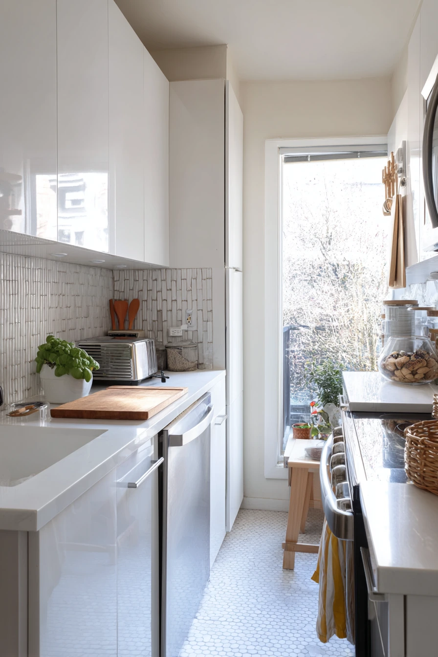
In a tiny galley kitchen, a vertical stack tile backsplash is a smart trick because it visually elongates the wall. The straight up-and-down lines make the space feel taller, which helps when you are working with a narrow counter and limited light. With a toaster, cutting board, dish brush, and a single basil plant, this backsplash reads crisp and efficient without looking sterile.
To style the look, keep countertop items slim and tall. A narrow canister, a vertical paper towel holder, or a small tray can echo the vertical tile lines. Hang one towel on a cabinet handle and choose a color that matches the grout for a tidy feel. If a tote bag lives on a stool, pick one in a neutral fabric so it does not fight the clean geometry of the tile.
Installation details matter in small spaces. Use a level line and consistent spacing so the vertical stacks do not drift. A slightly larger tile reduces grout, which helps cleanup and looks calmer. Choose a satin or glossy finish if the galley is dark, since it will bounce morning window light. If the kitchen is bright, matte tile can look softer and hide smudges better.
- Use vertical stack tile to make low ceilings feel higher.
- Pick a tile size that is not too small to reduce grout maintenance.
- Style with tall, slim items to match the wall’s vertical rhythm.
- Keep one plant like basil for a fresh, functional touch.
- Choose a grout color close to the tile for a less busy look.
Pro Design Tip: End the tile with a clean edge profile instead of a thick trim; in a narrow galley, slim details make the space feel wider.
Budget Considerations: Basic ceramic stack tile is usually affordable; costs rise with handmade tile, so save by using a standard field tile in a vertical layout.
8 8. Moody Dark Tile for an Evening Entertainer’s Kitchen
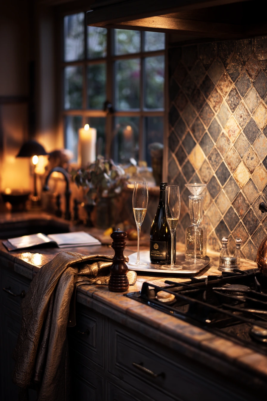
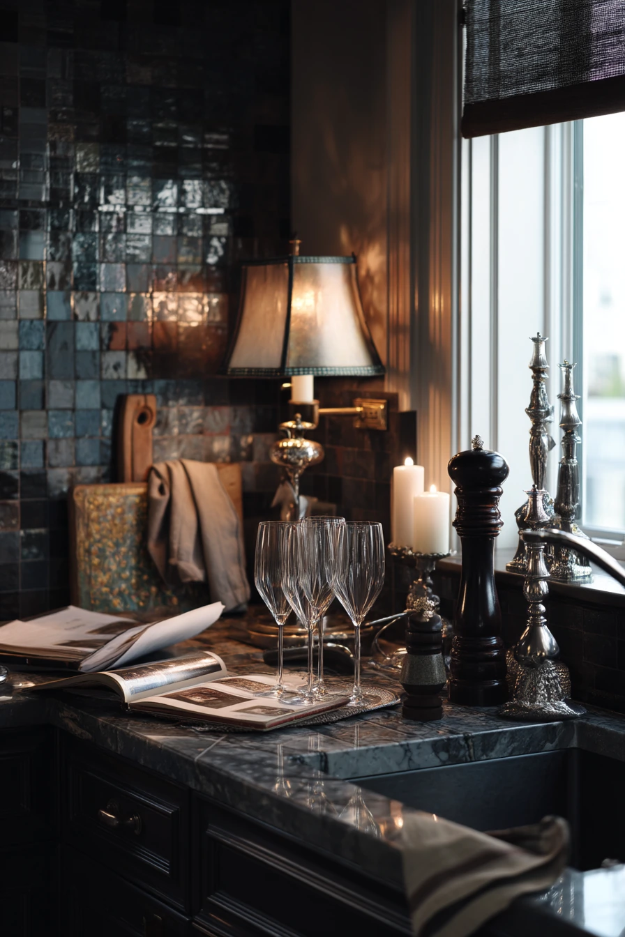
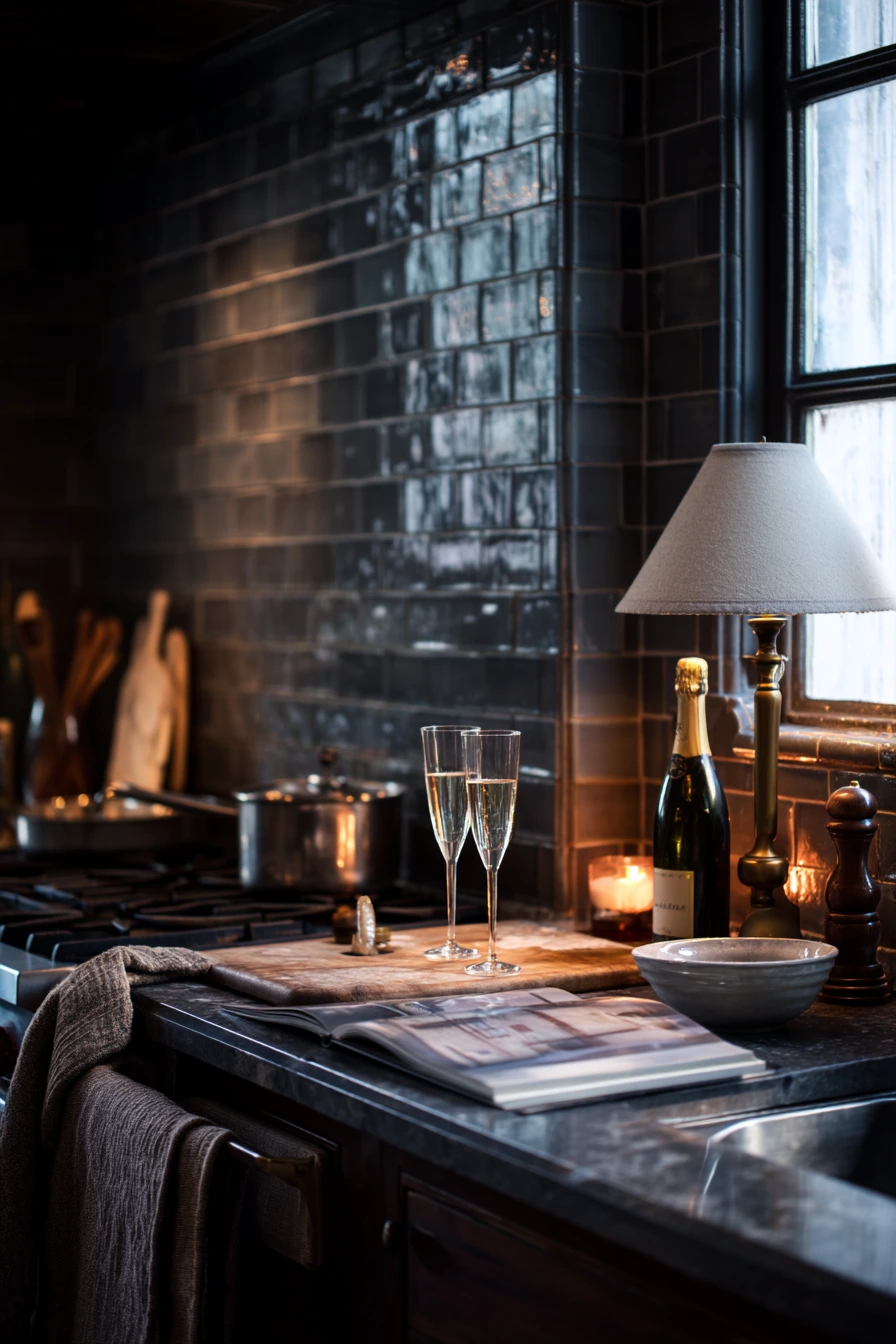
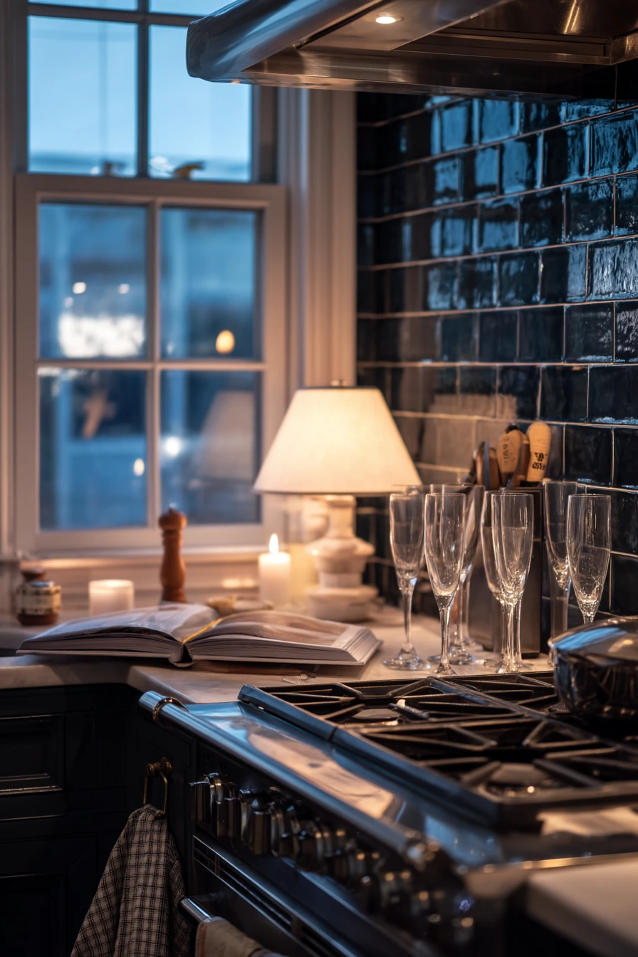
For evening entertaining, a moody dark handmade tile backsplash can make the kitchen feel intimate and warm. Dark tile behind a range looks rich under lamp light and twilight, and it hides small marks better than bright white. With champagne flutes drying, a candle stub, an open cookbook, and a jacket draped on a chair, the space feels ready for guests but still real.
To style this look, use soft layers. A folded napkin, a pepper mill, and one beautiful utensil can sit out without looking cluttered. Keep the countertop finish simple so it does not compete with the tile. If your kitchen has open shelving, display glassware that catches light and breaks up the dark wall.
Dark handmade tile needs the right grout and lighting plan. A high-contrast grout can turn the backsplash into a grid, which may feel too busy. A charcoal or deep warm gray grout often looks better and hides cooking splatter. Add under-cabinet lighting so prep areas stay bright, and consider a slightly reflective glaze to prevent the wall from feeling flat in low light.
- Use warm bulbs to keep dark tile from looking cold at night.
- Choose a grout color close to the tile to reduce a busy grid look.
- Balance dark walls with lighter counters or brass accents.
- Keep styling simple with one cookbook, one mill, and one folded napkin.
- Add under-cabinet lighting to make cooking practical.
Pro Design Tip: Test a sample tile at night with your actual bulbs; dark glazes can shift color and you want the tone to feel steady in evening light.
Budget Considerations: Dark handmade tile can be mid to high priced; save by using a dark ceramic tile with slight variation and spending more on good lighting.
9 9. Classic Marble Backsplash in a Transitional Home
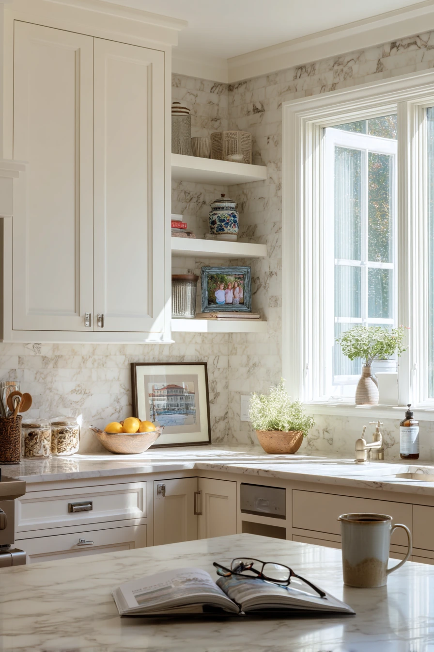
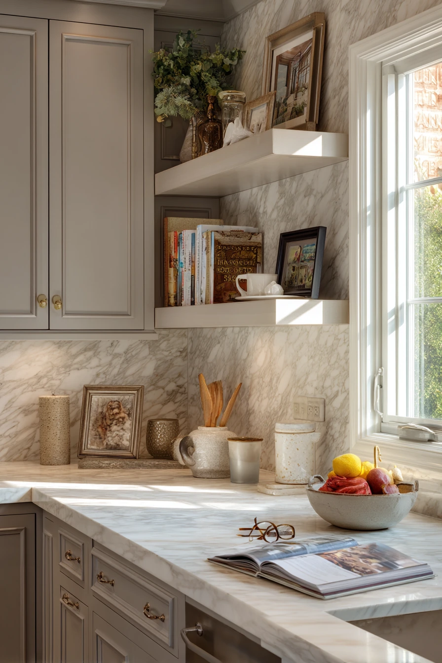
A soft-veined marble backsplash from counter to upper cabinets is a classic choice for a transitional family home. It feels refined, but it can still look familiar and livable when paired with daily items like a mixing bowl, tea mug, fruit basket, and an open cookbook with reading glasses nearby. The gentle veining adds movement without the boldness of heavy patterns.
To style marble, keep the rest of the finishes warm and simple. Add one framed family photo on a shelf to make the space feel personal. Use wood or woven textures, like a bowl or tray, to balance the stone. In morning window light, marble can look bright and clean, so choose soft, not stark, whites in paint and accessories.
Marble needs realistic expectations. It can etch from acids and it can stain if spills sit too long, especially near cooking zones. If that worries you, use marble on the wall but pick a more durable countertop. Choose a honed finish if you want fewer reflections and a more forgiving surface. Good sealing and quick wipe-down habits help marble stay beautiful in a busy home.
- Pair marble with warm metals like brass or champagne bronze.
- Use wood boards and baskets to soften the stone’s cool feel.
- Keep a small tray for daily items to reduce visual clutter.
- Choose honed marble for a softer look and easier fingerprint hiding.
- Wipe splashes quickly, especially near the range and sink.
Pro Design Tip: Continue the marble to the underside of the upper cabinets and keep the bottom joint tight; the full-height run looks custom and minimizes grime traps.
Budget Considerations: Marble slab or full-height marble tile can be costly; for a similar effect, use marble-look porcelain with soft veining and low maintenance.
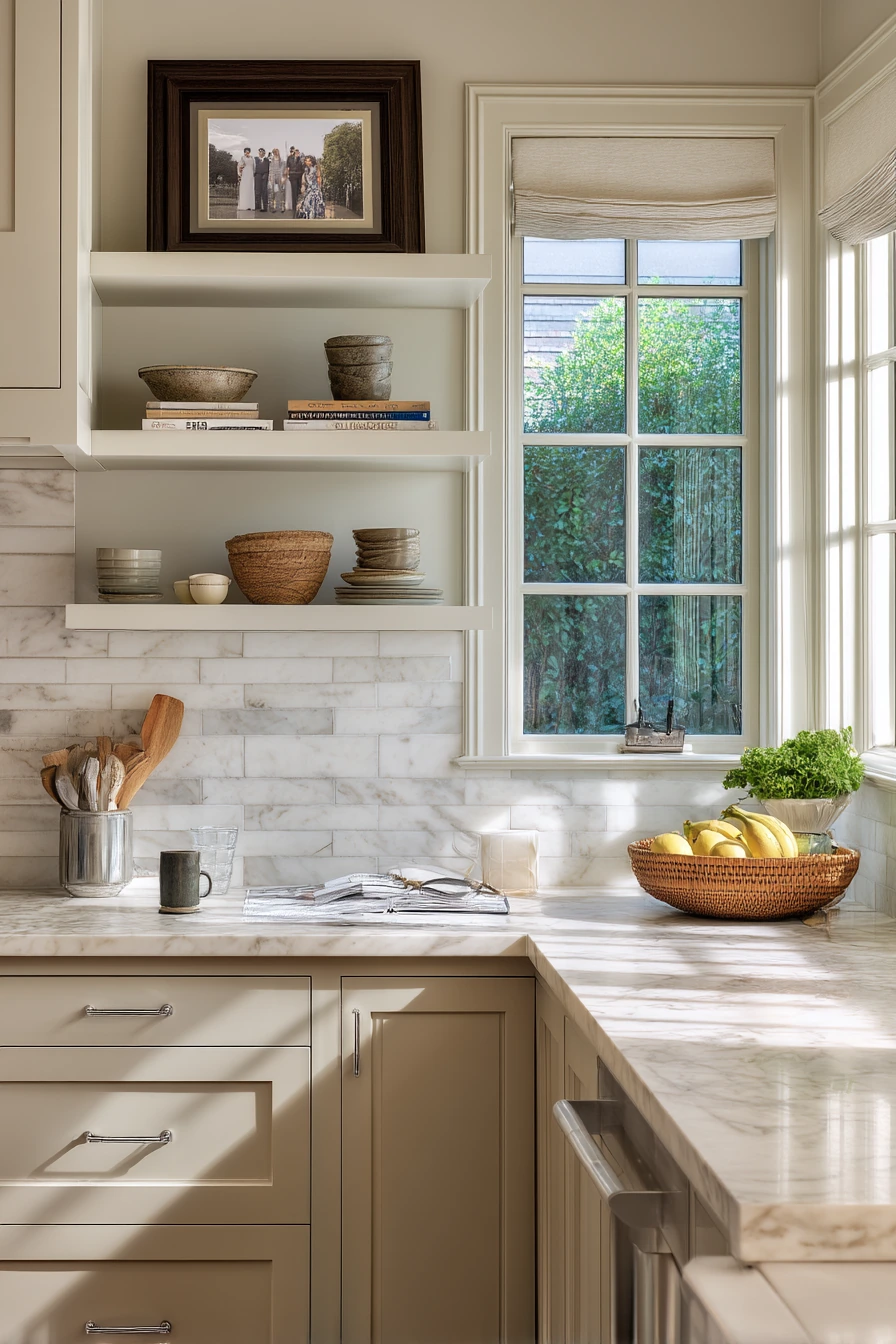

10 10. Statement Tile Above a Cozy Breakfast Banquette
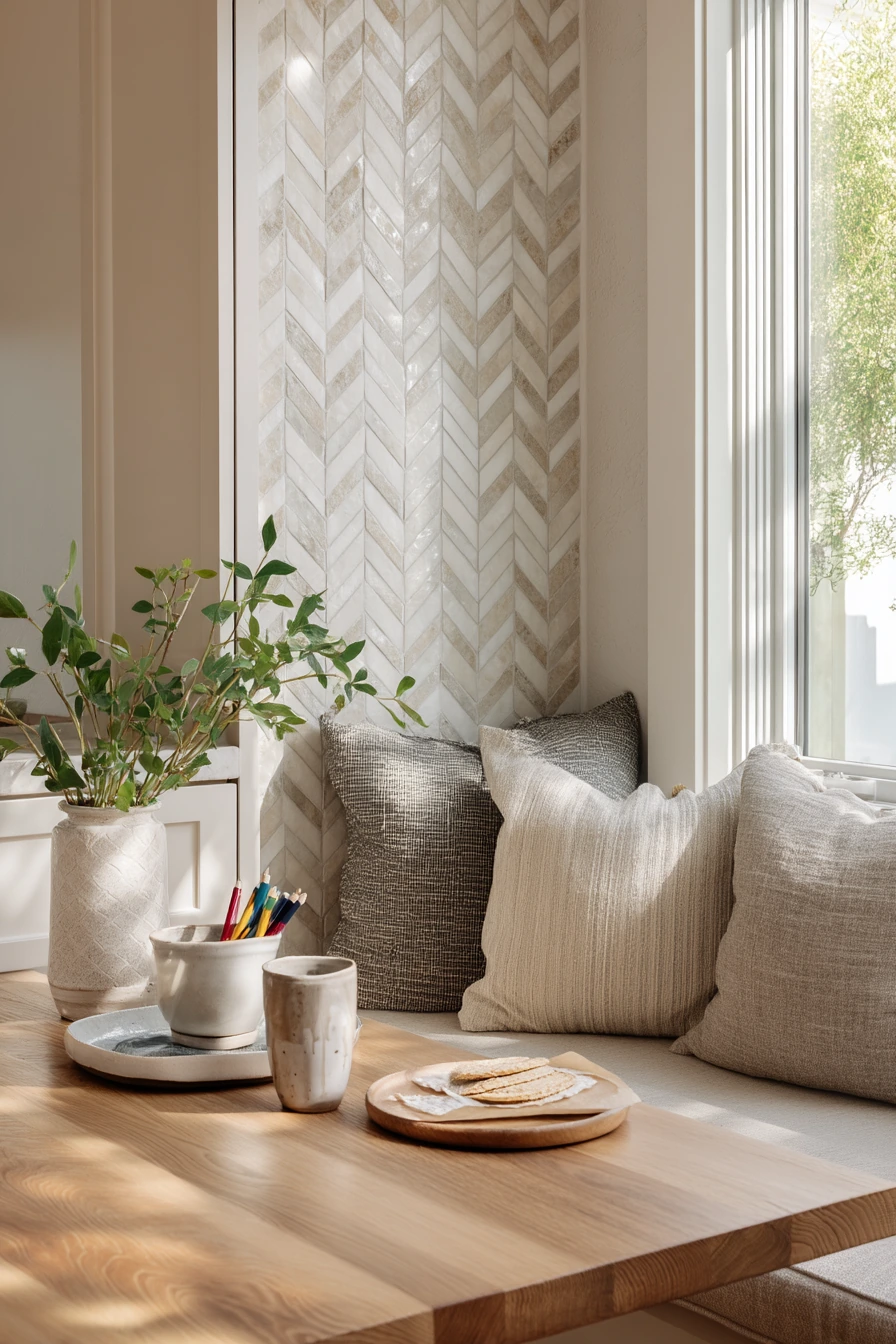

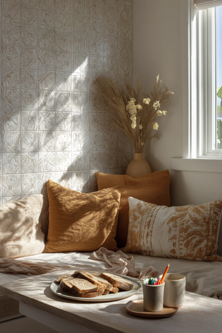
A breakfast nook kitchen is a great place for a statement ceramic backsplash with a subtle geometric pattern. It adds personality without being loud, and it fits the warm rhythm of family mornings. With banquette cushions, a wrinkled throw, kids’ markers in a cup, and a half-finished toast plate, this backsplash helps the area feel cheerful and grounded.
To style it, let the backsplash color guide the textiles. Pull one tone from the ceramic pattern and repeat it in cushions or a towel. Plant shadows across the wall look especially good on geometric tile, so place a simple plant near a window where light moves during the day. Keep table items in a small bin or drawer so you can reset the space quickly after breakfast.
For practicality, choose a ceramic tile with an easy-clean glaze and grout that will not show every crumb. In a family nook, a medium grout color often looks better than white. If the banquette is close to the wall, think about how chairs and bags might bump the tile, and consider a slightly higher backsplash height in that area. The goal is a backsplash that can handle fingerprints and still look warm in late-morning light.
- Repeat one backsplash color in cushions to make the nook feel cohesive.
- Choose a wipeable glaze to handle sticky fingers and daily spills.
- Use a medium grout to hide marks near seating and food prep.
- Add a plant where sunlight creates shadows for extra texture.
- Store markers and small items in a cup or bin for quick cleanup.
Pro Design Tip: Use the geometric pattern to set your layout lines and center it on the main view from the banquette; that makes the nook feel planned and balanced.
Budget Considerations: Statement ceramic tile varies widely in price; to save, use the patterned tile on one focal wall and pair it with an affordable solid tile elsewhere.

The best kitchen backsplash ideas come from real routines: coffee, homework, pets, and weeknight cooking. Start with how you use the space, then pick a surface that matches your cleanup habits and the light in your kitchen.
If you want a calm backdrop, choose textured whites, warm stone, or soft-veined looks. If you want personality, use handmade color or graphic pattern in a smaller zone so it stays easy to live with.
Before you buy, test samples on your wall, check grout options, and plan where the tile should end. Small decisions like finish, lighting, and edge details make the biggest difference.
FAQ
1. What is the easiest kitchen backsplash to clean. Large-format quartz, porcelain panels, and glossy ceramic tile are usually the simplest because they have fewer grout lines.
2. Is zellige tile hard to maintain. It can be easy if sealed as needed and paired with the right grout, but the texture may catch grease near a range, so plan for regular wiping.
3. Can peel-and-stick tile work behind a stove. Some products can, but many do not handle high heat well. Check the rating and consider a different material behind the range.
4. What grout color is best for a family kitchen. A warm light gray or mid-tone grout often hides stains better than bright white while still looking clean.
5. Should the backsplash go to the ceiling. Full-height backsplashes look seamless and protect more wall area, but they cost more. Use full height in key zones like behind the range or sink if budget is tight.
6. How do I choose between patterned and plain tile. Use patterned tile when the rest of the finishes are simple. If you already have busy counters or bold stone, a plain backsplash usually looks better.
7. What backsplash works best with open shelves. Simple tiles like white zellige, subway, or soft stone looks work well because the shelves add visual detail on their own.