

Choosing dining room paint can feel hard because this space has to do a lot. It needs to look good in daylight, feel cozy at night, and still hold up to real life like toys by the wall, mail on the table, and chairs that get moved around.
This guide shares dining room paint ideas based on real, believable rooms. You will see warm greige, deep navy, soft sage, clay tones, coral accents, muted taupe, smoky olive, classic blue-gray, two-tone walls with a chair rail, and terracotta.
For each color, you will get simple styling ideas, lighting tips, and ways to make the room feel finished without making it look staged. Each section also includes a pro design tip and a budget note so you can choose what fits your home.
Use these ideas whether you have a full dining room or a small nook with a compact table. The goal is to help you pick a paint color that looks calm, works with your furniture, and feels like everyday life.
1 Warm Greige Family Dining Room


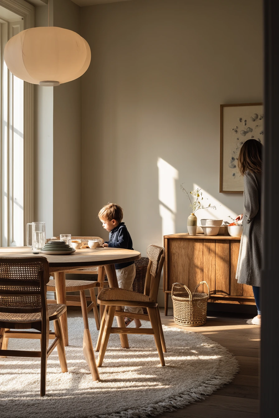
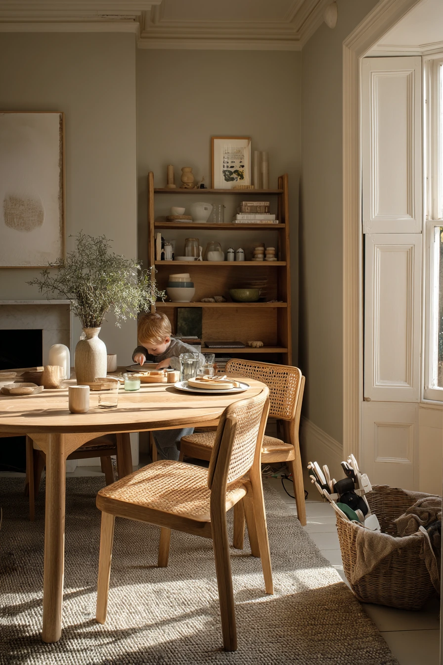
Warm greige dining room paint is a safe choice when your home is busy and you want the walls to feel soft, not flat. Greige sits between beige and gray, so it works with oak, cane, and mixed wood tones without fighting them. In a real family dining room, this color also hides small scuffs better than bright white, which helps when chairs bump the wall or a toy basket lives in the corner.
To style warm greige, start with natural textures. A round oak table and woven cane chairs look grounded against this shade. Add a low sideboard with candles and ceramic bowls for easy, everyday decor. Keep the tabletop simple so it can handle real life, like a water glass catching the light or plates that need clearing. Soft window light from one side will make greige look warmer, and plant shadows can add quiet movement on the wall.
If the room feels a little dull, bring in contrast with matte black or aged brass in small doses. Think frames, a simple pendant, or sideboard hardware. For a lived-in look, use items you already touch daily, like a small tray for keys, a place to hide a charging cable, and a bowl for napkins. Greige is also a strong backdrop for seasonal changes, so you can swap linens and candles without repainting.
- Choose a warm greige with beige undertones so oak looks rich, not orange.
- Use washable eggshell paint if kids eat here often.
- Layer beige linen, cane, and pottery to add depth.
- Keep decor low on the sideboard so the room feels open.
- Add one darker accent, like a black frame or a charcoal runner.
Pro Design Tip: Test greige on two walls next to the window and far from the window, because it can shift from cozy to cool depending on daylight.
Budget Considerations: If you already have wood furniture, warm greige helps it look intentional, so you can skip buying a new dining set and update only chairs or a runner.
2 Moody Navy Dinner Nook
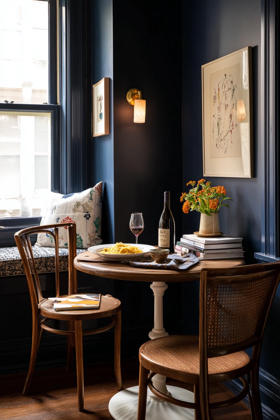
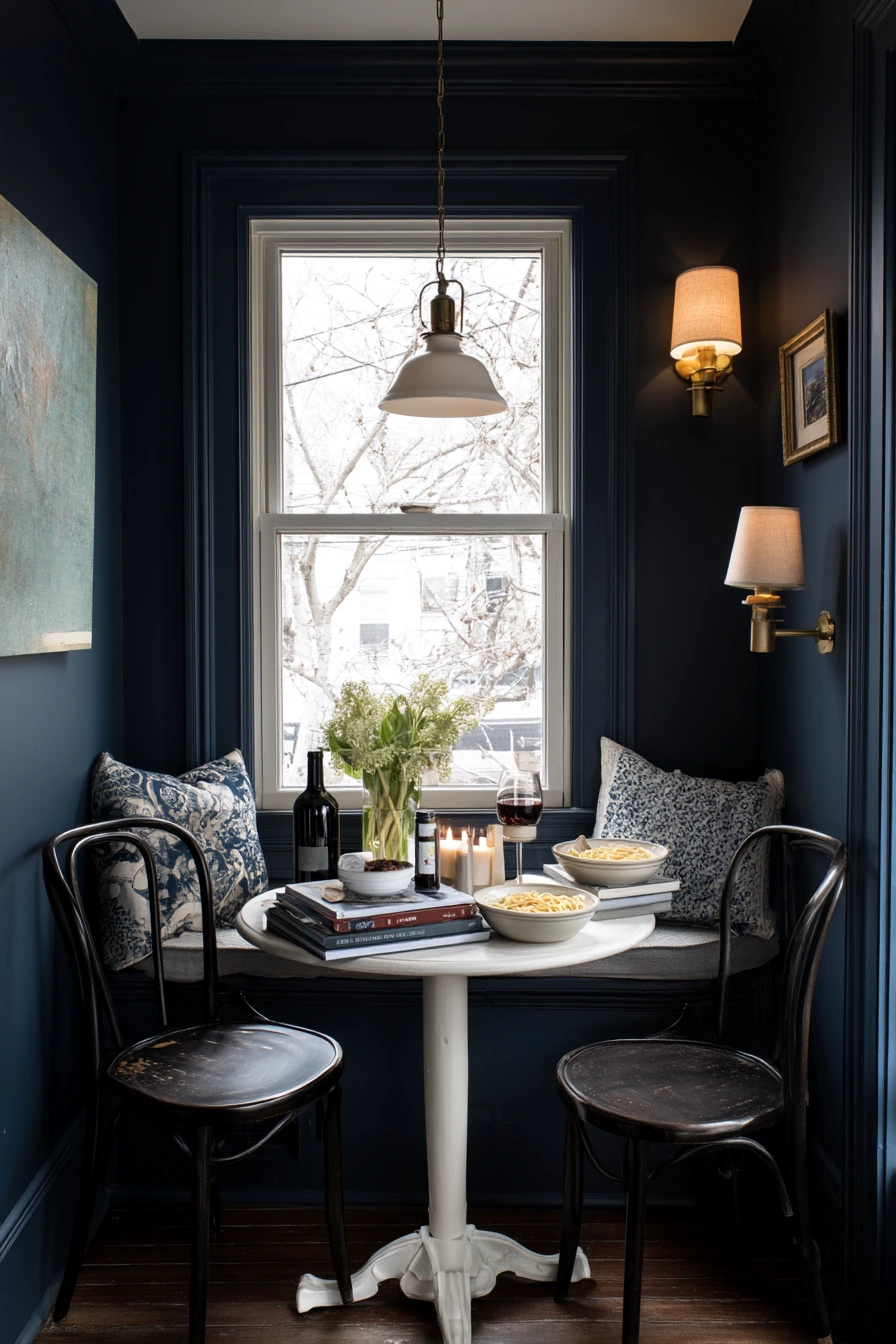
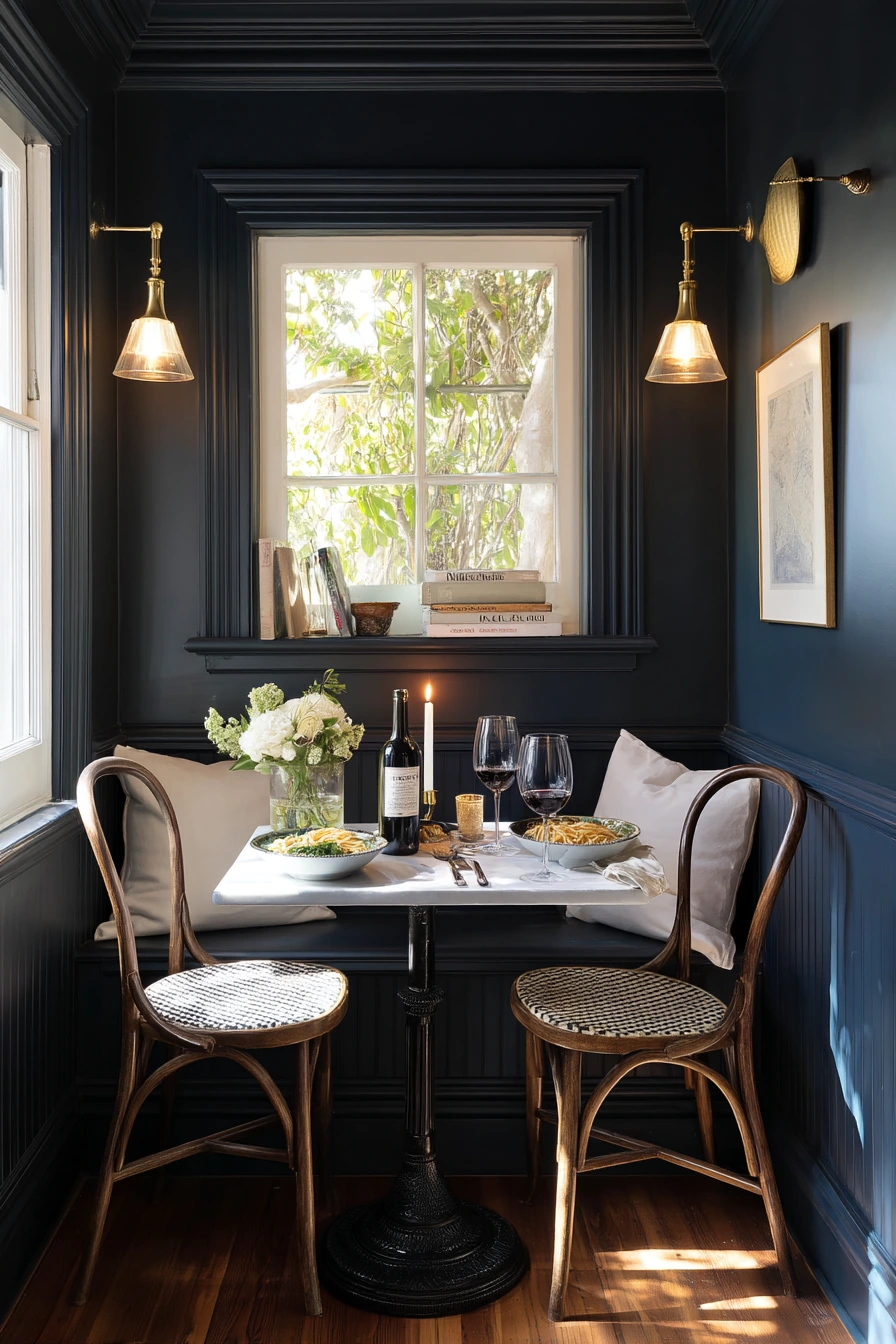
Deep navy dining room paint can make a small dining nook feel calm and cocooning. Dark color is not only for big rooms. In a tight corner with a compact pedestal table and bentwood chairs, navy can make the space feel planned on purpose instead of like an afterthought. White trim is key here because it outlines the nook and keeps the edges crisp.
Navy also looks great with warm metals. Brass sconces or a small lamp add a gentle glow that softens the walls. This is the kind of setup that fits real evenings, like two friends setting out pasta and a bottle of wine. Keep the styling simple but useful: a folded linen napkin, stacked cookbooks you actually open, and a candle that is not perfect. Navy hides marks better than pale paint, but it can show dust, so wipe trim and sconce plates now and then.
To keep navy from feeling heavy, balance it with light wood and light textiles. A pale wood tabletop, a cream seat cushion, or an off-white roman shade helps. If you have limited natural light, pick a navy with a slight gray base so it does not go too purple at night. Use warm bulbs in sconces and skip cool white LEDs, which can make navy look harsh.
- Pair deep navy walls with bright white trim for clean contrast.
- Use warm brass lighting to keep the nook cozy at night.
- Choose a small round or pedestal table to improve flow.
- Add one soft textile, like a linen napkin or seat pad.
- Keep wall art simple, like one framed print or a small shelf.
Pro Design Tip: In small nooks, paint the walls and the ceiling the same navy for a smooth wraparound look, then let the trim stay white for definition.
Budget Considerations: If new sconces are pricey, use plug-in wall lights or a small table lamp on a nearby shelf for the same warm glow.

3 Soft Sage Breakfast Dining Space


Soft sage dining room paint is a good pick when you want the room to feel calm and breathable. Sage has enough color to feel special, but it still reads like a neutral next to maple, rattan, and simple art. In the morning, natural window light and gentle leaf shadows make sage look fresh without looking bright. It fits real family rhythm, like coffee left on the table, a school note nearby, and a spoon rest that did not get put away yet.
To style sage walls, keep the furniture light and simple. A light maple table and rattan chairs match the soft tone and make the room feel open. A paper pendant adds texture without heaviness. For wall decor, framed landscape prints or simple line art work well because they echo the nature feel of the paint. Add a pothos plant trailing by the window for an easy green-on-green look that still has contrast.
If you worry that sage will feel too “green,” use warm whites and light woods to balance it. A bench with a slightly wrinkled throw keeps the room casual. Choose natural materials like linen, cane, and wood instead of shiny finishes, since gloss can fight the soft paint. Sage also works with black accents if you want sharper lines, but keep them thin, like a frame or a small bowl, so the room stays light.
- Pick a sage that is muted, not mint, for a timeless look.
- Use light wood furniture to keep the room airy.
- Hang a simple pendant for soft texture over the table.
- Add framed landscapes to repeat the outdoor feel.
- Style the table with a small tray for everyday items like notes and pens.
Pro Design Tip: Match sage walls with warm white trim, not stark white, so the room feels soft and natural in daylight.
Budget Considerations: Rattan and cane can be costly new; check thrift stores for woven chairs and refresh them with new seat pads.


4 Renter-Friendly Clay Accent Wall


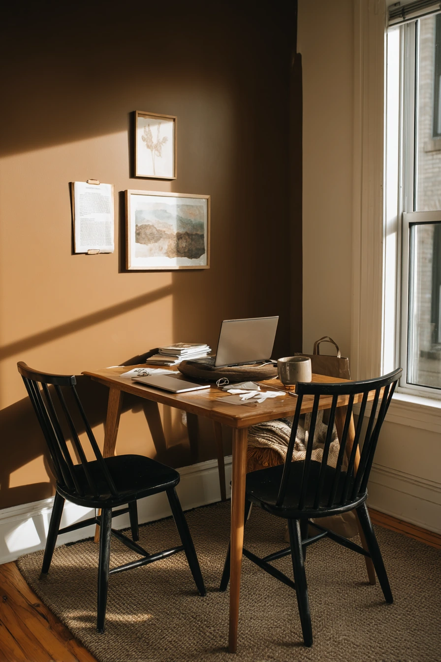
A clay-toned accent wall is a renter-friendly dining room paint idea when you want warmth but cannot repaint the whole space. Clay sits between terracotta and soft brown, so it feels earthy without being too loud. It pairs well with walnut, black spindle chairs, and a vintage runner. In a real apartment, this color also looks good next to normal life details, like a stack of mail, a laptop charging cable, and a grocery tote tucked under the table.
To keep the accent wall looking clean, choose the wall that naturally frames the dining area, like the wall behind the table or sideboard. Then add removable art so you can change it later. A slim walnut table keeps the footprint small and lets the wall color do the work. Black chairs add clear contrast and make the setup look more finished, even if the rest of the room is simple. Soft afternoon window light will make clay look richer, so test it at the time of day you eat most often.
Styling tip: repeat the clay tone in small items so the accent wall feels connected. Try a rust linen napkin, a warm-toned candle, or a small ceramic bowl. Keep the rest of the room in calm neutrals, like cream, warm white, and wood, so the accent does not take over. If you cannot paint, you can still get this look with removable wallpaper in a clay color, but choose a matte finish so it looks like paint.
- Use the accent wall to define the dining zone in an open plan.
- Pair clay paint with walnut and black for a balanced look.
- Choose removable frames or posters to stay rental-safe.
- Ground the space with a vintage-style runner under the table.
- Hide daily clutter with a lidded basket near the sideboard.
Pro Design Tip: Keep the accent wall edge sharp by painting up to a natural break, like a corner or trim line, so it looks intentional.
Budget Considerations: If painting is not allowed, use peel-and-stick wallpaper on one wall and spend the savings on a better rug pad to keep the runner in place.

5 Sunlit White Dining Room with Color Pop


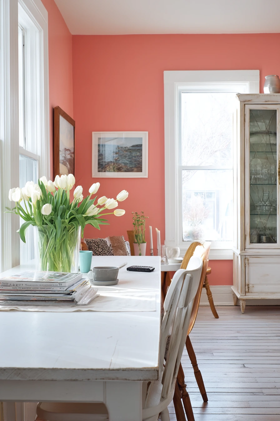
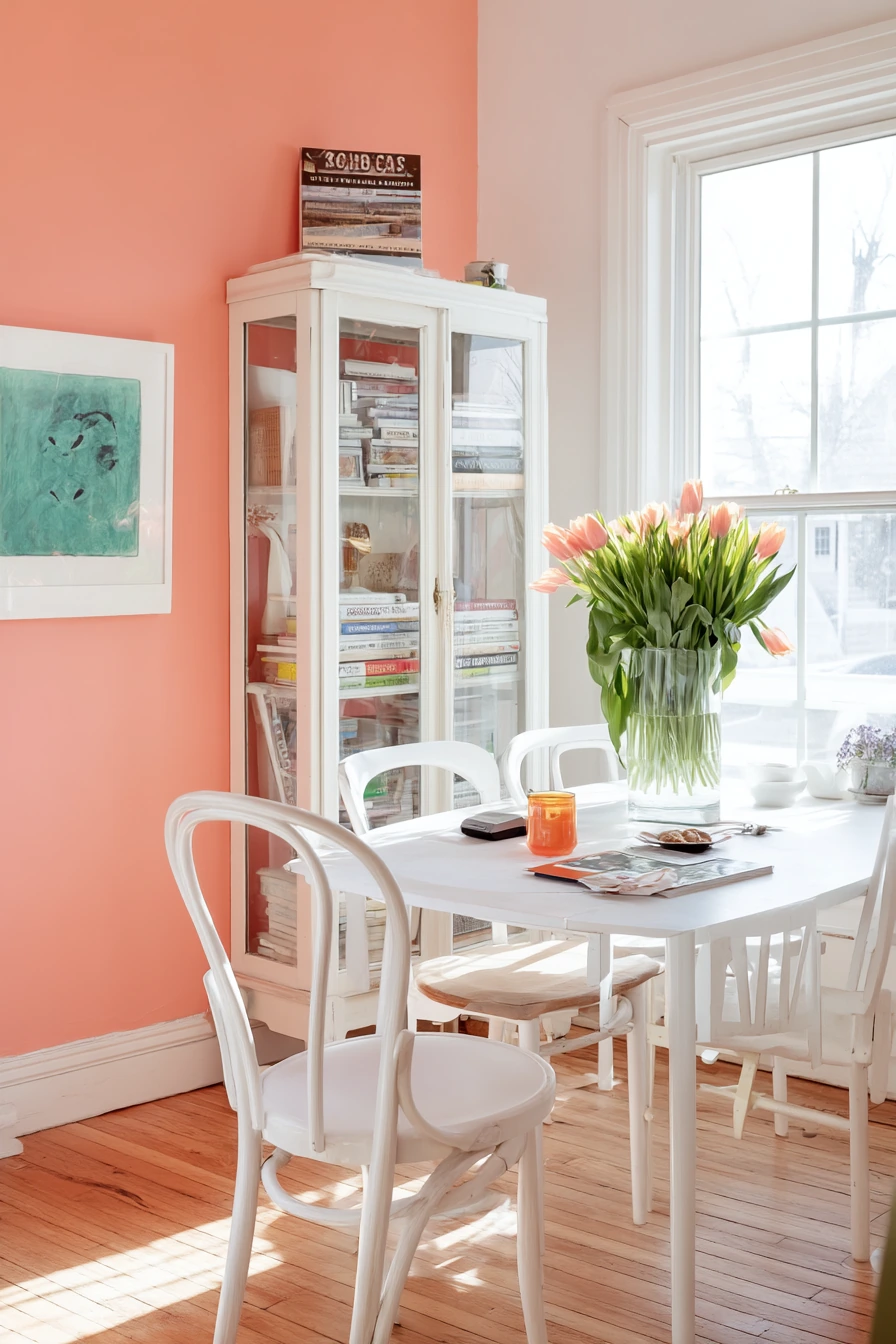
A coral accent wall in a bright white dining room adds energy without making the space feel messy. This idea works well if you like color but still want most of the room to feel clean. Coral looks lively next to pale oak floors and a mixed set of chairs, and it plays well with thrifted finds like a glass cabinet. It also fits a real home where the table has a kid’s cup, a crumpled napkin, and a phone that got left behind.
To style coral, keep the other walls and trim a soft white so the color feels like a feature. Choose coral with a touch of pink for a warm, friendly look, not a harsh orange. Let sunlight do part of the decorating. When sun streaks across the floor, coral looks brighter and more natural. Add a vase of grocery-store tulips and a stack of art books for a casual, cheerful feel. A glass-front cabinet is useful here because it shows color and texture inside, like plates, bowls, and vintage glasses.
Coral can look strong at night, so plan your lighting. Use warm bulbs and add a shade or dimmer if possible. If your chairs are mismatched, tie them together with one repeating element, like similar wood tones or matching seat cushions. For table styling, choose one simple centerpiece and leave space for everyday use. Coral is also great for seasonal swaps: spring florals, summer stripes, and warm fall candles can all work.
- Keep three walls white and use coral on one main wall.
- Choose warm lighting so coral stays soft at night.
- Use thrifted glass storage to add personality and function.
- Repeat coral with small items like napkins or a bowl.
- Unify mismatched chairs with matching cushions or one shared color.
Pro Design Tip: Pick a coral paint with enough depth so it does not look neon in strong daylight, especially near big windows.
Budget Considerations: Accent walls use less paint, so you can buy a higher-quality washable formula without paying for gallons.
6 Muted Taupe Entertaining Room
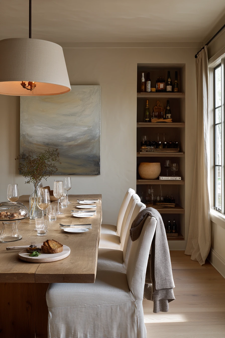
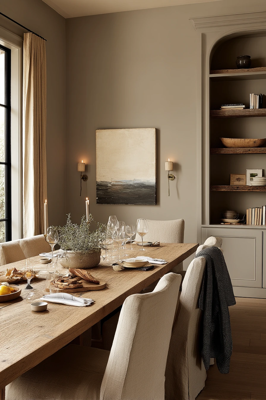
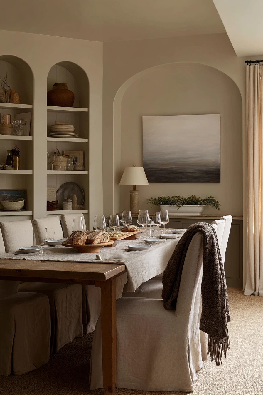
Muted taupe dining room paint is a strong choice for a serene, tailored look. Taupe sits between brown and gray, so it feels warm but still modern. In a room with a long oak table, linen slipcovered chairs, built-in shelves, and a simple abstract painting, taupe creates a quiet background that lets the food, the people, and the wood grain stand out. It also looks natural in evening light, when lamps take over and the windows go dim.
This color works well for entertaining because it is forgiving. It makes a dinner party scene look good even when it is mid-meal, with a serving platter out, half-filled stemware, and a bread board on the table. Add softness with textiles: a linen runner, cloth napkins, and a cardigan draped over a chair can look relaxed instead of messy when the wall color is calm. Built-in shelves look more custom against taupe, especially if you style them with books, pottery, and a few framed photos.
To keep taupe from feeling flat, focus on contrast in texture. Mix smooth ceramics with nubby linen and natural wood. Use a slightly darker tone for a frame or a shelf back if you want more depth. If the room lacks natural light, choose a taupe with a warm base so it does not turn muddy. A warm white ceiling helps lift the space, and a soft rug under the table can reduce echo and make the room feel more comfortable.
- Pair muted taupe with oak and linen for a calm, classic look.
- Use warm lamps to bring out the cozy side of taupe.
- Style built-in shelves with a mix of books and pottery.
- Add a soft rug to warm up the room and cut noise.
- Keep wall art simple so the room feels restful.
Pro Design Tip: Choose taupe based on your wood tone, then test it beside the table to make sure the walls do not pull too pink or too green.
Budget Considerations: Slipcovers can cost less than replacing chairs, and they are easy to wash after dinner parties.

7 Small Apartment Dining Wall Color Idea


Smoky olive dining room paint is a smart small-space color because it feels rich but not loud. In a compact apartment dining room, a single olive wall can make a tiny setup feel finished. It pairs well with a round drop-leaf table, two café chairs, a narrow mirror, and floating shelves. This is the kind of space that has to work hard, like when you are eating takeout next to a paperback and earbuds, with keys by the entry and a bike helmet near the chair.
To style smoky olive, keep shapes simple and use wall space for storage. Floating shelves can hold glasses, a small plant, and a candle, but do not overfill them. A mirror helps bounce late-day window light and makes the dining area feel wider. Choose a table that can fold down so the walkway stays clear. Olive looks good with black metal, warm wood, and cream textiles, so add a small cushion or a light runner if the room needs softness.
This color also hides everyday wear well, which matters in rentals and busy apartments. If you want the wall to feel brighter, pick olive with a softer gray base and keep the trim and ceiling warm white. For decor, stick to practical pieces: a small tray for keys, hooks for totes, and a wall-mounted light if you can. The goal is a dining spot that feels intimate, not cramped.
- Use smoky olive on one main wall to anchor the dining corner.
- Add a narrow mirror to reflect light and open the space.
- Choose a drop-leaf or round table for better traffic flow.
- Keep shelves simple with a few useful items and one plant.
- Use hooks near the entry to stop clutter from landing on the table.
Pro Design Tip: Paint the wall behind floating shelves olive, then use shelves in the same wood tone as the table to make the corner look built-in.
Budget Considerations: Floating shelves and a small mirror can cost less than a sideboard, but still give you storage and style in a tight space.


8 Classic Blue-Gray Formal Dining Room
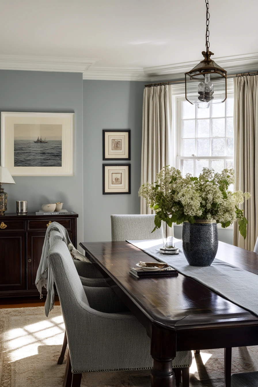
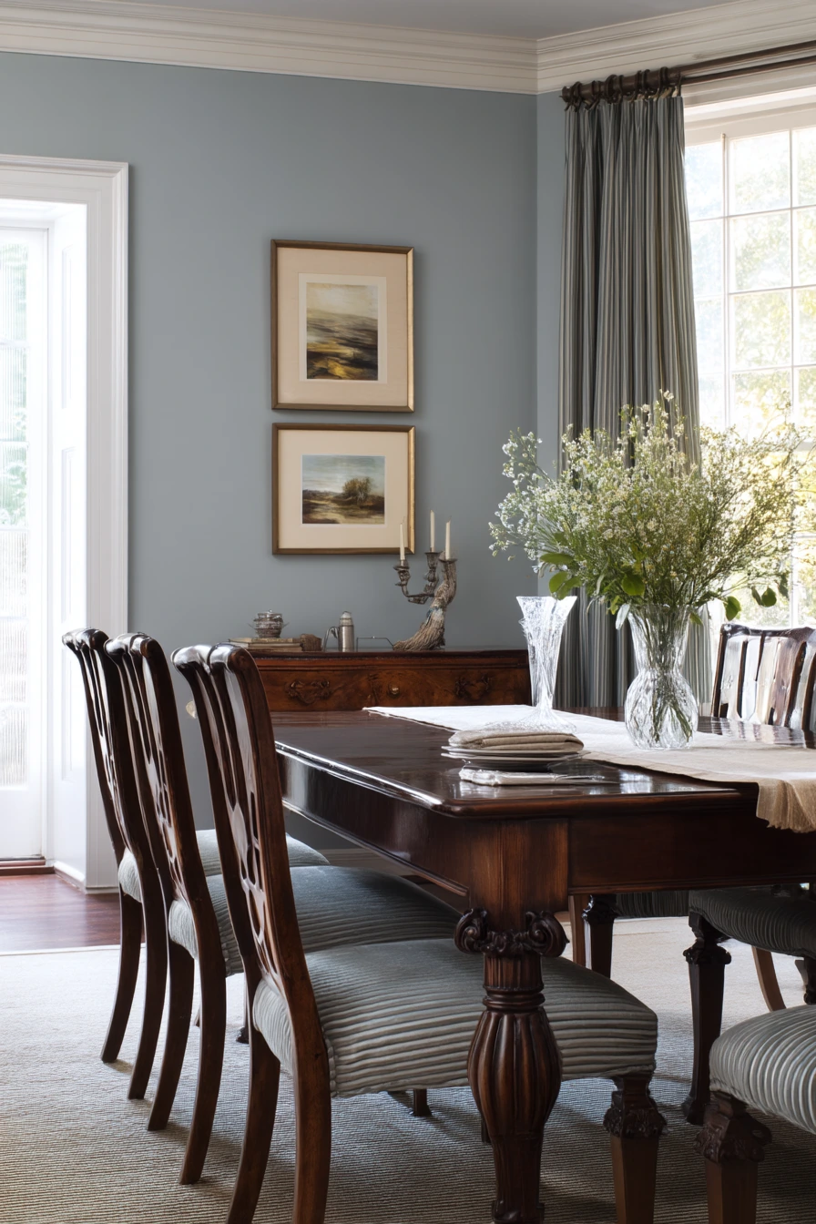
Blue-gray dining room paint is a classic choice that feels polished and calm. It works well with a dark wood table, upholstered host chairs, a crystal vase, and framed family photos. Blue-gray has enough color to add interest, but it still reads as neutral in many homes. It also fits a lived-in traditional space where a folded tablecloth is on the sideboard, a coaster is left out, and reading glasses are set down after lunch.
To style blue-gray, focus on contrast. Dark wood looks rich against this tone, and soft upholstery keeps the room comfortable. Add shine in small amounts, like a crystal vase or a glass candle holder, but avoid too many glossy surfaces so the room stays grounded. Family photos in matching frames help the walls feel personal without looking busy. If one chair is slightly pulled back, the room still looks tidy because the color feels steady and forgiving.
Blue-gray can shift with light, so it is important to choose the undertone. Some shades lean more blue, others more gray, and some can look a bit green in certain rooms. Test it in morning and late afternoon. For lighting, warm bulbs keep the room welcoming and prevent a cold look at night. If you want a little more warmth, add beige linen napkins, a warm wood bowl, or a brass picture light over art.
- Pair blue-gray walls with dark wood for a classic contrast.
- Use matching frames for family photos to reduce visual clutter.
- Add one glass or crystal piece for a clean highlight.
- Pick warm bulbs so the paint does not feel icy at night.
- Use a sideboard to hold everyday items like coasters and linens.
Pro Design Tip: Choose a blue-gray with a balanced undertone, then tie it to the room with one repeat, like blue-gray in a rug pattern or in chair fabric.
Budget Considerations: Instead of new upholstered host chairs, add chair slipcovers or thrifted seat cushions in a solid neutral to soften dark wood chairs.


9 Budget Refresh with Painted Chair Rail
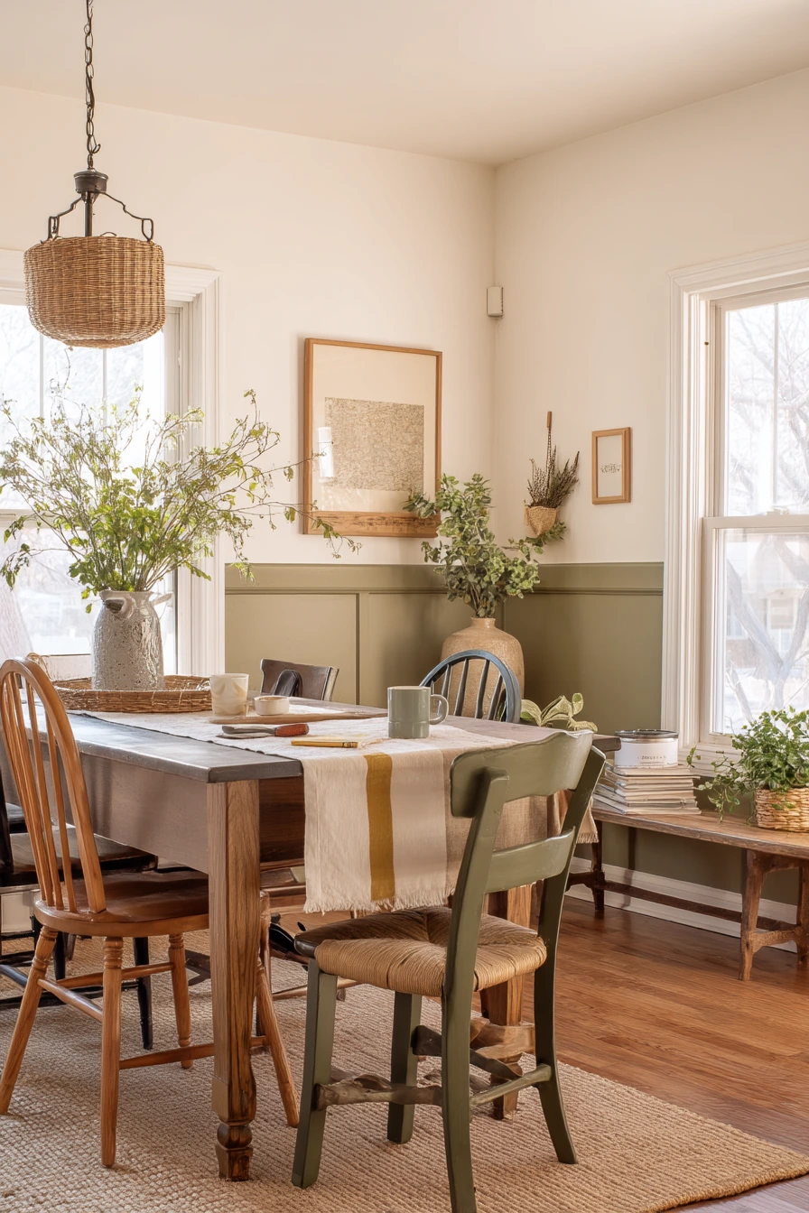
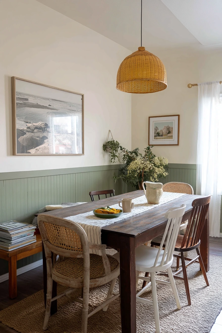
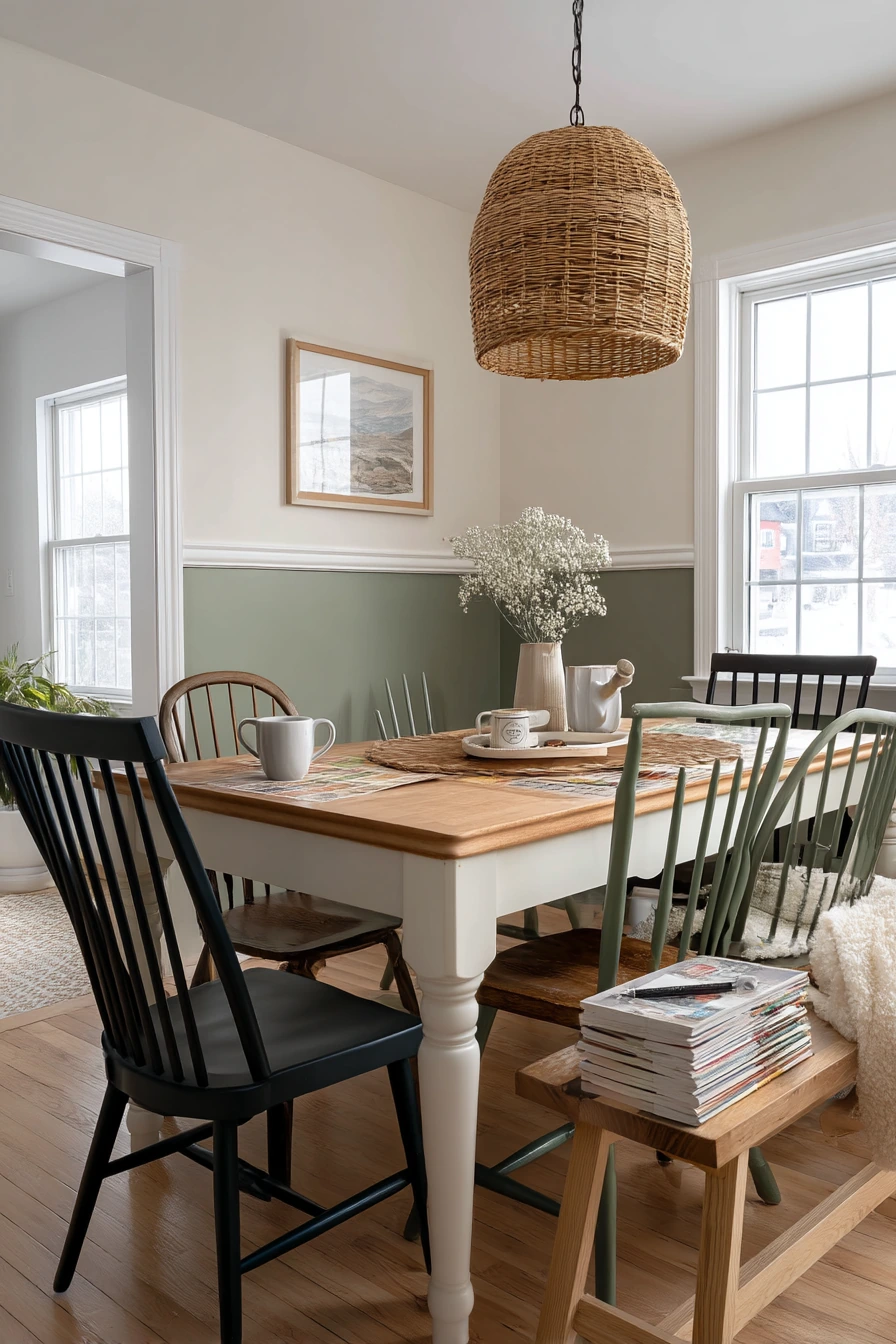
Two-tone dining room paint with a chair rail is a budget-friendly way to add character fast. A cream upper wall and olive lower wall creates a cozy, classic look that works with secondhand furniture and mismatched chairs. It also makes sense during a DIY refresh, when the room is not perfect yet and you have a paint tray, painter’s tape, a mug of tea, and a stack of samples on the bench.
This style helps with real-life wear. The lower wall is where scuffs happen from chairs, bags, and kids, so a darker olive there is practical. Cream on top keeps the room from feeling closed in. If you already have a chair rail, repainting above and below is simple. If you do not, you can add one with basic trim, but measure carefully so it looks right with your ceiling height. A thrifted pendant can pull the look together, especially if it has warm metal or a simple shade.
To style a two-tone room, keep the table area relaxed. Mismatched chairs look more planned when you repeat one element, like similar wood tones, matching seat pads, or a shared paint color on chair legs. Add a simple centerpiece, like a bowl or small plant, and keep the rest clear for meals. For the olive, pick a shade that is not too dark, so it still feels friendly in daylight. Use a durable finish on the lower section so wiping is easy.
- Use cream on top to brighten the room and olive below for depth.
- Pick a washable finish for the lower wall where scuffs happen.
- Unify mismatched chairs with matching cushions or painted legs.
- Use painter’s tape and a level for a sharp chair rail line.
- Add a thrifted pendant to make the refresh feel complete.
Pro Design Tip: Place the chair rail at a height that relates to your furniture, often near the back height of dining chairs, so the line feels natural.
Budget Considerations: Two-tone walls use small amounts of each color, so you can buy paint during sales or use leftover cans, then spend more on a good brush and tape for cleaner lines.

10 Cozy Evening Dining Room with Terracotta Walls
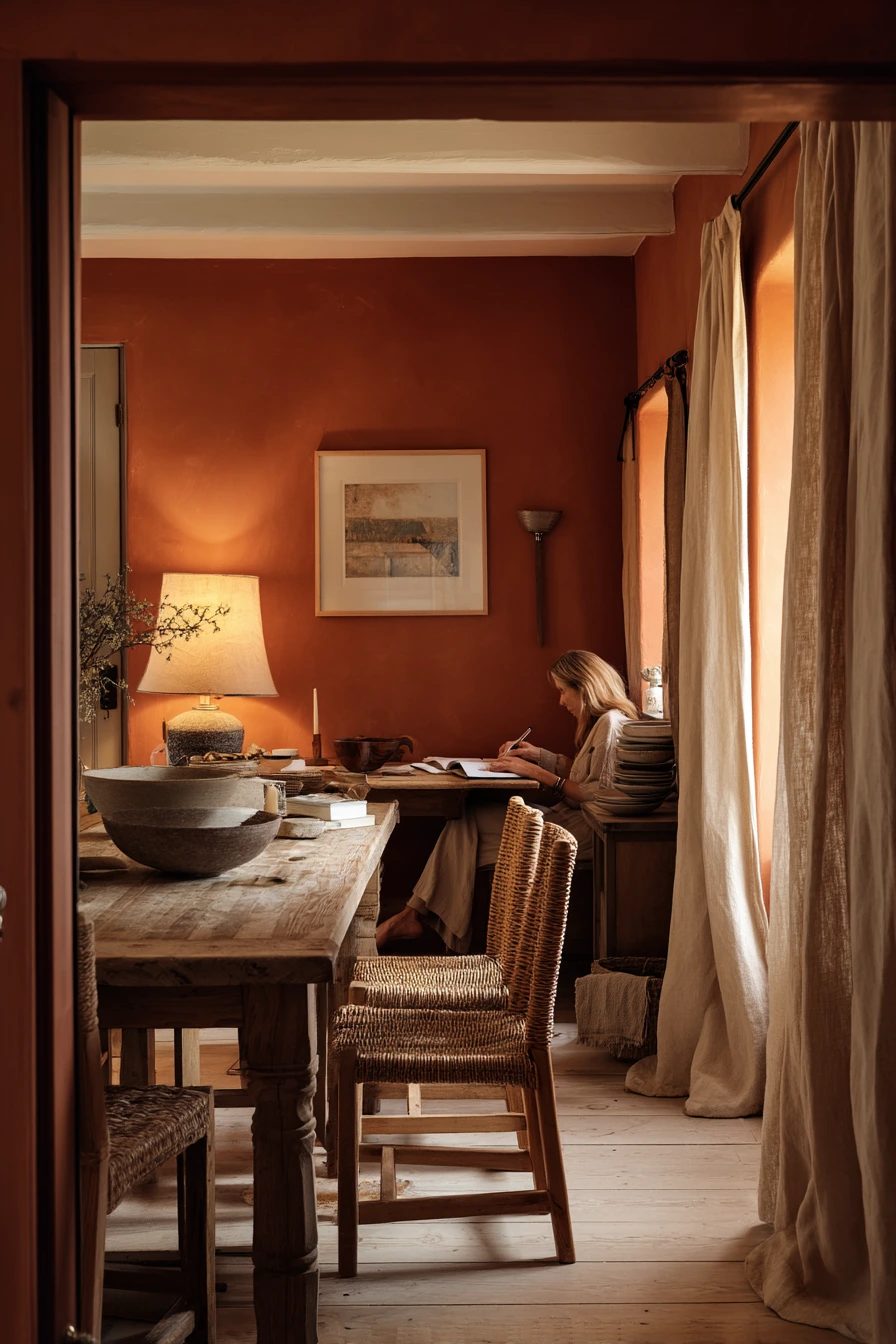
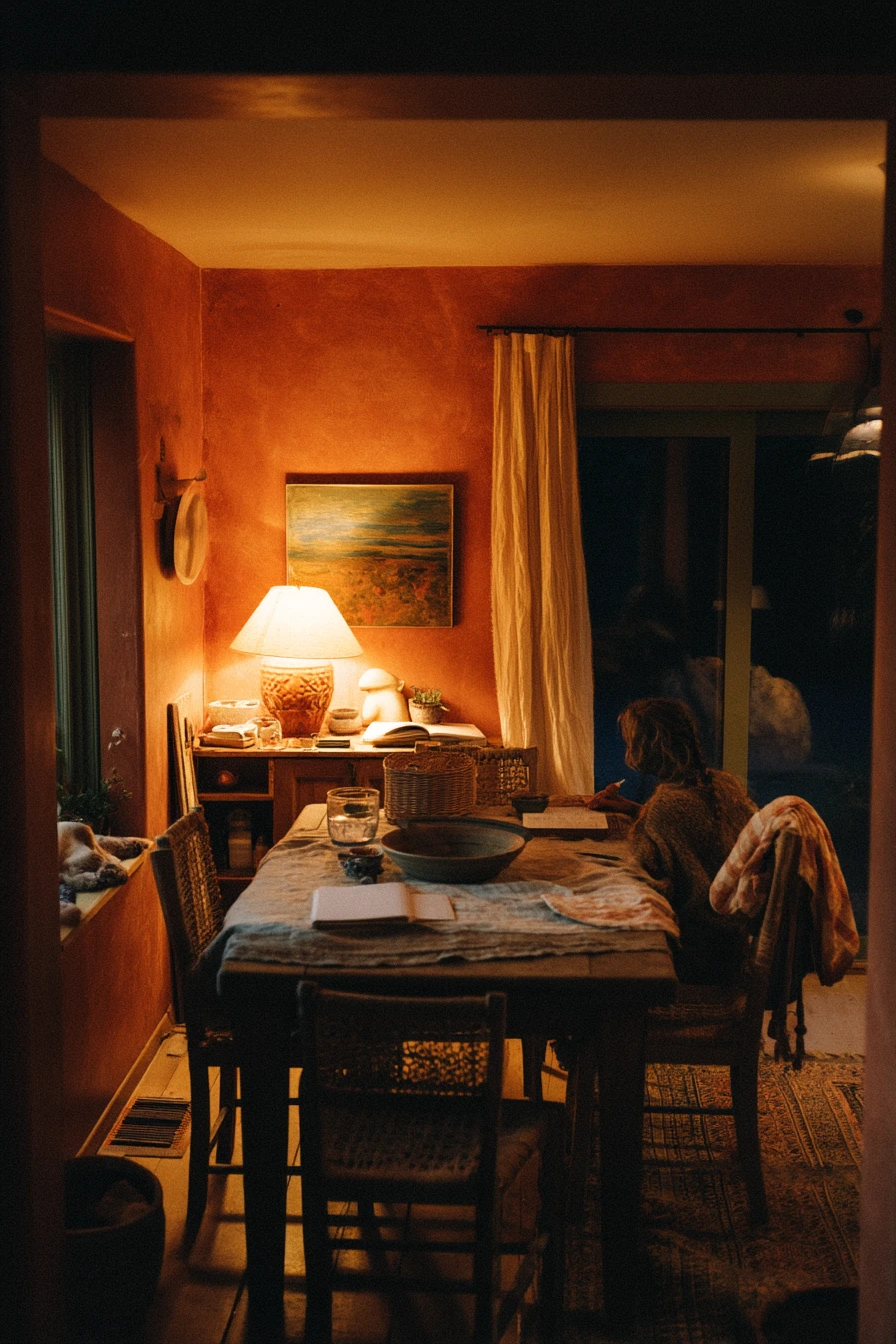
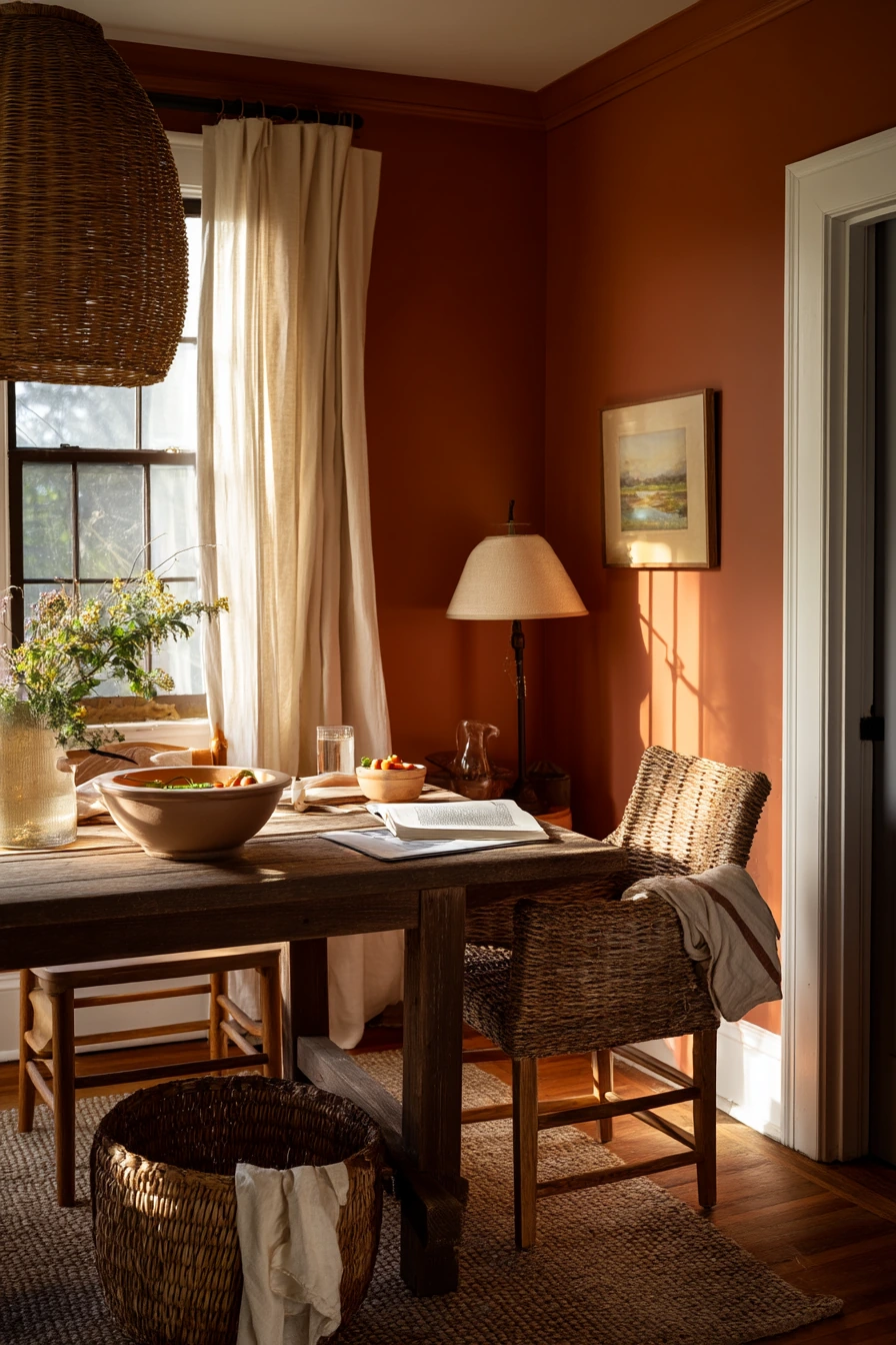
Terracotta dining room paint is a strong option if you want a cozy, amber feel, especially at night. This warm clay tone looks natural with a rustic table, woven chairs, linen curtains, and a ceramic bowl centerpiece. It supports real home moments, like a couple finishing dinner by lamplight, a cookbook left open, and a dish towel bunched on a chair. It even makes small pet items, like a water bowl near the baseboard, blend in better than cooler wall colors.
To style terracotta, lean into texture. Woven chairs, linen, and handmade ceramics look right against this color. Keep the table setting simple: a neutral runner, a few candles, and one bowl of fruit can be enough. Terracotta can feel intense in bright sun, so it helps to use soft window coverings like linen curtains to diffuse light. At night, warm lamp glow brings out the best in this paint and makes the room feel inviting without extra decor.
If you want terracotta but worry it will shrink the room, use it on the walls and keep the ceiling and trim a warm white. Light oak floors also help. Add contrast with black or dark bronze in small accents, like a pendant, frames, or hardware. For an easy upgrade, swap cool-toned bulbs for warm ones. Terracotta is also great with plants, but choose deeper greens so the leaves do not clash.
- Pair terracotta walls with woven chairs and linen for a soft look.
- Use warm lamps and dim lighting for a cozy evening feel.
- Keep trim warm white to balance the rich wall color.
- Style the table with one ceramic bowl and a simple runner.
- Use linen curtains to soften bright daylight on the paint.
Pro Design Tip: Terracotta looks best when you repeat it in small ways, like a rust napkin or a clay vase, so the walls feel connected to the table.
Budget Considerations: If full-room painting feels expensive, start with one terracotta feature wall and use warm bulbs and textiles to get a similar cozy effect.

Dining room paint ideas work best when they match your real routine, not a perfect photo. Warm greige, navy, sage, clay, coral, taupe, olive, blue-gray, two-tone chair rail, and terracotta can all look great if you plan for your light and your furniture.
Before you commit, test large swatches in morning and evening. Then style with a few simple layers like wood, linen, and one useful centerpiece so the room stays easy to live in.
FAQ
What is the best paint color for a dining room that connects to a kitchen?
Warm greige, soft sage, and muted taupe blend well with many cabinet and countertop finishes, so the transition feels smooth.
Are dark dining room paint colors a bad idea in a small space?
No. Deep navy or smoky olive can make a small nook feel cozy. Add white trim and warm lighting to keep it balanced.
What paint finish is best for dining rooms?
Eggshell is a good default. It is easier to wipe than flat paint and still looks soft on walls.
How do I choose between blue-gray and sage?
Choose blue-gray for a classic, traditional feel with dark wood. Choose sage for a lighter, nature-inspired look with maple, rattan, and plants.
How can I make a dining room look pulled together on a budget?
Try a two-tone paint job with a chair rail, use thrifted chairs, and add one simple pendant or warm lamp.
Should the dining room ceiling be the same color as the walls?
It depends. Matching can feel cozy in dark colors like navy. A warm white ceiling can make mid-tone colors like terracotta and taupe feel taller and brighter.