

Choosing dining room color ideas can feel tricky because the room has to do more than look pretty. It has to handle meals, homework, quick breakfasts, and sometimes a little mess.
In this guide, you will see ten color palettes based on real-life spaces, from soft sage with creamy trim to deep blue gray for a cozy evening mood. Each section includes simple styling ideas you can copy.
These looks are made for normal homes and apartments, including renter friendly options like warm clay and mushroom tones. You will also get practical notes on lighting, paint sheen, and how to tie in wood, metal, and textiles.
Use this post to pick a palette that fits your schedule, your light, and your furniture, then make small changes that help the whole room feel pulled together.
1 Soft Sage Family Dining Room
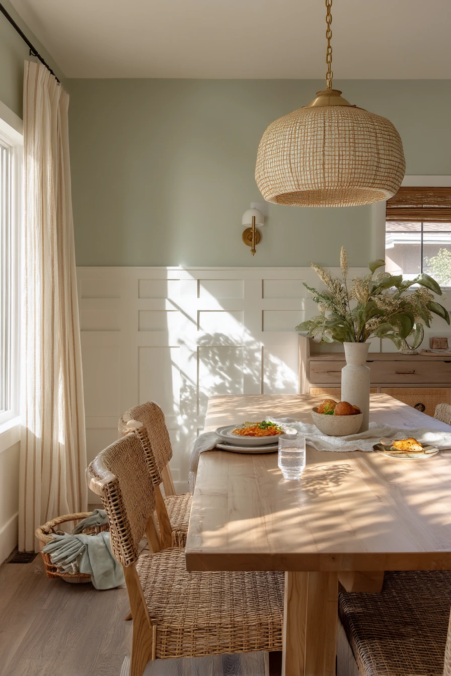
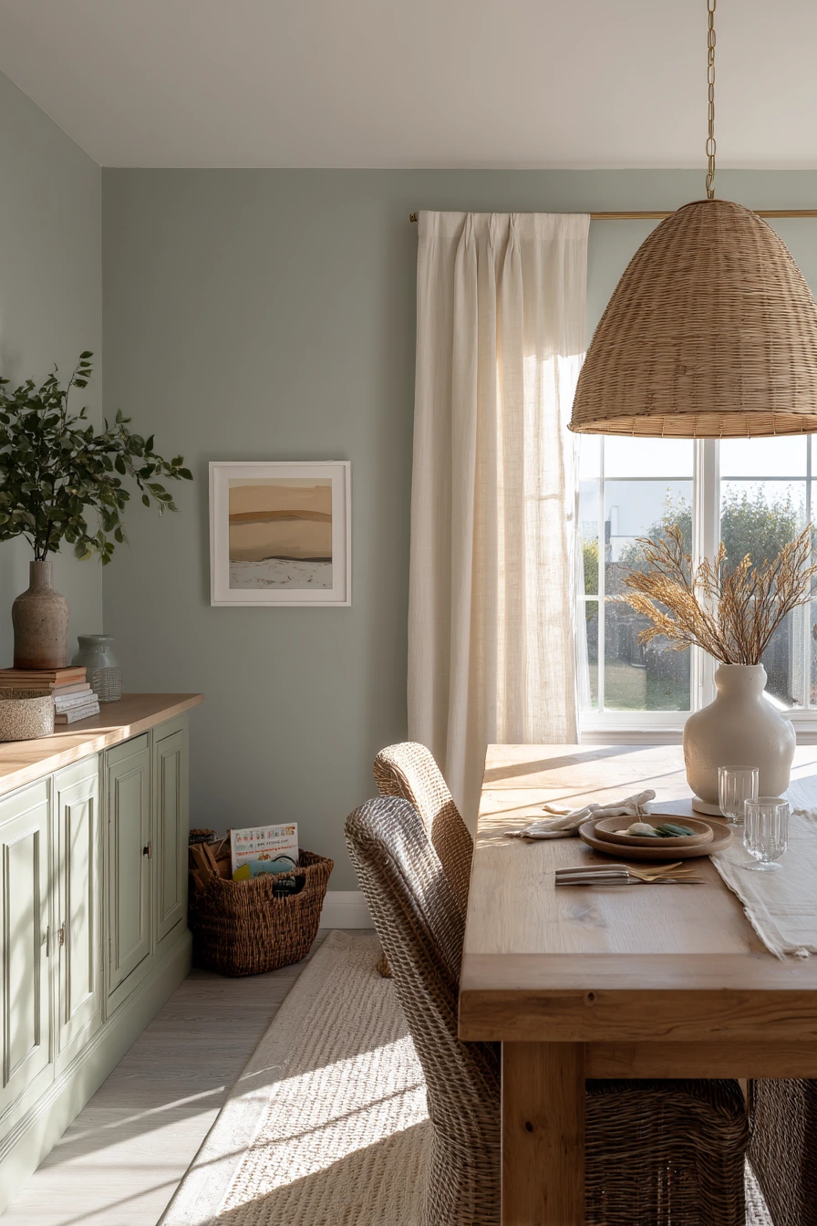
Soft sage is a calm dining room color that still feels fresh in daylight. It works well for a young family because it hides small marks better than bright white, and it looks natural next to an oak table and woven chairs. Creamy trim keeps the space warm, not icy, and it helps the green read as gentle instead of sharp.
To style this look, keep window treatments light. Pale linen curtains soften the sun and let plant shadows move across the wall, which adds texture without adding clutter. Brass lighting, like a simple pendant, gives a warm glow at night and plays nicely with the oak grain. A ceramic vase on the table can be your main decor, so you do not have to fuss with lots of little items.
This palette also supports real life. A kid toy basket tucked by the sideboard can match the natural feel if you choose seagrass or canvas. A small stack of board books can live on a lower shelf so the toddler can reach them. Even a single water glass near a half finished meal will not ruin the vibe because the room is meant to feel lived in.
- Pick a sage with a gray base if your room gets strong sun from the left.
- Use creamy trim to keep the green from looking cold.
- Add woven texture through chairs, baskets, or a simple runner.
- Keep the table styling low so it is easy to clear for meals.
- Repeat brass once more, like on cabinet pulls, for a matched look.
Pro Design Tip: Test sage paint on two walls and watch it morning to evening; greens shift a lot, and trim color changes the whole feel.
Budget Considerations: Paint and new curtains do most of the work here. If new woven chairs are pricey, mix in one or two thrifted wood chairs and add seat cushions.
2 Warm Clay Rental Dining Nook
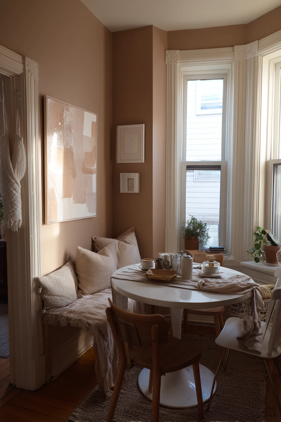
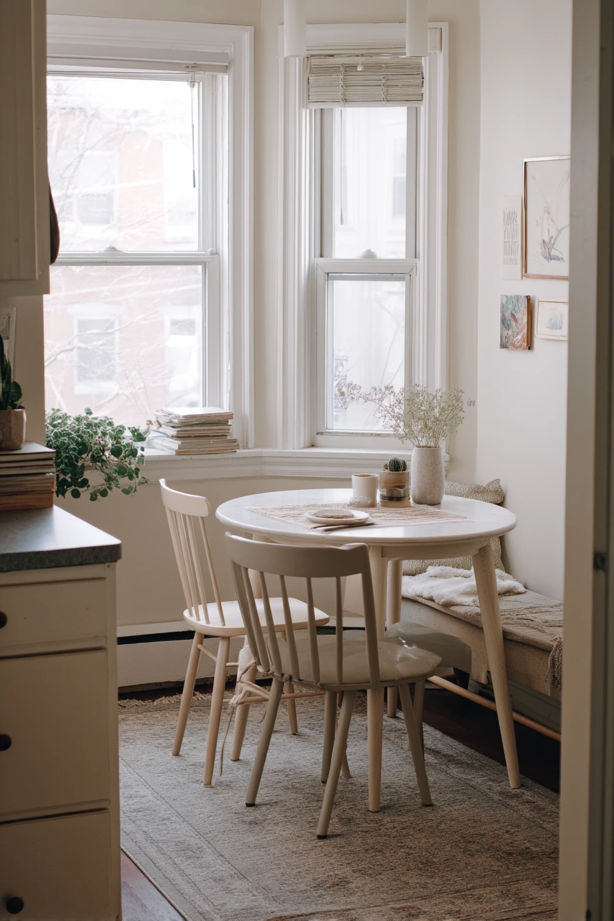
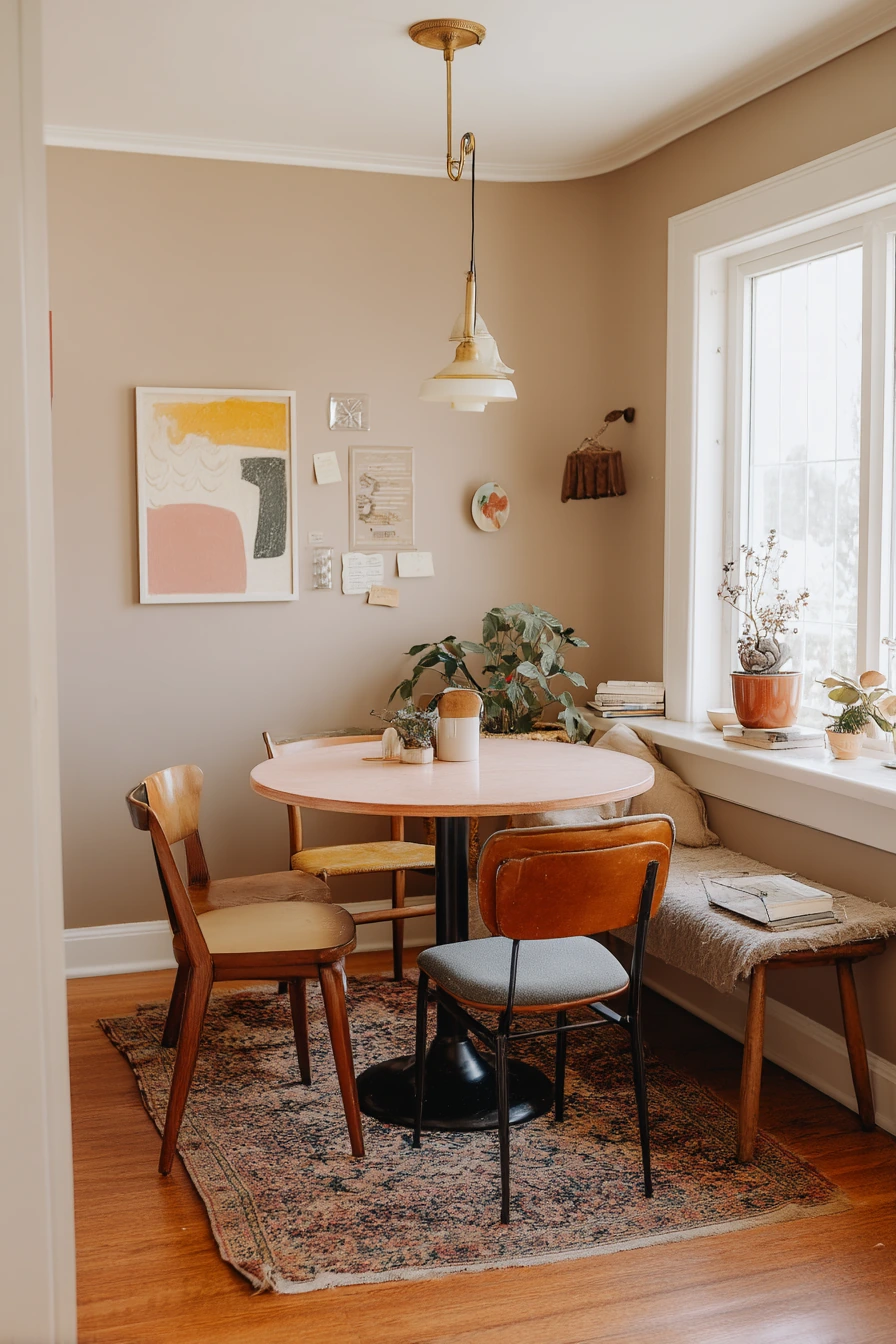
Warm clay and mushroom tones are a smart dining nook color idea for renters because they make a compact corner feel cozy and grounded. These shades look good with mixed thrifted chairs, a faded runner, and a small round table. They also help everyday clutter, like mail stacks, look less harsh.
Since you may not be able to paint, you can build the color with removable choices. Peel and stick art, a clay toned table runner, and a mushroom colored throw on a bench can change the mood fast. If you have an unplugged phone charging cable on the bench, use a small tray or a lidded basket to keep it from looking messy.
Finish the nook with a tiny buffet or narrow shelf for storage. A basil plant by the window adds life and repeats the earthy feeling without adding more decor. Aim for soft afternoon light with warm bulbs at night so the clay tones stay mellow, not orange.
- Use peel and stick wall art to add clay tones without paint.
- Mix chair styles, but repeat one element like wood tone or seat color.
- Add a faded runner to soften hard floors and define the nook.
- Corral mail and cords in a tray, basket, or small bin.
- Style the window with a simple herb plant for an easy green accent.
Pro Design Tip: Choose one main warm neutral (mushroom) and one accent (clay), then repeat each three times so the nook looks planned.
Budget Considerations: Thrifted chairs and a used round table can save a lot. Spend a little more on a washable runner so the space stays easy to live with.
3 Deep Blue Evening Dining Room
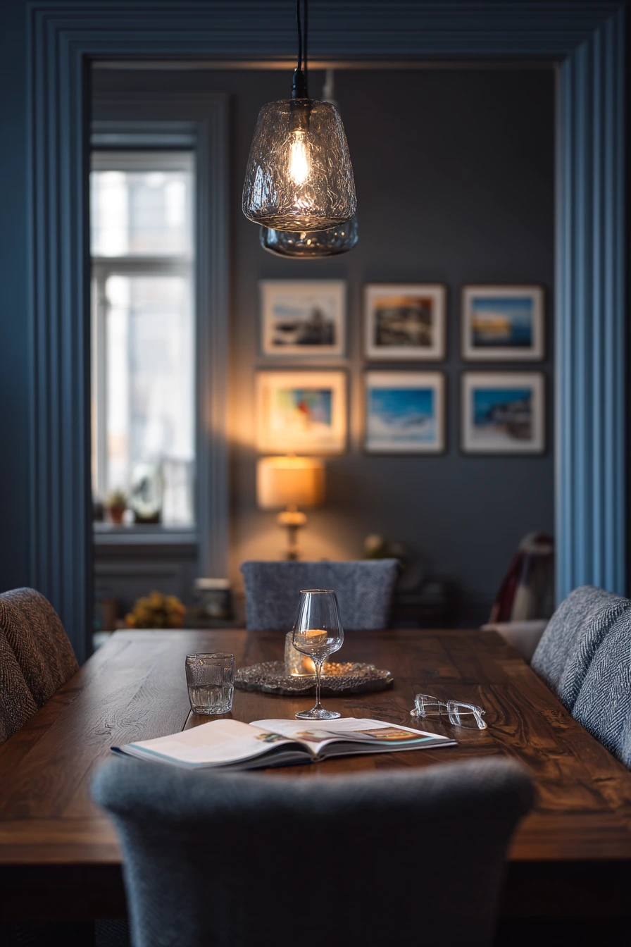
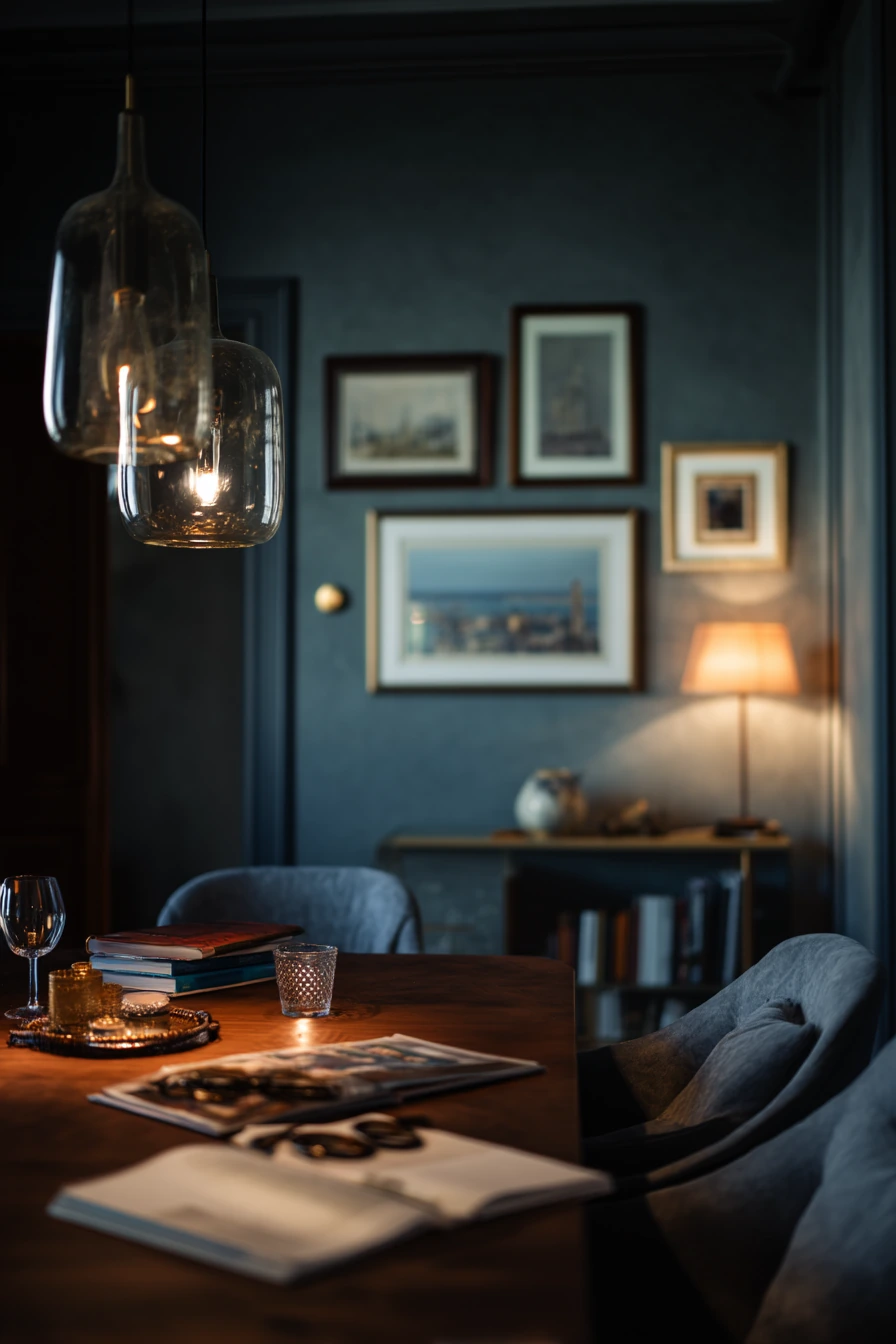
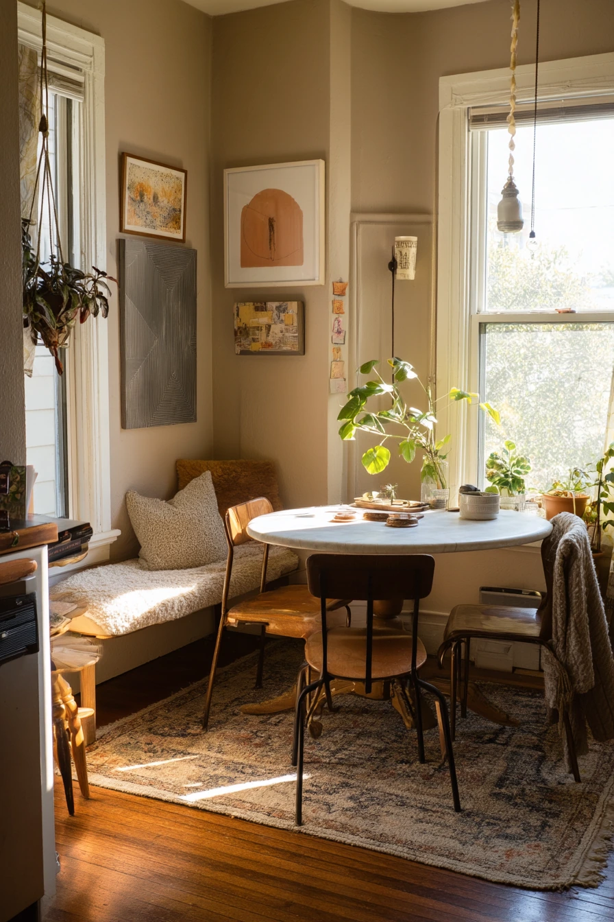
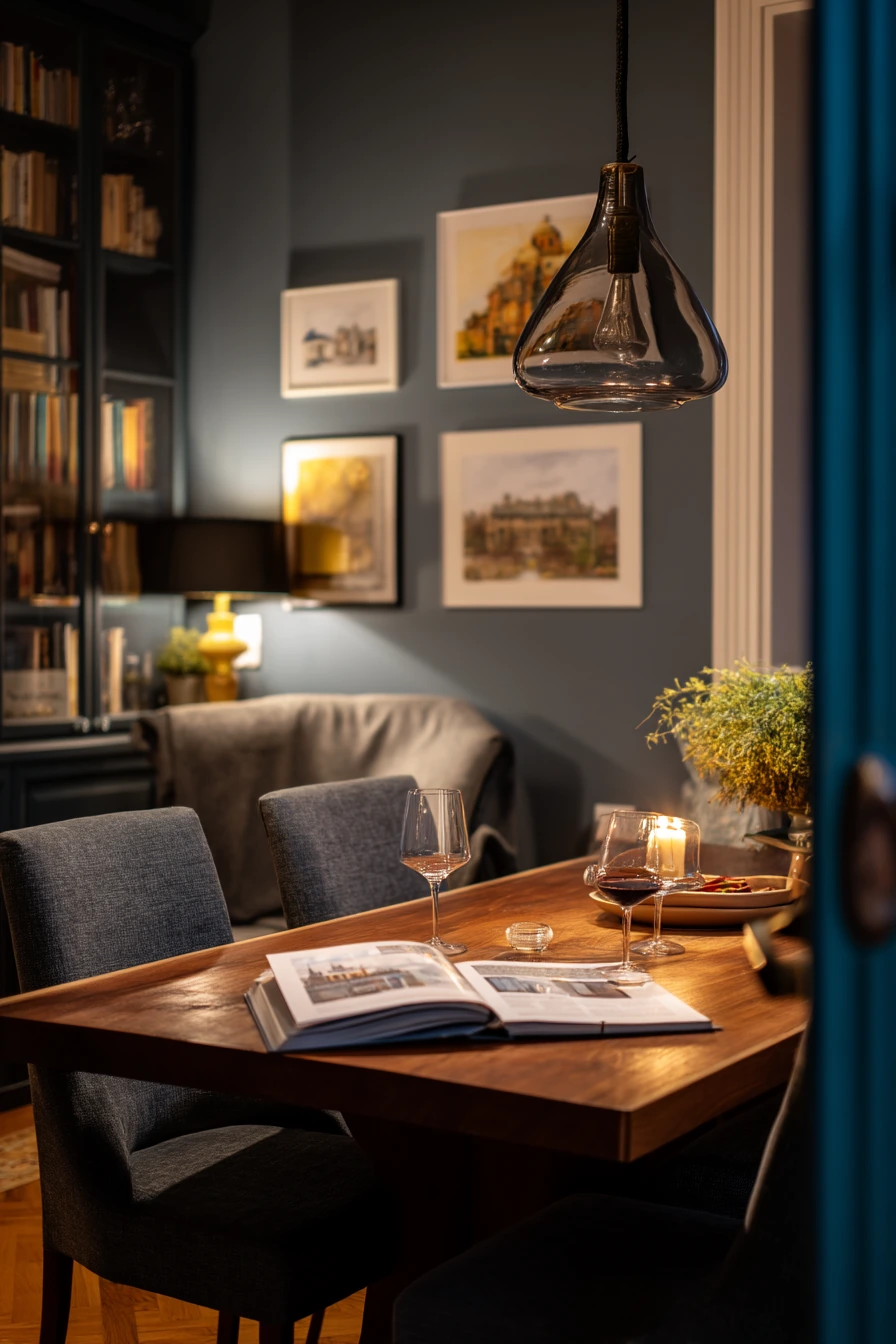
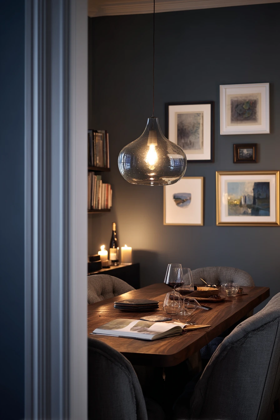
Deep blue gray walls create a cozy evening dining room that feels intimate in a city apartment. This color is moody but still livable, especially with walnut furniture and upholstered chairs. It also makes framed travel photos pop, even when the light is low.
To keep the room from feeling too dark, mix warm and cool light sources. A smoky glass pendant gives soft overhead light, and a practical lamp adds a warm pool of glow on the sideboard. If dim streetlight comes in at night, the blue gray will look velvety instead of flat. Use a simple table setting, like an open cookbook, reading glasses, and one candle stub, to make the room feel real and welcoming.
For styling, bring in texture. Linen napkins, a matte wood bowl, or a wool runner helps balance the smooth paint. A wine glass with condensation can even look like part of the scene, but keep surfaces easy to wipe. If you host, set out stacked plates and keep serving items close to the table to avoid extra trips in a smaller space.
- Pick a blue gray with a little warmth if your floors are dark.
- Use walnut or medium wood to prevent the room from looking too cool.
- Add one lamp for warm light, even if you have a pendant.
- Choose matte or eggshell paint to reduce glare and hide small marks.
- Hang travel photos in simple frames for contrast against dark walls.
Pro Design Tip: In a dark palette, use at least three textures (fabric, wood, and glass) so the room feels layered, not heavy.
Budget Considerations: If reupholstering chairs is costly, add removable seat covers or cushions and spend on good warm light bulbs instead.
4 Butter Yellow Breakfast Dining Space
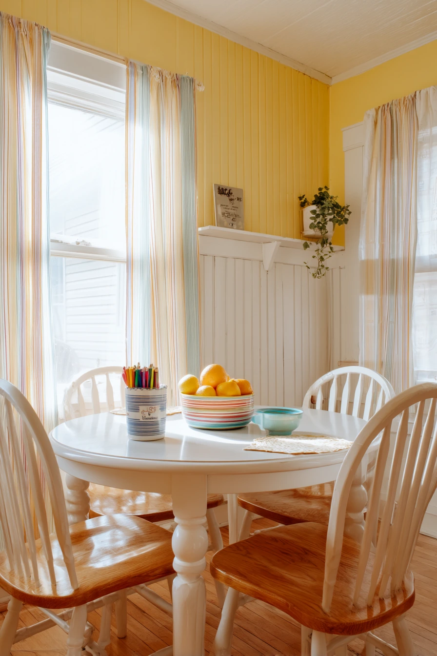
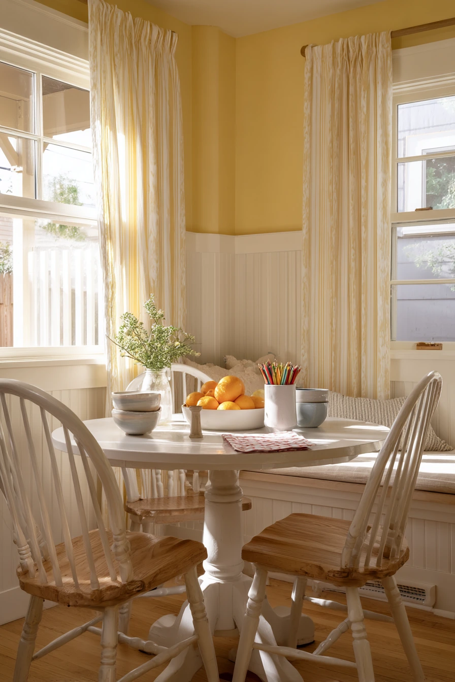
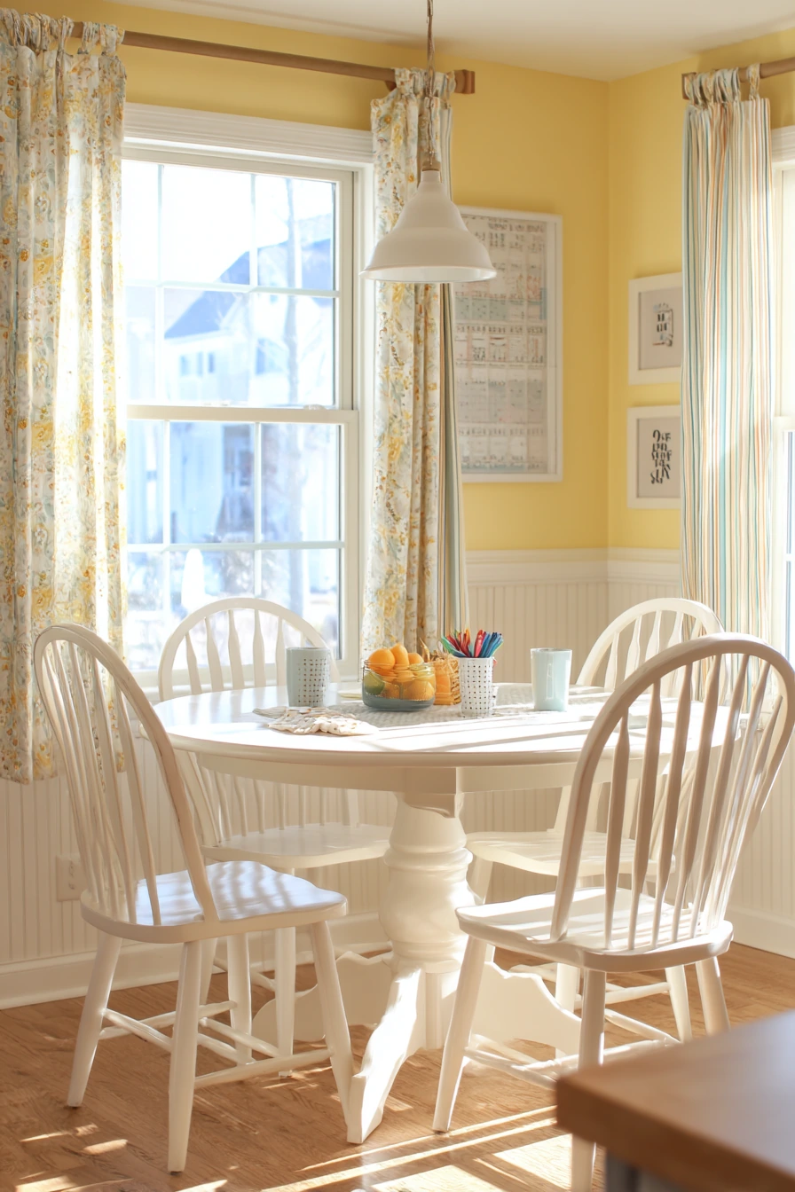
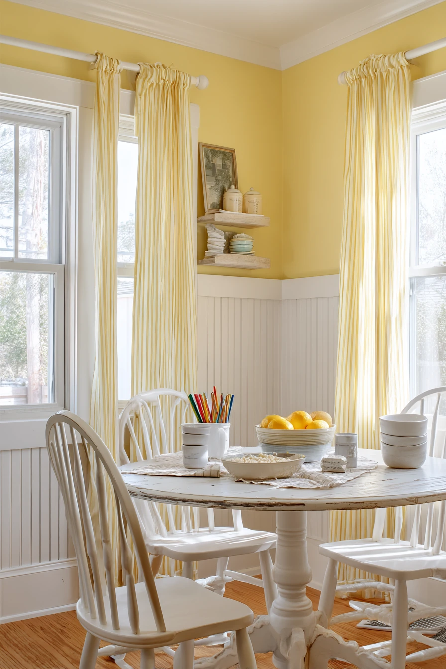
Butter yellow is a cheerful dining room color idea that works well in a busy breakfast space. It brightens mornings without feeling harsh, especially when paired with white beadboard. The combo looks clean but still warm, which helps the room feel friendly when the day starts fast.
Style this palette with simple shapes and a few playful details. A tulip table keeps the floor area open and is easy to wipe. Spindle chairs add a classic touch and look great against yellow walls. Striped cafe curtains bring pattern without blocking light. If you have stacked cereal bowls, crayons in a cup, and a napkin on the floor, the room can still look tidy because the colors support a relaxed, family feel.
Keep the decor practical. A citrus bowl adds color and helps the room feel fresh. Choose a washable rug or runner if you want softness underfoot. Morning window light will make butter yellow glow, so balance it with white trim and beadboard to keep it from looking too strong.
- Use satin or eggshell paint so walls wipe clean after spills.
- Pair butter yellow with crisp white beadboard for a balanced look.
- Add striped cafe curtains for pattern that still feels light.
- Use a fruit bowl as everyday decor and a snack station.
- Keep a small bin for crayons and papers to reduce table clutter.
Pro Design Tip: Paint beadboard in a slightly warmer white than your trim so the room feels soft, not stark.
Budget Considerations: If real beadboard is expensive, try beadboard wallpaper or paint a simple panel effect with trim boards.
5 Greige Coastal Dining Room
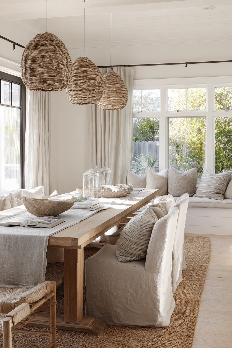

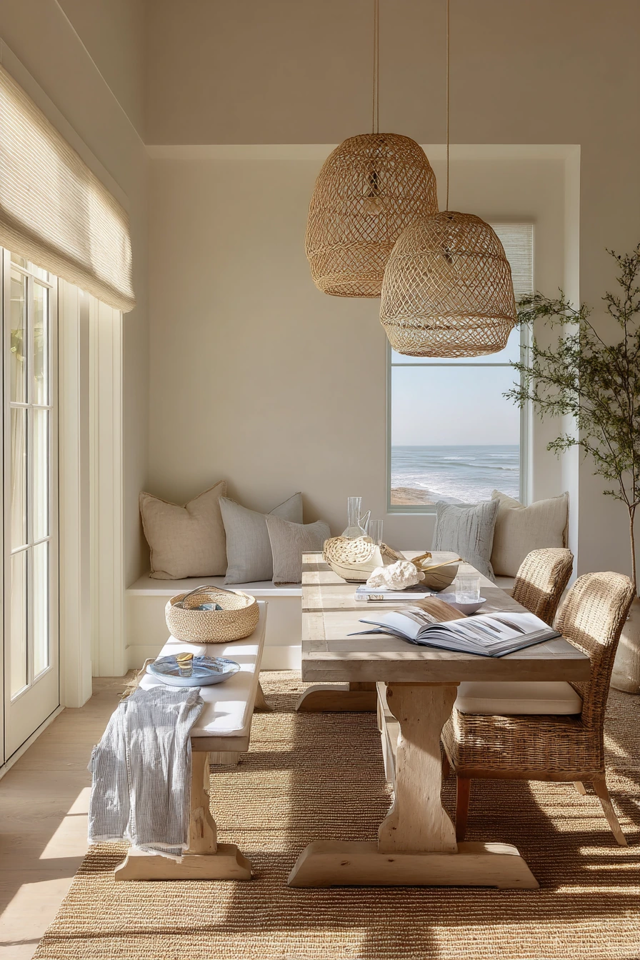
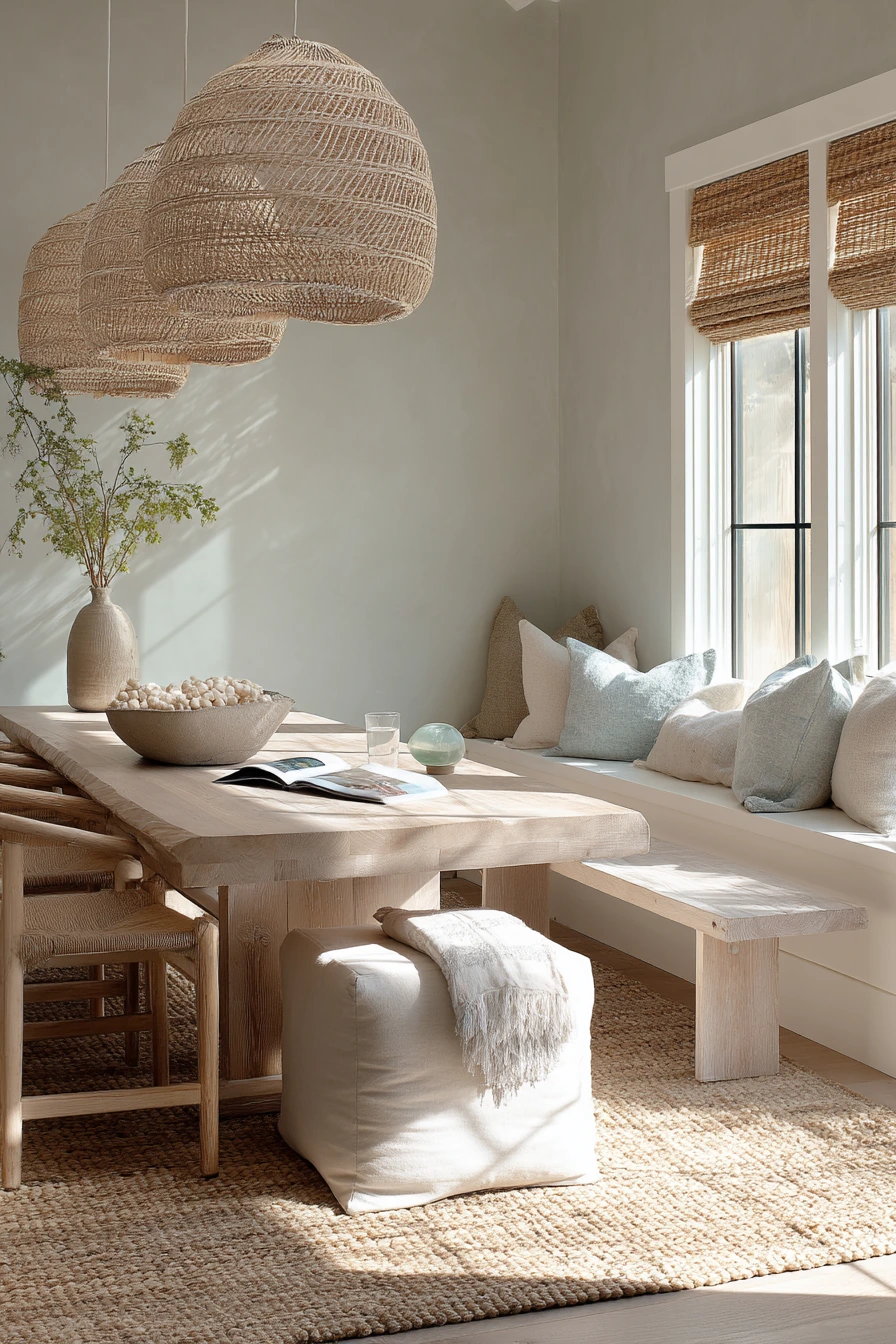
Greige, sandy beige, and sea glass accents create a relaxed coastal dining room color scheme that stays calm all year. It is airy without looking themed, and it works well with a long oak table, slipcovered chairs, and a jute rug. Natural side window light helps these soft neutrals look clean and open.
To style this look, start with texture. Jute, linen, and woven pendants bring the beach feeling without using obvious decor. Keep the center of the table simple, like a shell bowl or a low ceramic piece, so the room stays easy for everyday meals. A bench nearby can hold folded beach towels, an open paperback, or a basket for extra napkins. These little items make the room feel lived in and not staged.
Sea glass accents should be small and repeatable. Think glassware, a pale blue green vase, or a framed print with soft ocean tones. Plant shadows moving across the wall add a gentle pattern, so you do not need busy wallpaper. If your greige leans too gray, warm it up with brass or aged bronze hardware and warmer bulbs.
- Choose greige that matches your flooring so the room feels seamless.
- Use slipcovers for a soft look that is also washable.
- Add a jute rug for texture and to define the dining zone.
- Repeat sea glass tones in two to three small items, not everywhere.
- Use woven pendants to warm up an all neutral palette.
Pro Design Tip: Keep coastal colors muted and dusty; bright aqua can read loud and fight with natural wood tones.
Budget Considerations: Slipcovered chairs can be pricey, so start with slipcovers on existing chairs and invest later in one quality woven pendant.
6 Plum Accent Dining Corner
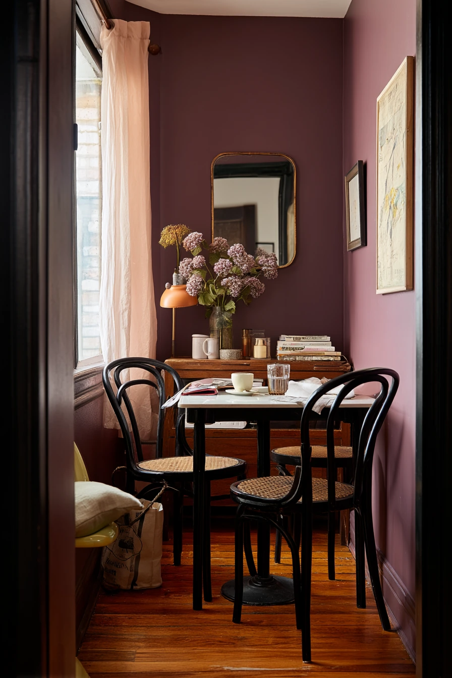
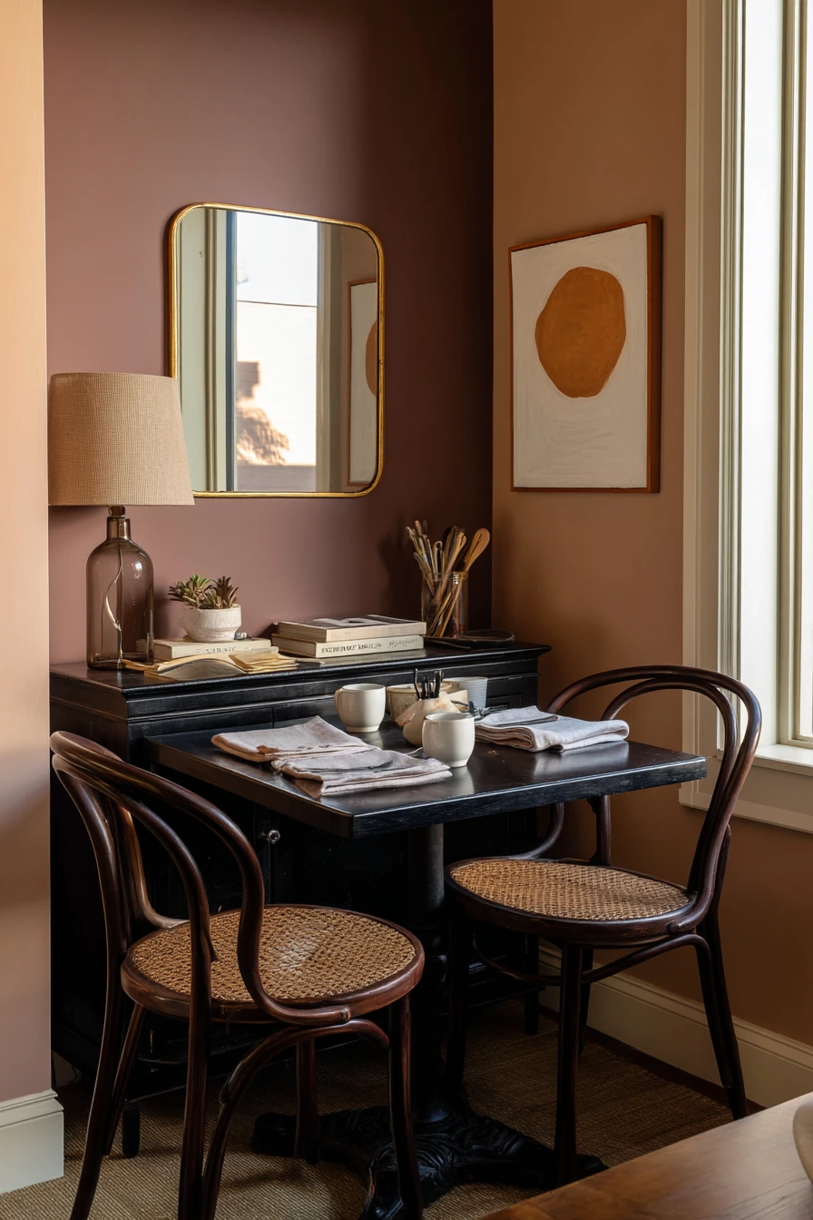
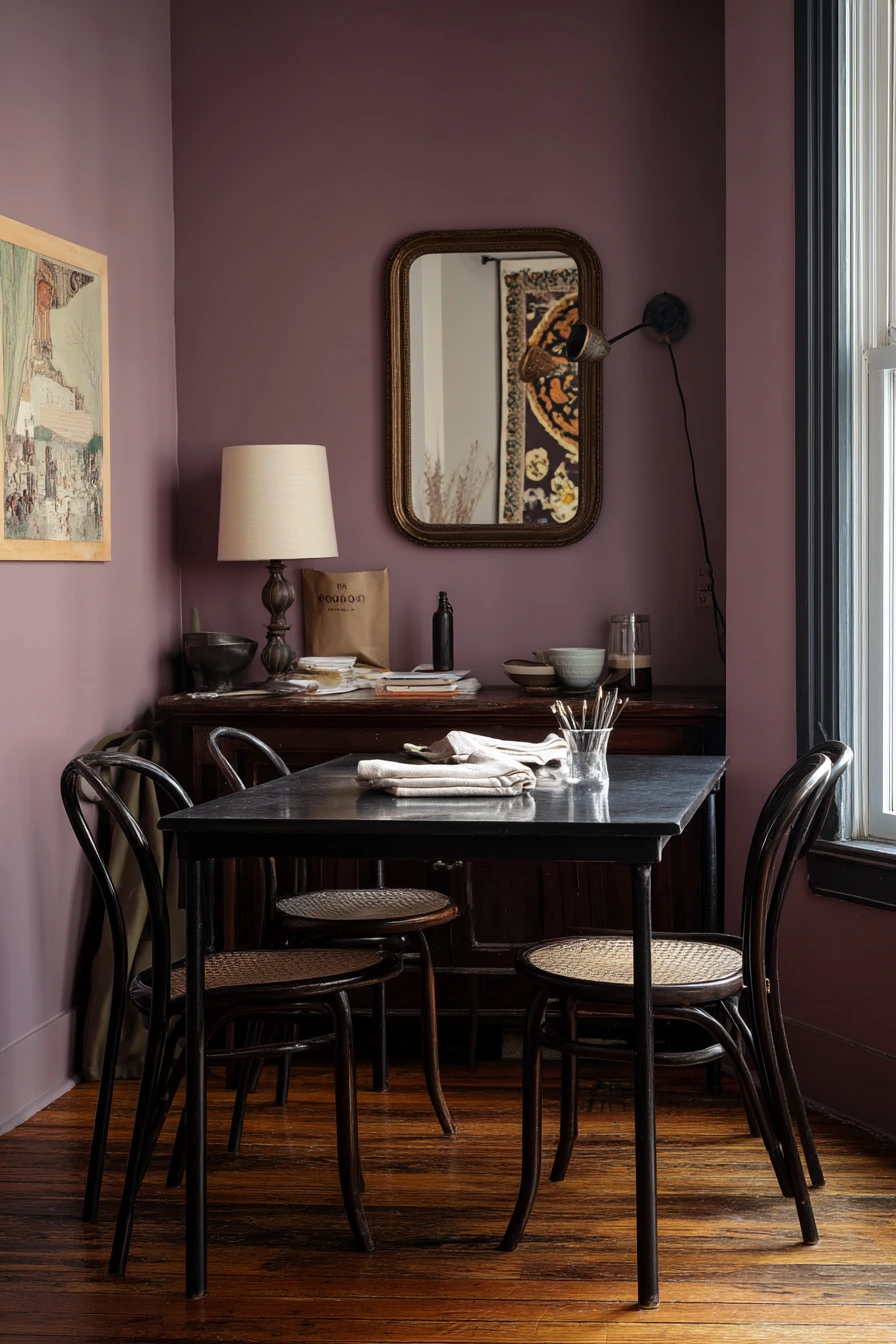
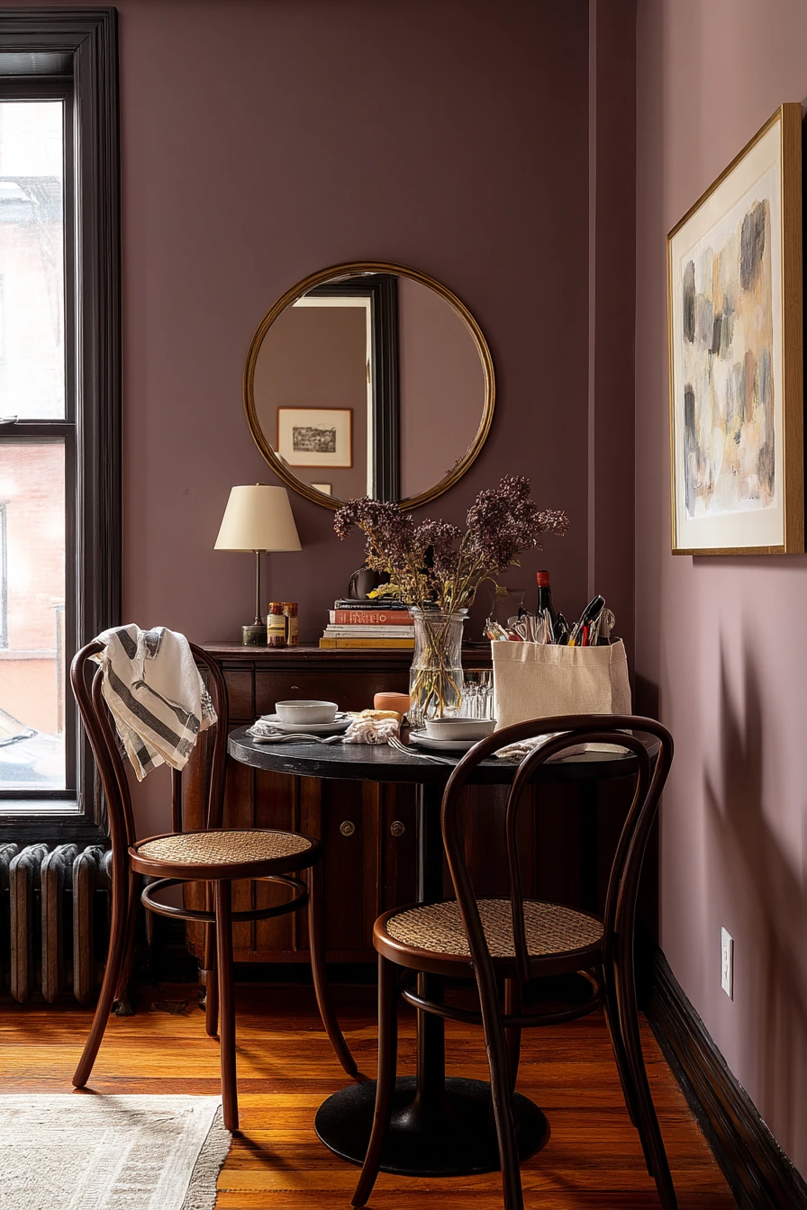
A muted plum accent wall is a bold dining room color idea that still feels calm when the shade is soft and dusty. In a small space, one colored wall adds depth without closing the room in. It looks especially sharp behind a compact black table and bentwood chairs because the shapes stay simple while the color does the heavy lifting.
Styling matters with plum. Add reflective pieces like a vintage mirror to bounce light and keep the corner from feeling dim. Linen napkins, art books, and a pen cup on a sideboard help the room feel creative and personal. If you have a grocery tote by the chair or a charging cable snaking across the sideboard, use hooks or a small basket so the everyday items look intentional.
Balance the warm and cool parts of the room. A warm lamp gives the plum a rich, plush look, while a cooler edge of window light keeps it from turning muddy. Keep the rest of the walls neutral, like soft white or warm gray, so the accent wall stays special.
- Use plum on one wall to add drama without shrinking the room.
- Pair it with black and natural wood for a clean, modern base.
- Add a mirror to reflect light and make the space feel larger.
- Choose linen textiles to soften the darker tones.
- Hide cords in a box or behind a tray to keep surfaces neat.
Pro Design Tip: Pick an accent wall that you see first when you enter; it makes the color feel like a feature, not an accident.
Budget Considerations: A single gallon of paint can cover an accent wall. Shop secondhand for a mirror and bentwood style chairs to get the look for less.
7 Soft White Farmhouse Dining Room
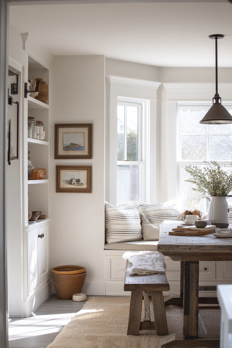
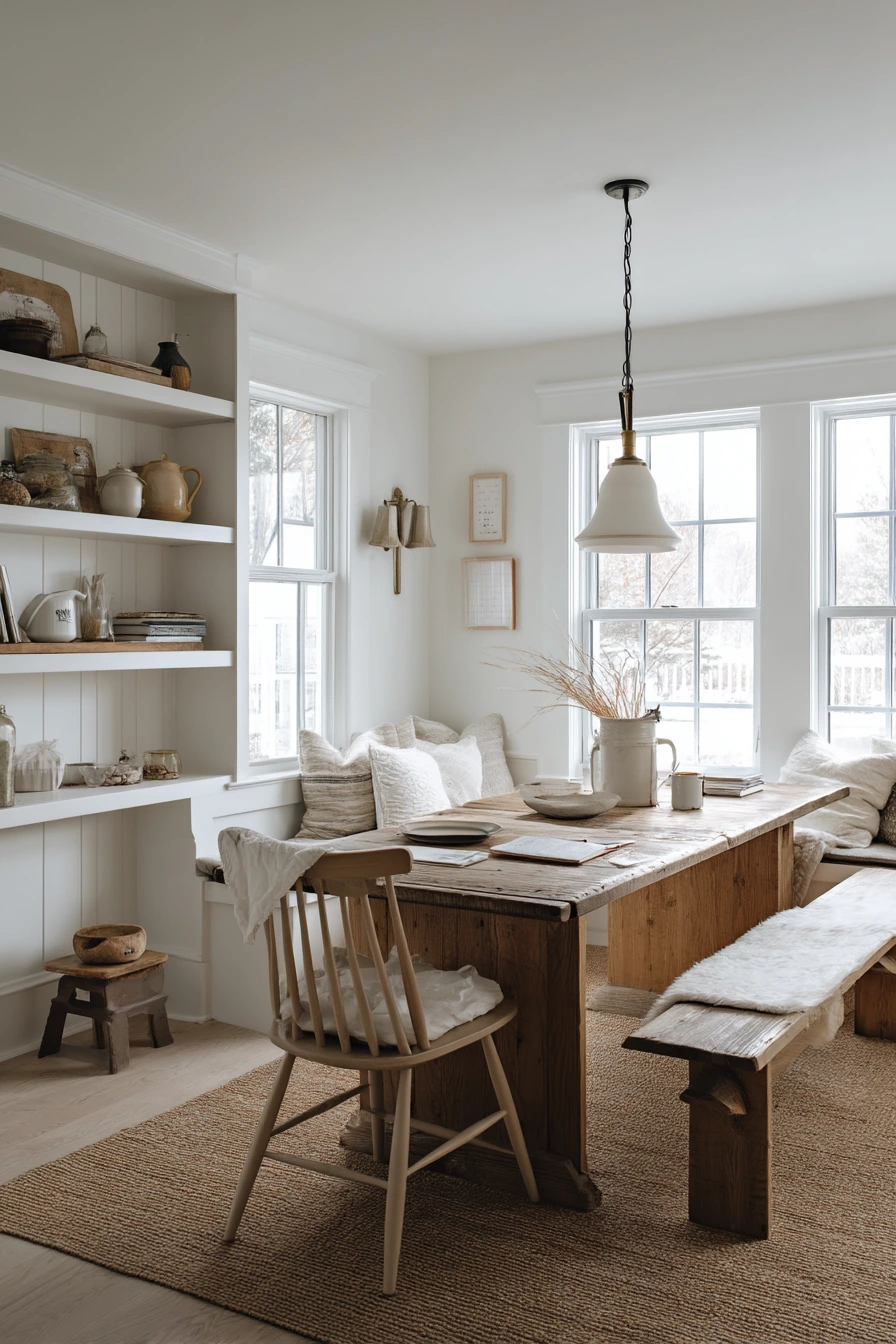
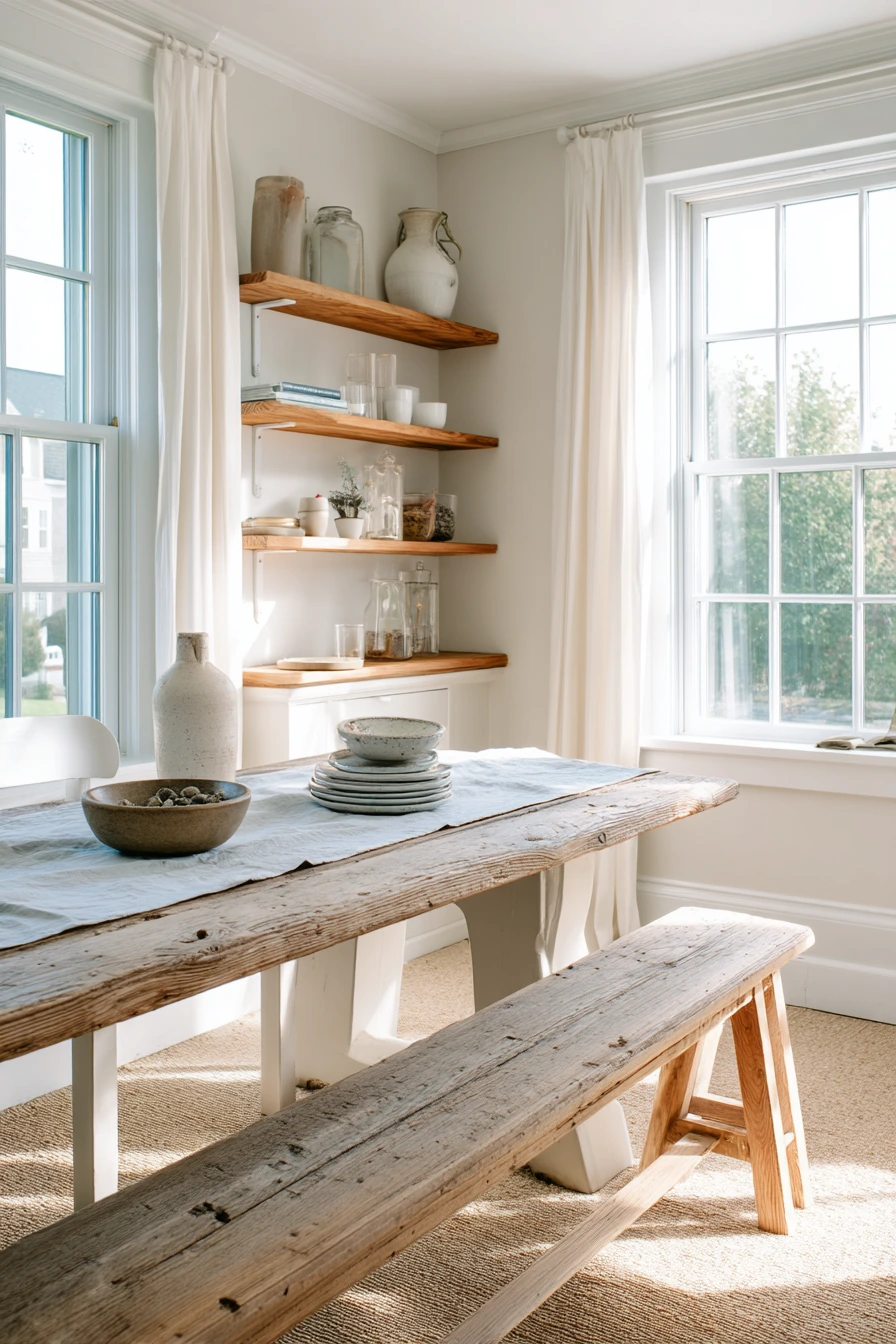
Soft white with oatmeal undertones is a practical farmhouse dining room color idea for a multi use family space. It reads clean in the morning but stays warm in the evening. This shade also works with reclaimed wood, painted benches, and open shelves without making the room feel too yellow.
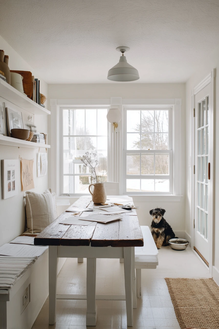
In a home that does it all, styling needs to support routines. A reclaimed wood table can handle daily use and still look better with age. Open shelves with stoneware pitchers keep things within reach for dinners and homework time. If there are homework papers, pencil shavings, and a dog bowl near the door, this color palette helps the room still feel calm because the background is soft and steady.
Add texture instead of more color. Linen seat cushions, woven baskets, and simple pottery create that farmhouse feel without clutter. Use a gentle wide perspective when planning layout, meaning leave space to walk around the bench and reach the door easily. Morning window light will make oatmeal undertones glow, so keep bulbs warm but not overly orange.
- Choose a warm soft white so the room does not feel cold.
- Use reclaimed wood to bring in natural contrast and character.
- Add a painted bench for flexible seating and easy cleanup.
- Use baskets on shelves to hide school supplies and dog items.
- Pick washable cushion covers for a family friendly setup.
Pro Design Tip: Match your white paint to fixed finishes like countertops and flooring first, then choose textiles that echo the oatmeal undertone.
Budget Considerations: Reclaimed wood tables vary in price. If needed, use a basic pine table and add a stained top or a wood veneer to get a similar look.
8 Muted Terracotta Dinner Party Room
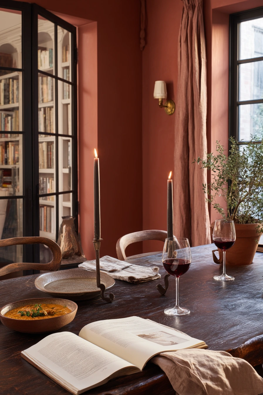
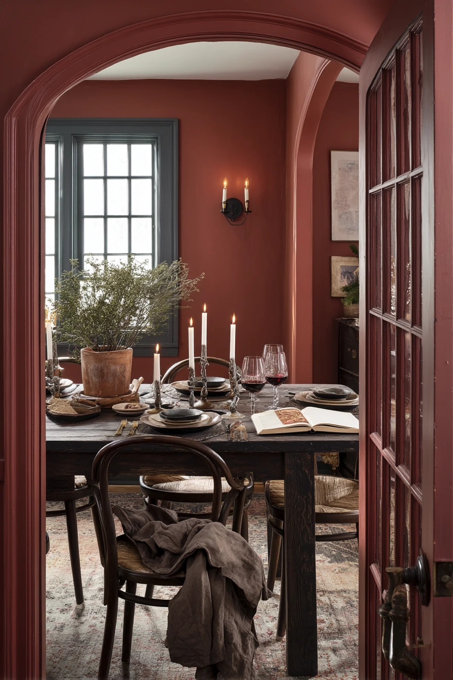
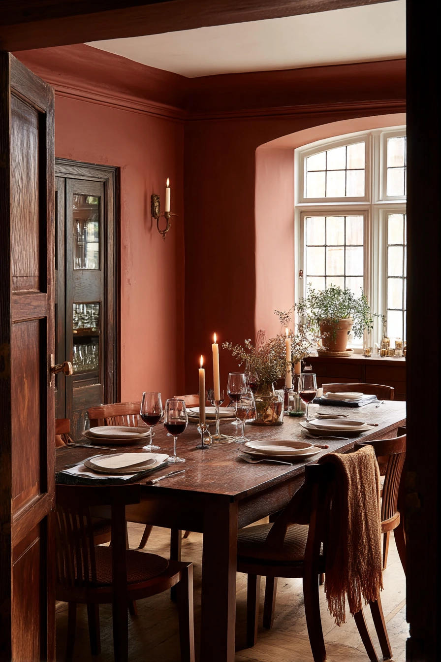
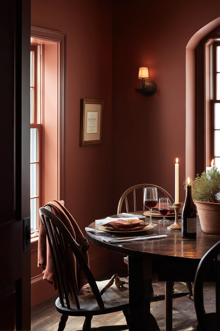
Muted terracotta walls are a strong dining room color idea for people who love dinner parties. The tone feels warm and social, and it makes food and candlelight look good. With a dark wood table and curvy chairs, the room feels grounded and a little more dressed up without being formal.
To style terracotta, lean into deep neutrals and soft shine. Smoked candleholders and warm sconces create an ember glow that flatters the wall color. Keep tabletop items real and useful, like stacked plates, an open cookbook to a favorite recipe, and a tiny herb pot by the window. If you have a jacket draped on a chair or a red wine stain napkin, the room can still feel welcoming because the palette is forgiving and earthy.
Make sure terracotta does not overpower the space. Add light elements like a pale runner, light art mats, or a simple off white ceiling. If your room is small, choose a terracotta that is more muted and dusty, not bright orange. This keeps it cozy and grown up.
- Pick muted terracotta so the walls feel warm, not loud.
- Use dark wood to anchor the room and add contrast.
- Layer candlelight with sconces for soft, even evening lighting.
- Repeat greenery with a small herb pot or simple stems.
- Use washable napkins so hosting feels easy, not stressful.
Pro Design Tip: Terracotta looks best with warm metals like aged brass; try to avoid shiny chrome, which can feel sharp against earthy walls.
Budget Considerations: Wall color is the main statement, so keep decor simple. Use thrifted candleholders and upgrade later to better lighting if needed.
9 Pale Gray Modern Dining Room
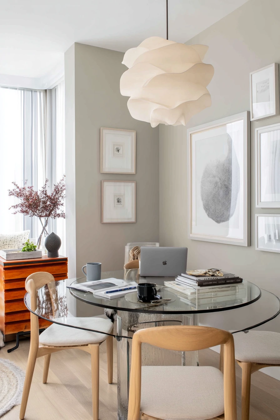
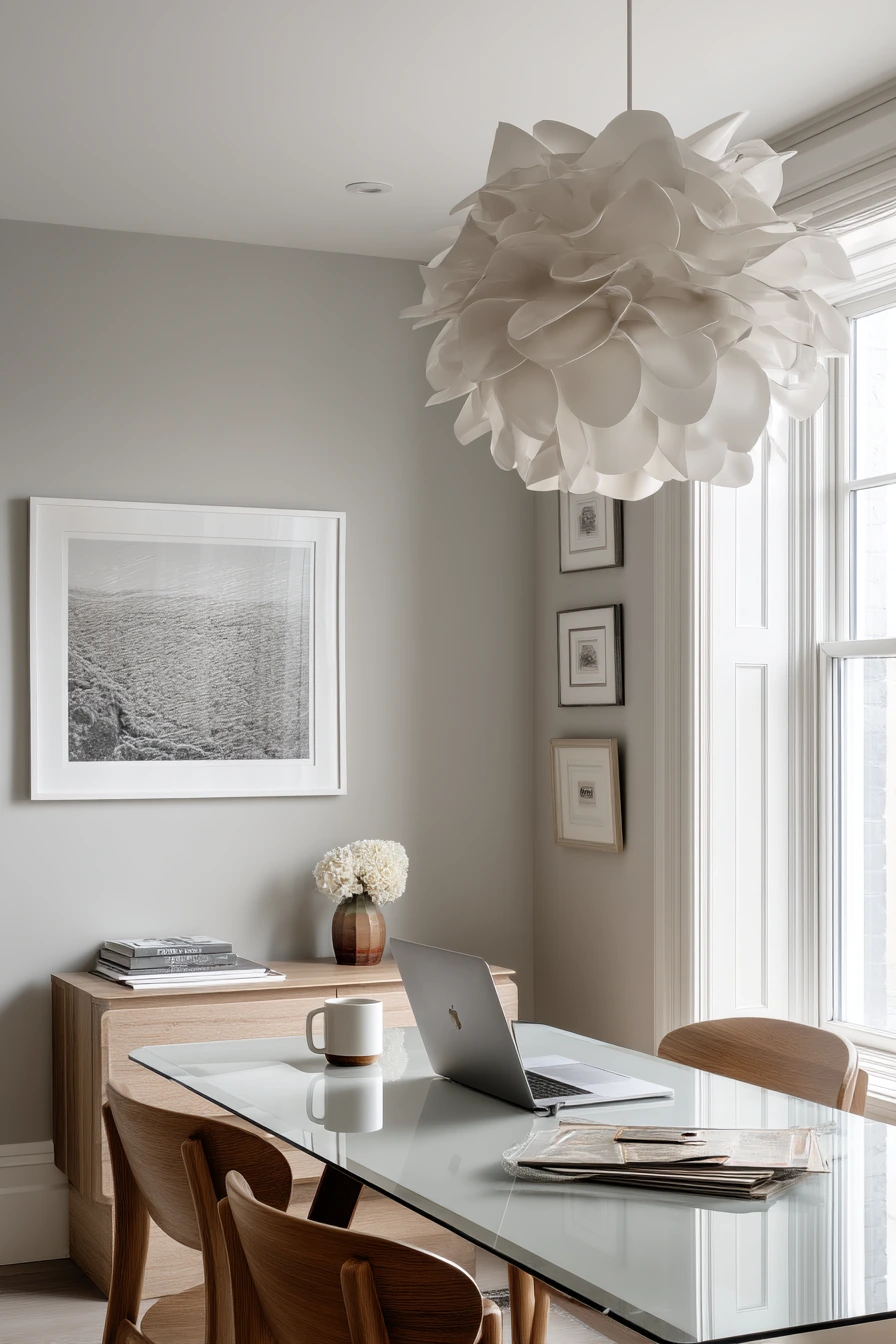
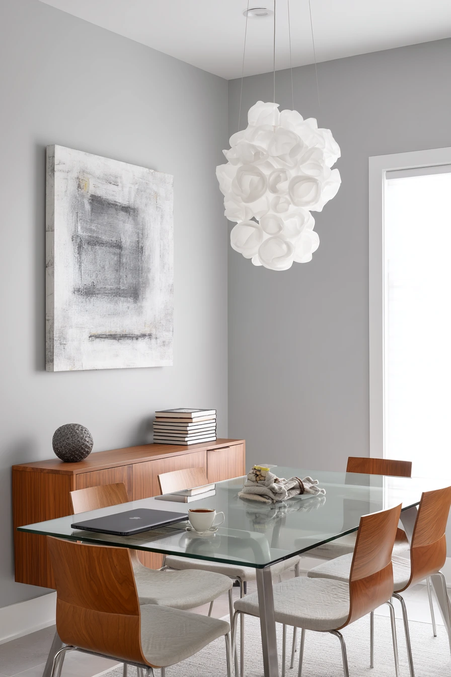
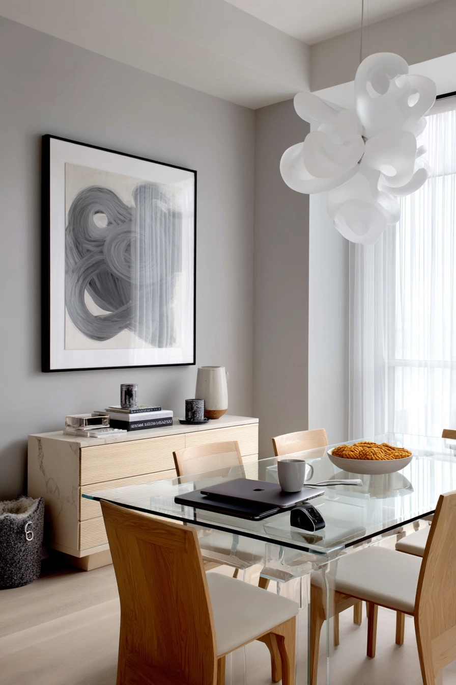
Pale gray walls with cool undertones are a modern dining room color idea for a neat, design aware homeowner. This shade feels calm and polished, especially with a glass top table and slim oak chairs. It is a good choice if you like clean lines and want your art and lighting to stand out.
Because cool gray can feel a bit flat, styling should add shape and contrast. A sculptural pendant becomes the focal point, and monochrome art keeps the look consistent. If the dining room also acts as a work zone, a closed laptop near a coffee mug can still look tidy if you use a tray and keep cords out of sight. A discreet pet toy under the sideboard is normal life, so use a sideboard with a toe kick or lower shelf to hide small items.
Overcast window light works well with cool gray because it does not push the color too blue. At night, choose bulbs labeled soft white to keep the room from feeling sterile. Add one warm texture, like a woven placemat or a wool runner, so the space feels comfortable, not like an office.
- Choose a cool pale gray if you want a crisp, modern feel.
- Use oak accents to warm up gray without changing the palette.
- Add a sculptural pendant to create a clear focal point.
- Keep tabletop clutter in a tray for a more polished look.
- Use one soft textile, like a runner, to balance glass and metal.
Pro Design Tip: In a minimalist room, scale matters more than decor count; go larger with the pendant or art so the space feels finished.
Budget Considerations: A glass top table can be costly. Look for a used base and replace the top, or choose a faux glass acrylic top for a similar light look.
10 Green-and-Cream Garden Dining Room
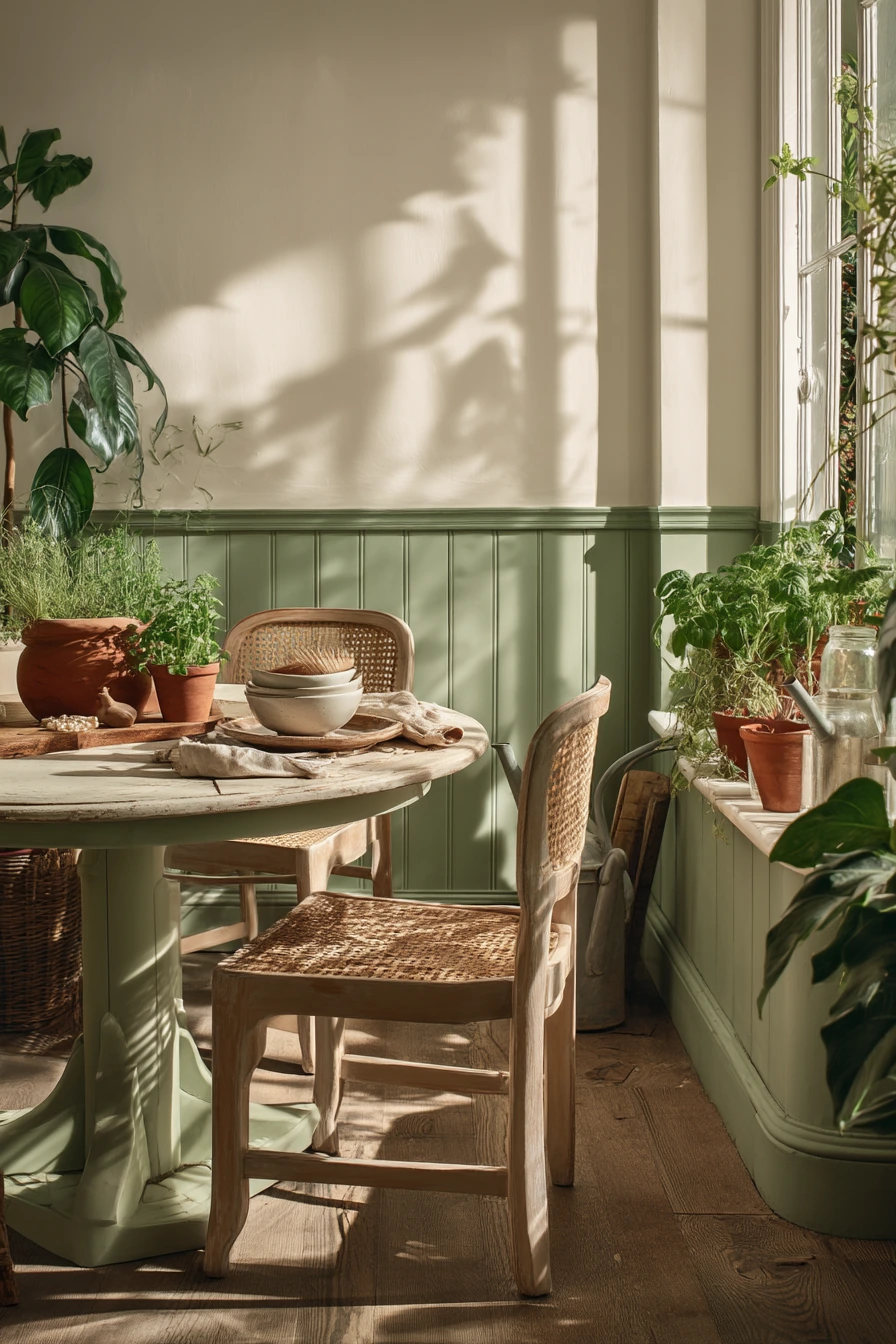

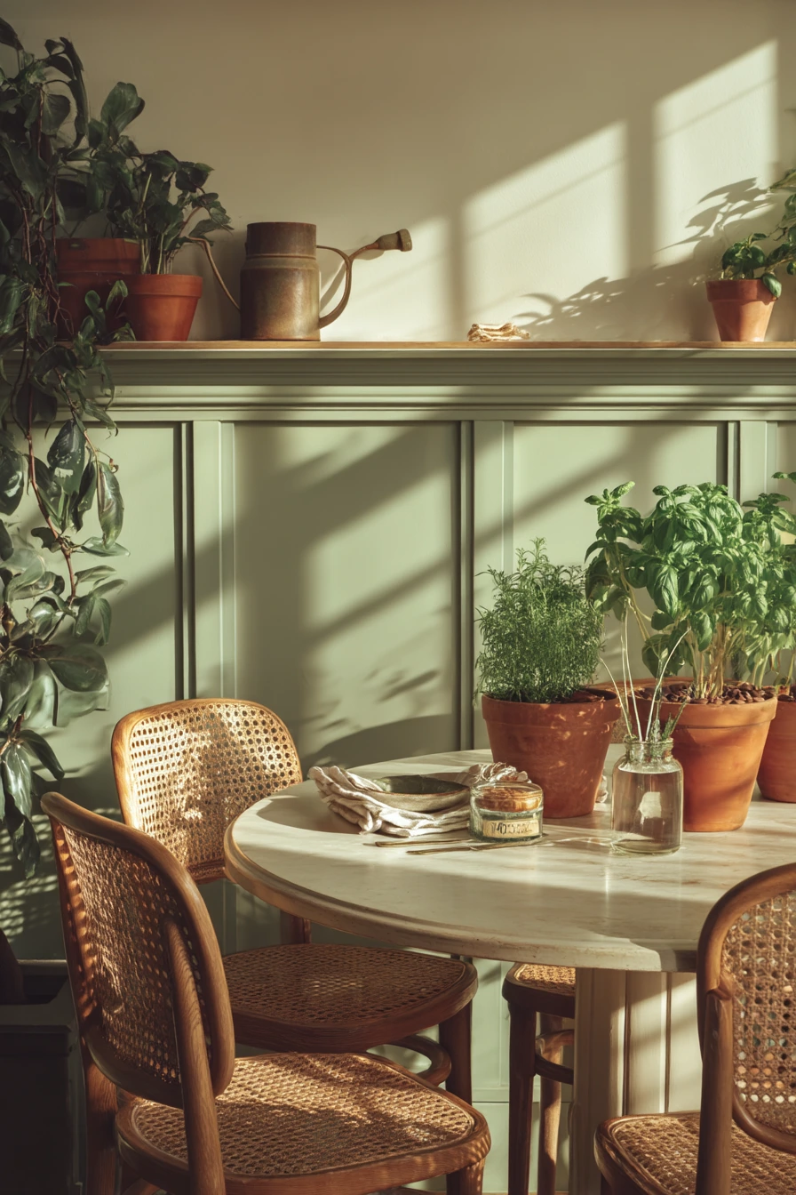
Creamy walls with a muted green wainscot are a fresh dining room color idea that suits a plant loving household. The creamy upper wall keeps the space bright, while the green lower section adds a grounded, garden feel. It also pairs well with cane backed chairs, terracotta pots, and natural wood.
To style the room, keep the table simple and let plants do the decorating. A round pedestal table makes it easy to move around and talk. Use terracotta pots in different sizes, but keep the shapes similar so it looks calm. Small real life details, like herb clippings in a glass jar, napkins folded beside a chipped bowl, and a watering can by the window, fit the theme and make the room feel honest.
Leaf shadows on the wall add soft pattern, so you can skip busy prints. Choose a muted green that is not too bright, so it works in late morning light and still feels restful at dinner. If you worry about scuffs, the wainscot can be painted in a more durable finish than the upper wall.
- Use creamy paint up top to keep the room light and open.
- Choose a muted green wainscot to hide bumps and scuffs.
- Repeat terracotta for warmth and to match plant pots.
- Use cane backed chairs to add airy texture.
- Style with simple jars and bowls for a casual, lived in look.
Pro Design Tip: Paint the wainscot in satin for durability and the upper wall in eggshell for a softer look.
Budget Considerations: If building wainscot is expensive, paint a faux wainscot line with a level and add one thin trim rail for a similar effect.

Good dining room color ideas are not just about trends. They should fit your light, your furniture, and how you use the room each day.
If you want calm, start with soft sage, greige, or creamy white. If you want mood, try deep blue gray or muted plum. For warmth and hosting, terracotta and butter yellow are easy wins.
FAQ
What is the best dining room paint color for a small room? Lighter colors like creamy white, soft sage, or pale gray help a small dining room feel bigger. If you want depth, use one accent wall like muted plum.
Should dining room trim match the wall color? Trim does not have to match. Creamy trim next to sage or warm white trim next to butter yellow can make the room feel softer and more finished.
How do I choose a dining room color with lots of natural light? Strong sun can wash out light paint. Try a slightly deeper version of your favorite color and test it on two walls to see how it shifts.
What dining room colors hide mess best? Mid tone colors like sage, mushroom, terracotta, and muted green hide scuffs and crumbs better than bright white or very dark paint.
How can renters add color without painting? Use peel and stick art, textiles like runners and throws, and accessories like vases and curtains. Focus on one main neutral and one accent color.
What paint sheen is best for dining room walls? Eggshell is a common choice because it looks soft but wipes clean. Use satin on wainscot or lower walls for extra durability.
Pick one palette from this list, then repeat the main color in small ways like curtains, art, and table linens. That simple step makes the whole room feel put together.