

Choosing the right kitchen paint can change how the whole room feels, even if you keep the same cabinets and counters. The best kitchen paint ideas are the ones that fit real life: coffee spills, lunchboxes on the island, and toys near the pantry.
In this guide, you will see 10 color directions pulled from everyday kitchens, from soft sage and dusty blue to deep navy, buttercream yellow, and modern greige. Each section includes simple styling ideas, what to pair with wood tones, and small details like brass pulls, open shelving, and runner rugs.
You will also find practical tips for picking finishes, handling low light, and making renter-friendly changes like peel-and-stick backsplash. Use these ideas to plan your next weekend refresh and save the looks you want to try.
Near the end, there is a quick FAQ to help you choose paint colors, sheens, and easy updates that work with your budget.
1 Soft Sage Update in a Busy Family Kitchen
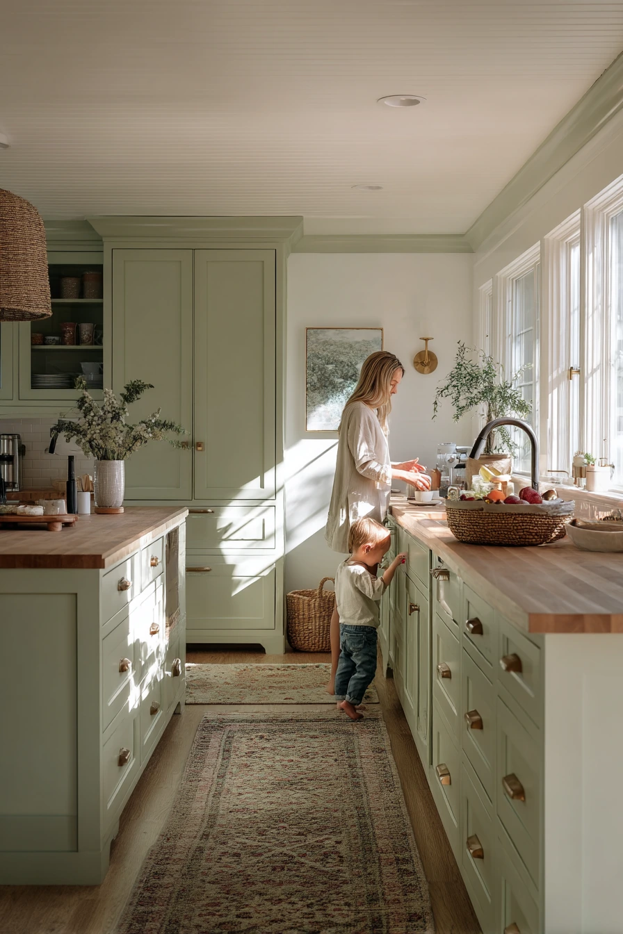
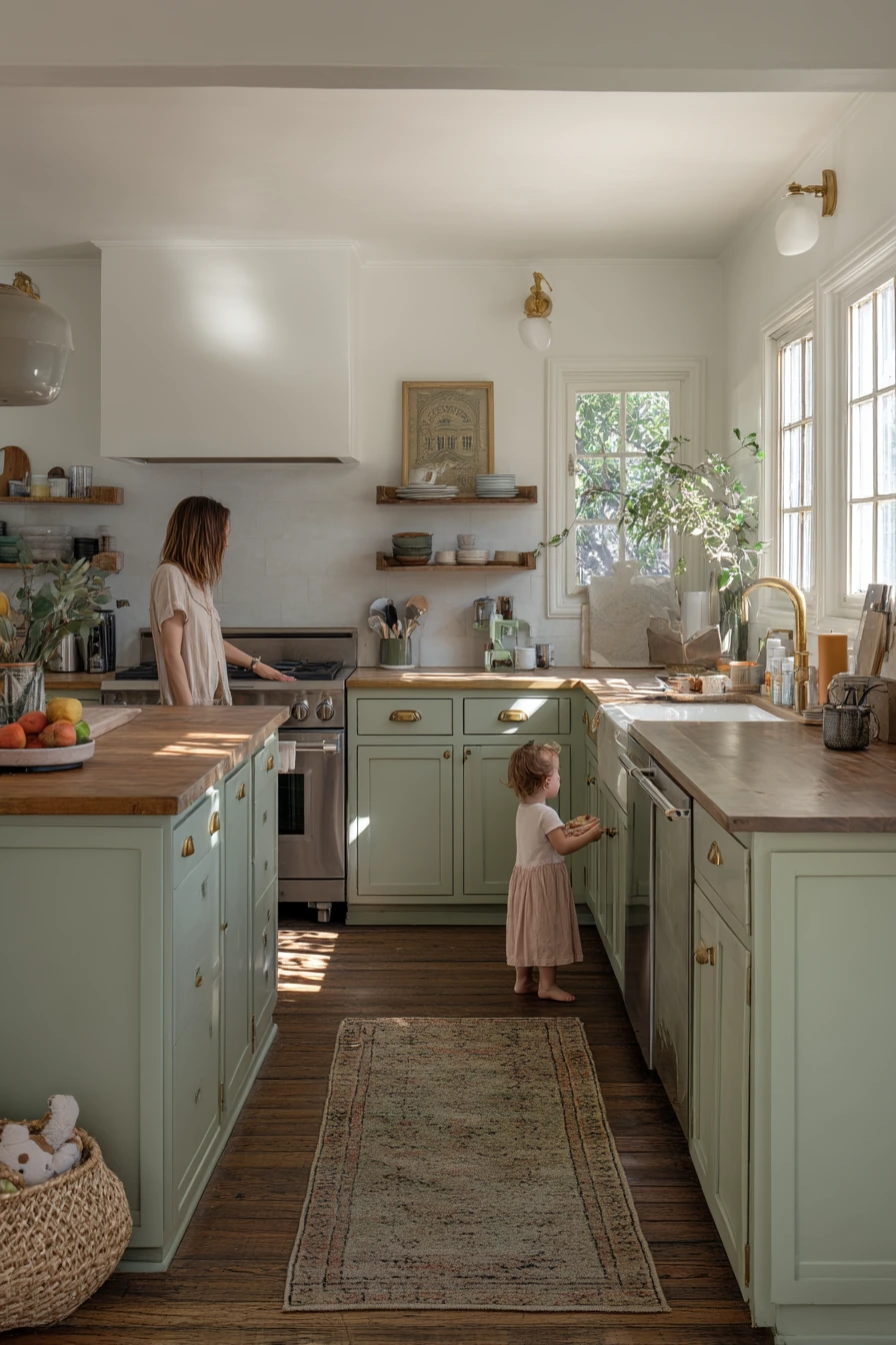
Soft sage painted cabinets are calm and easy to live with. They work well in a real family kitchen where mornings are busy, with a parent making coffee and a child’s lunchbox open on the island. Sage reads as a gentle green, so it brings color without taking over the room.
Pair sage cabinets with off-white walls to keep the space bright. Butcher block counters add warmth and help the green feel natural instead of cool. Brass pulls are a strong match because they bring a soft glow, especially in natural window light from the side. A worn patterned runner adds comfort and hides crumbs and footprints better than a solid light rug.
How to style it: keep the counters simple and practical. Use ceramic mugs, a fruit bowl, and one small plant so you get texture without clutter. If you have a pantry, tuck a kid toy basket nearby so the room looks tidy fast. Let light and plant shadows do the decorating, and avoid too many bold patterns at once.
- Choose a warm off-white wall color so sage does not look gray.
- Use a satin finish on cabinets for easy wipe-down in high-traffic areas.
- Add brass pulls or knobs to warm up the green and wood tones.
- Pick a runner with a small pattern to hide daily mess.
- Keep one “drop zone” tray on the island for lunch items and mail.
Pro Design Tip: Test sage paint next to your butcher block at different times of day; the wood can shift the green warmer, and you want the undertone to stay soft, not muddy.
Budget Considerations: If new brass pulls are pricey, mix styles by upgrading only the most visible doors and using simpler knobs elsewhere.


2 Moody Navy Paint for a Small Apartment Kitchen


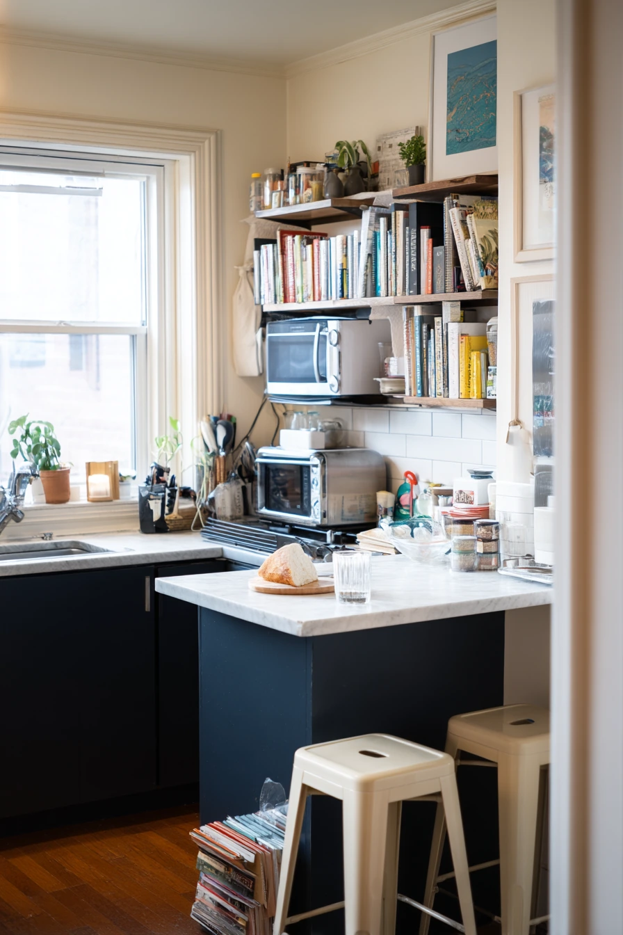
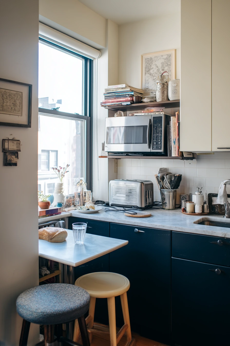
Deep navy lower cabinets are a smart choice for a compact apartment kitchen. Dark color on the bottom grounds the room and hides scuffs near the toe-kick. With creamy upper walls and open shelving, the space still feels light, even when it is small and busy.
This look fits a renter-friendly, lived-in moment: mismatched stools, a charging cable on the counter, and cookbooks stacked beside a toaster. Navy looks polished without needing perfect styling. It also pairs well with many metal finishes, from brushed nickel to warm brass, so you can work with what the apartment already has.
How to style it: keep open shelves simple with everyday dishes and one or two nice pieces, like a small bowl or a glass jar. Add a tiny bistro table if you have the corner space, and use stools that can slide in. In a kitchen with soft morning light from a courtyard, choose warmer bulbs at night so the navy does not feel too cold.
- Use navy on only the lower cabinets to prevent a heavy look.
- Keep the top half creamy to bounce light around the room.
- Limit open shelves to items you use often to reduce clutter.
- Add one wood element, like a cutting board, to soften the dark paint.
- Try peel-and-stick hardware updates if you cannot drill new holes.
Pro Design Tip: In small kitchens, match the wall color to the open-shelf back wall so the shelves visually “disappear” and the navy base feels clean and intentional.
Budget Considerations: If you cannot paint cabinets, use removable vinyl wrap on lower doors for a similar navy look, and save paint for the walls.
3 Warm White Cabinets with Easy Everyday Charm
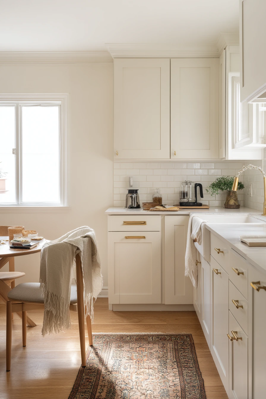
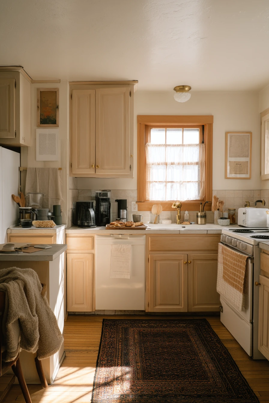
Warm white kitchen paint is a classic because it makes the room feel breathable and clean without looking stark. In a modest suburban kitchen with pale oak trim and simple shaker cabinets, warm white sets a calm base for daily life, including toast crumbs, a coffee press, and mail on the counter.
The key is choosing a white with a soft undertone. Warm whites pair well with pale oak because the wood brings gentle honey tones that keep the space from feeling flat. A vintage rug adds color and helps define the work area near the sink. If you have a dining chair nearby, a slightly wrinkled throw adds softness and makes the kitchen feel like part of the home, not just a work zone.
How to style it: keep counters mostly clear, then add a few natural textures. Try a wood tray for the coffee press and mugs, and use one simple bowl for fruit. For walls, eggshell finish is easier to wipe than flat paint. Let natural light wash across the sink wall, and avoid too many cool gray accents that can make warm white look yellow.
- Pick a warm white that works with your oak trim, not against it.
- Use a washable paint finish on walls near cooking areas.
- Add a vintage-style rug to bring in pattern and hide crumbs.
- Group daily items (coffee, tea) on one tray to reduce visual mess.
- Choose simple hardware so the look stays timeless.
Pro Design Tip: Sample two warm whites: one slightly creamy and one slightly beige, then view them next to oak trim in morning and late afternoon light before you commit.
Budget Considerations: Instead of replacing counters, use a new rug and updated cabinet pulls; those small changes make warm white paint feel like a full remodel.
4 Dusty Blue Paint for a Light-Filled Cottage Kitchen
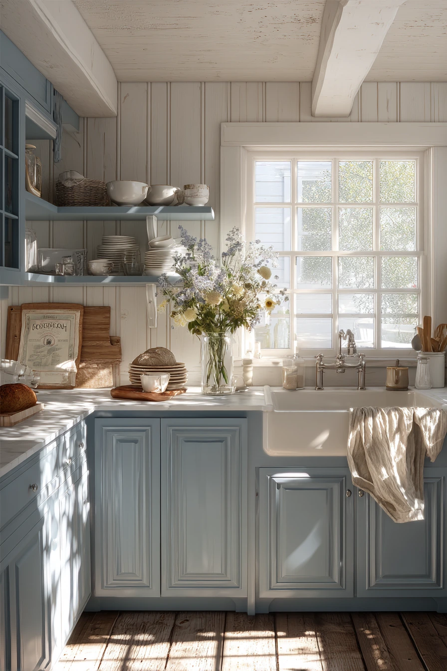
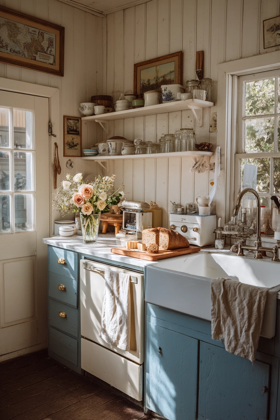
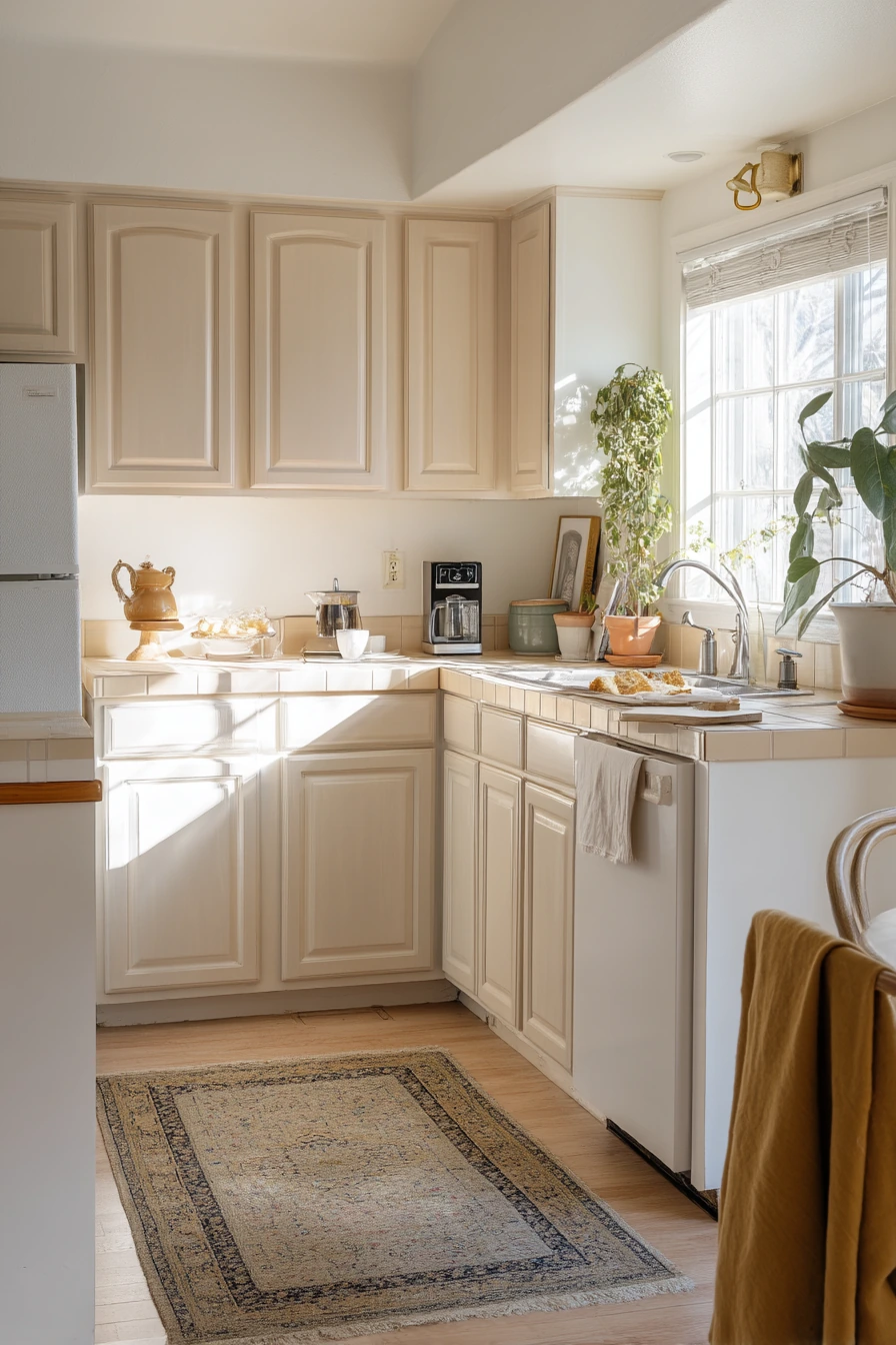
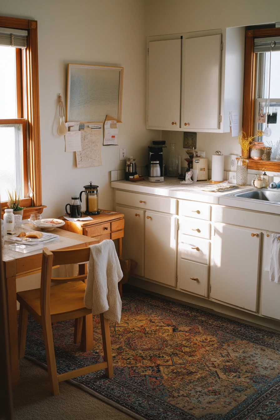
Dusty blue lower cabinets bring a soft, cottage feel that still looks fresh. Paired with cream beadboard walls and open shelves, the color feels airy and nostalgic, especially with a farmhouse sink. Dusty blue is muted, so it works with both warm and cool accents.
This scheme looks best when it feels lived-in: a vase of grocery-store flowers, recipe cards on the counter, a tea towel hanging a little crooked, and a loaf of bread on a cutting board. Those small touches make the room feel welcoming instead of staged. Leaf shadows from side window light add movement and help the space feel calm.
How to style it: choose warm white dishes on open shelves, and add a few wood items like a rolling pin or bread board. Use glass jars for pantry staples to keep things tidy. If your floors are wood, a simple runner in a faded pattern will support the cottage mood without competing with the cabinets.
- Use dusty blue on lowers and keep walls cream to stay bright.
- Choose open shelf brackets in black or brass for contrast.
- Mix in natural wood cutting boards for warmth.
- Keep flowers and towels in soft colors to match the gentle palette.
- Add one vintage element, like a crock or enamel tray, for charm.
Pro Design Tip: Dusty blue looks best with slightly warm whites; if the wall white is too cool, the cabinets can turn gray and lose the cottage feel.
Budget Considerations: Beadboard can be costly; try beadboard wallpaper or a simple vertical panel look with paint to get a similar effect for less.
5 Peachy Beige Paint in a Rental Kitchen Makeover
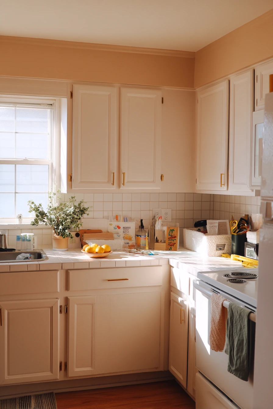
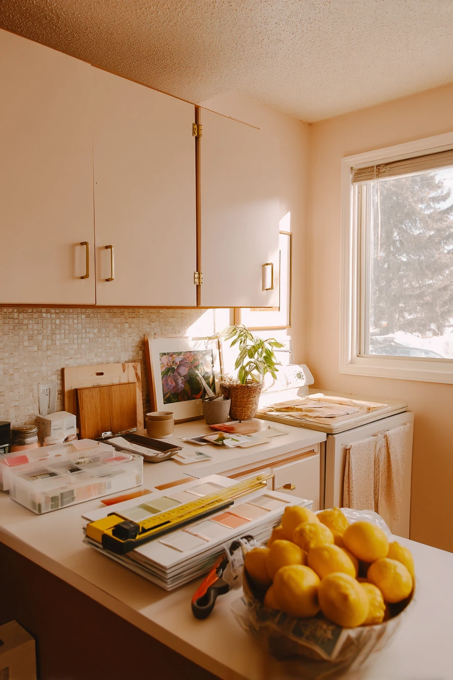
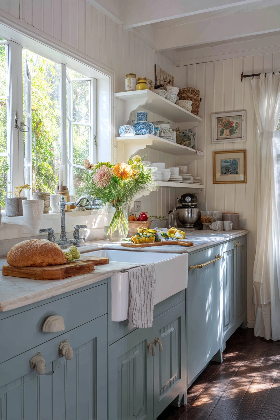
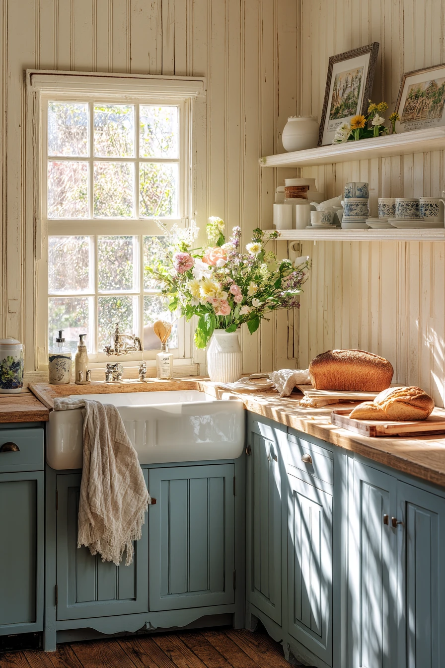
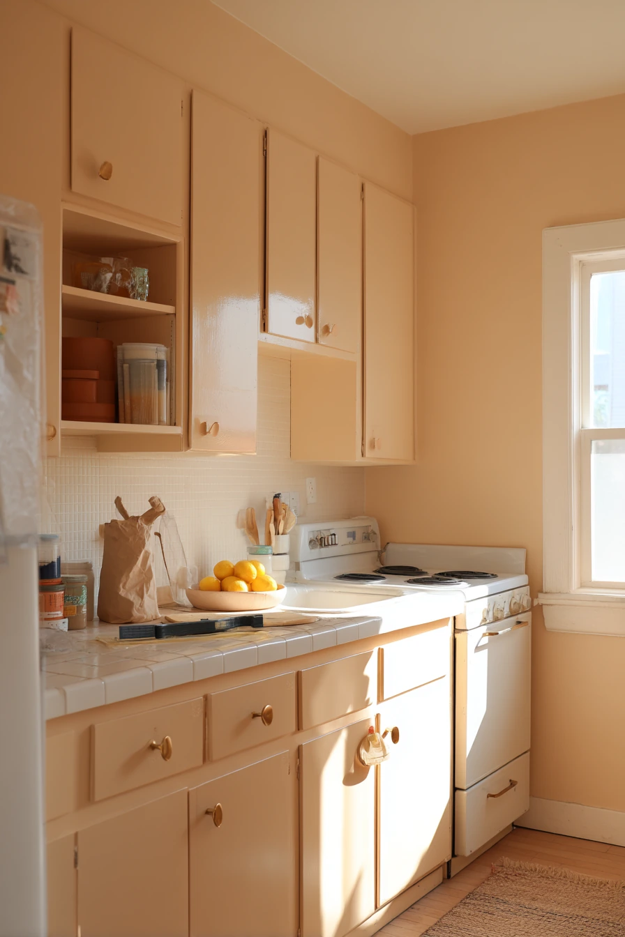
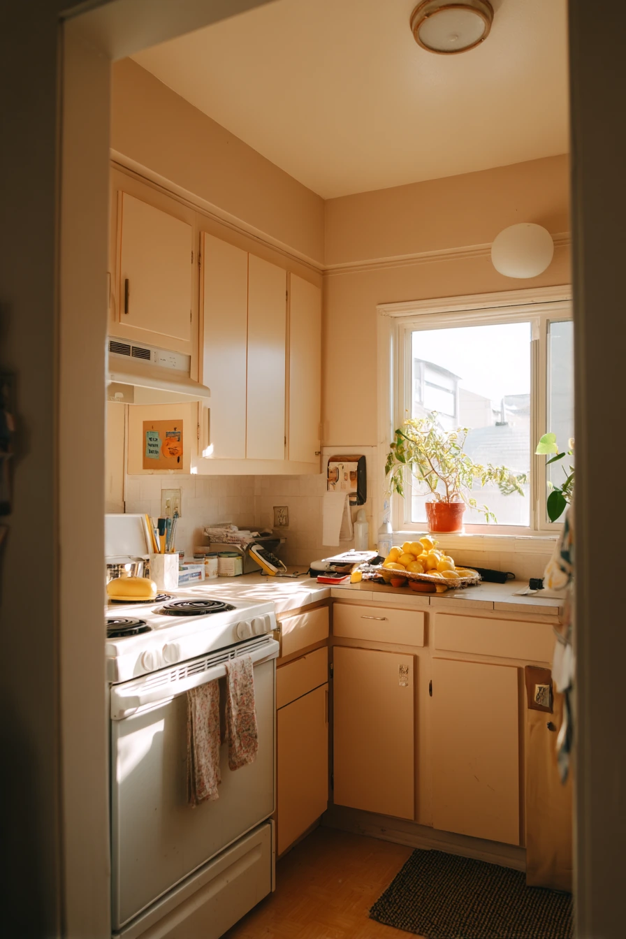
Peachy beige paint on the walls is a friendly way to warm up a rental kitchen. It adds color without feeling loud, and it works with many cabinet styles, including flat-front doors. This shade can make late-afternoon light look extra cozy, which helps when a rental has basic finishes.
This look is also practical for a weekend project. Picture paint samples on the counter, an open toolbox, a measuring tape, and a grocery bag of lemons. Peachy beige makes those everyday moments feel cheerful and grounded. Pair it with a peel-and-stick backsplash for a big impact without permanent construction. Thrifted hardware can add personality, especially if the original knobs feel bland.
How to style it: keep the palette simple. Use white dishes, light wood boards, and one or two terracotta or glass pieces. Lemons, a small bowl, and a towel in cream or tan will match the warmth of the walls. If the room is small, avoid heavy dark rugs and choose a light runner with texture.
- Pick a peachy beige with enough softness so it does not turn pink.
- Use removable peel-and-stick backsplash tiles for quick change.
- Swap cabinet hardware for thrifted finds in the same finish family.
- Add a simple light runner to balance the warm wall color.
- Keep counters clear and store tools in a basket during the project.
Pro Design Tip: Before painting the whole room, test the color behind the toaster and near the fridge; appliances can reflect cool tones and change how peachy beige reads.
Budget Considerations: If you are limited to one update, prioritize paint and hardware; peel-and-stick backsplash can be added later in small sections to spread out cost.
6 Charcoal Accent Wall Behind Open Shelving
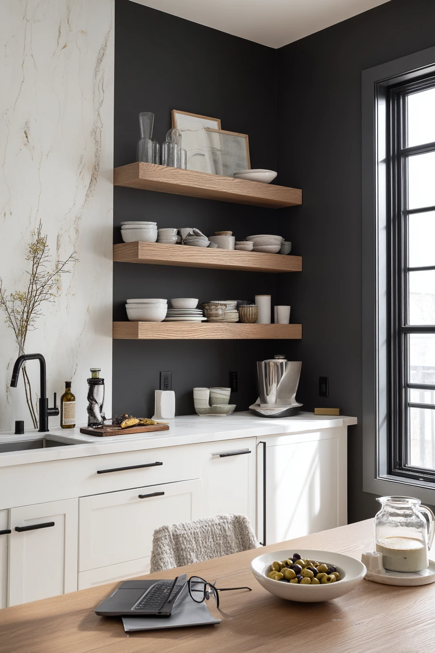

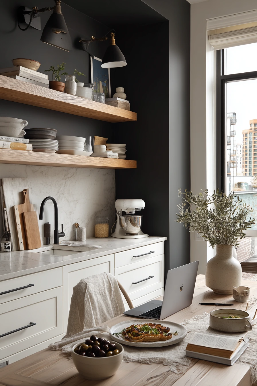
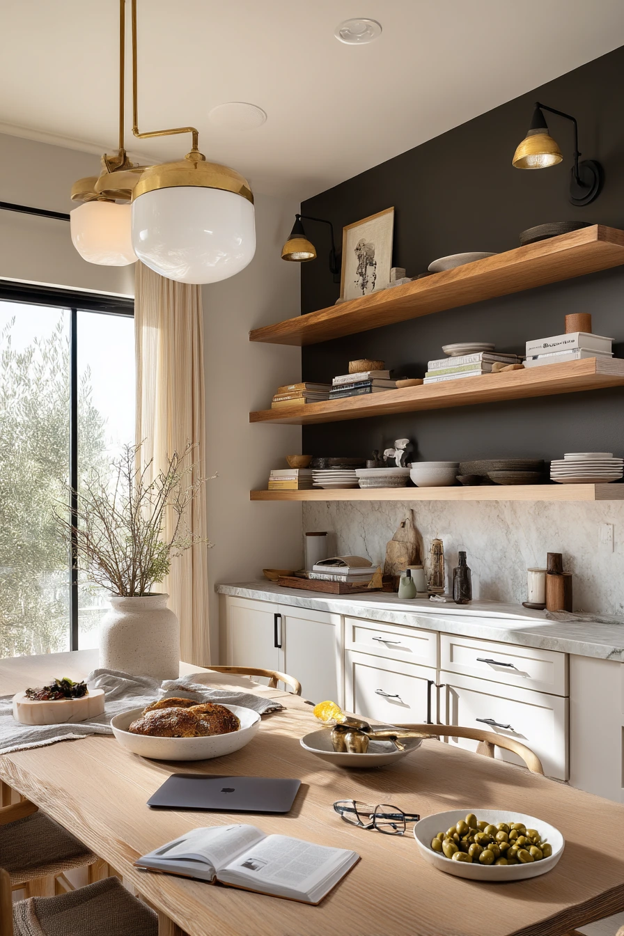
A charcoal painted accent wall can give a city kitchen a modern, moody edge without making the whole room dark. With white cabinets, floating wood shelves, matte black fixtures, and pale stone counters, charcoal creates contrast and helps the kitchen feel crisp and pulled together.
This scheme fits real evenings: dishes drying, a laptop at the table, reading glasses nearby, and a bowl of olives beside an unfinished dinner. Charcoal works well with mixed lighting, like warm lamp light plus fading window light. The trick is to keep the rest of the finishes light so the accent wall feels intentional, not heavy.
How to style it: add warmth with wood shelves and a few natural items like a cutting board or bowl. Keep decor simple and functional, like a small stack of plates or a glass jar. If you want more softness, add a linen runner on the table and a plant that can handle lower light. Use cohesive black accents so the fixtures and hardware look like a set.
- Paint only one wall charcoal to control the mood in small spaces.
- Use white cabinets to keep the kitchen bright and clean.
- Add floating wood shelves to soften the dark paint.
- Choose matte black fixtures for a modern, consistent look.
- Use warm bulbs at night so charcoal does not look flat.
Pro Design Tip: Pick a charcoal with a hint of brown or green if your kitchen is dim; those undertones keep the color rich instead of looking like a black hole.
Budget Considerations: An accent wall is a low-cost upgrade; if new stone counters are not possible, a pale counter mat or light-toned accessories can mimic that bright contrast.
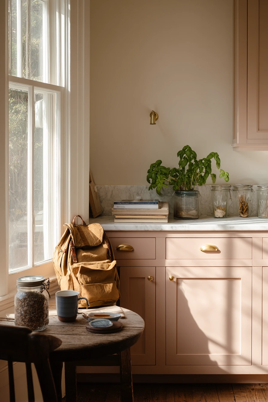
7 Clay Pink Cabinets for a Gentle Morning Kitchen
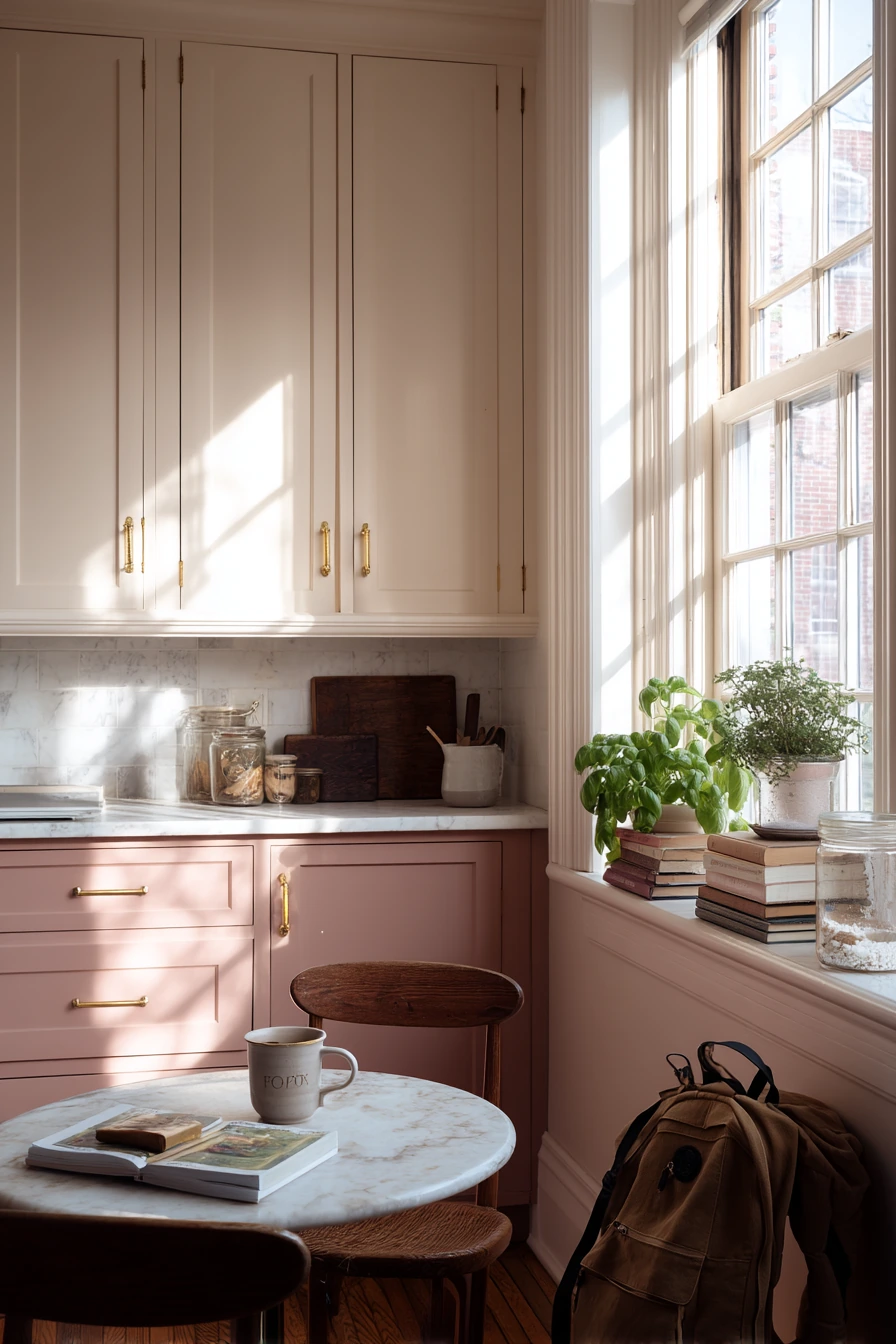

Clay pink lower cabinets add warmth and softness, but they still feel grown-up when the tone is muted. With linen-white uppers and unlacquered brass details, the kitchen looks calm and comfortable, not sugary. This palette is a nice fit for a quiet corner with a small round table by the window.
It also works for real life: a stack of library books, a chipped mug, fresh basil in a glass jar, and a backpack by the door. Clay pink plays well with natural wood, light stone, and warm metals. Unlacquered brass will change over time, which adds a relaxed, lived-in look that matches the color.
How to style it: keep the upper area light and simple. Use white dishes, clear glass, and one or two wood pieces. Add green herbs like basil to give contrast, and choose textiles in oatmeal, cream, or soft stripes. If you want a little pattern, use it on a seat cushion or a small runner, not on every surface.
- Choose a muted clay pink, not a bright blush, for a timeless look.
- Use linen-white uppers to balance the color on the lowers.
- Pair with brass details to add warmth and depth.
- Add green plants or herbs for natural contrast.
- Keep styling simple so the paint stays the main feature.
Pro Design Tip: To keep clay pink from looking dull, make sure your whites are warm (not icy); warm whites bring out the earthy tone and make the color feel intentional.
Budget Considerations: If painting all cabinets is too much, paint only the island or lower run in clay pink and leave uppers as-is for a similar two-tone effect.

8 Olive Green Paint in a Garden-View Kitchen
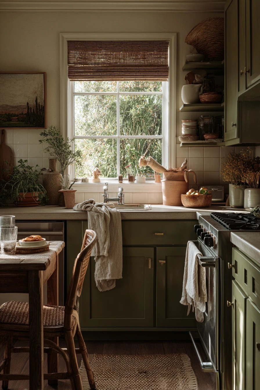
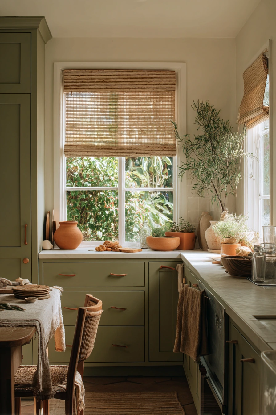
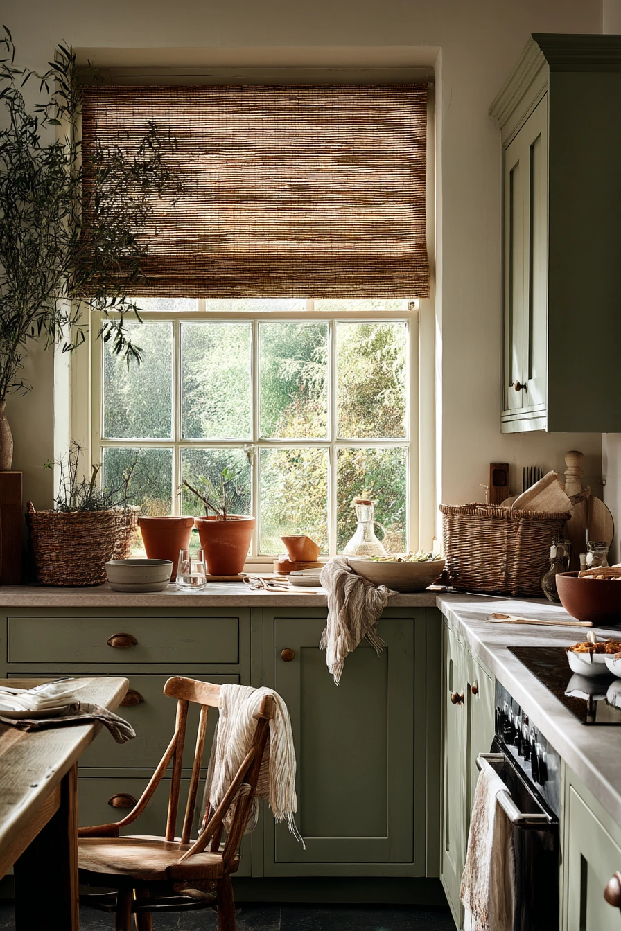
Olive green cabinets are earthy and steady, especially in a kitchen with a garden view. With cream walls, woven blinds, and terracotta pots on the sill, the palette feels natural and grounded. Olive works well in rooms that get leaf-dappled light, because the shifting shadows make the color look rich.
This style shines in real home moments: muddy herb clippings on the counter, a dish towel tossed on the oven handle, a water glass, and a chair pulled out mid-snack. Olive green hides smudges better than lighter colors, which is helpful in a busy kitchen. Cream walls keep the space from turning too dark, and woven blinds add texture without needing extra decor.
How to style it: lean into warm, natural materials. Use wood utensils, stoneware dishes, and terracotta planters. Keep countertop items in a small set, like a crock, a cutting board, and a bowl. If you want more contrast, add small black accents, like a simple frame or a matte black faucet, but keep it limited so the room stays soft.
- Choose olive green with a warm base to match cream walls.
- Use woven blinds to add texture and soften the window area.
- Style with terracotta pots and simple herb jars on the sill.
- Pick stoneware and wood accessories to support the earthy palette.
- Add one small darker accent for contrast, like black hardware or a faucet.
Pro Design Tip: Olive can shift a lot under different light; test it beside your flooring and counters, and check it with the blinds both open and closed.
Budget Considerations: Terracotta pots and woven shades can be found secondhand; prioritize cabinet paint first, then add small natural accents over time.

9 Buttercream Yellow for a Cheerful Breakfast Nook

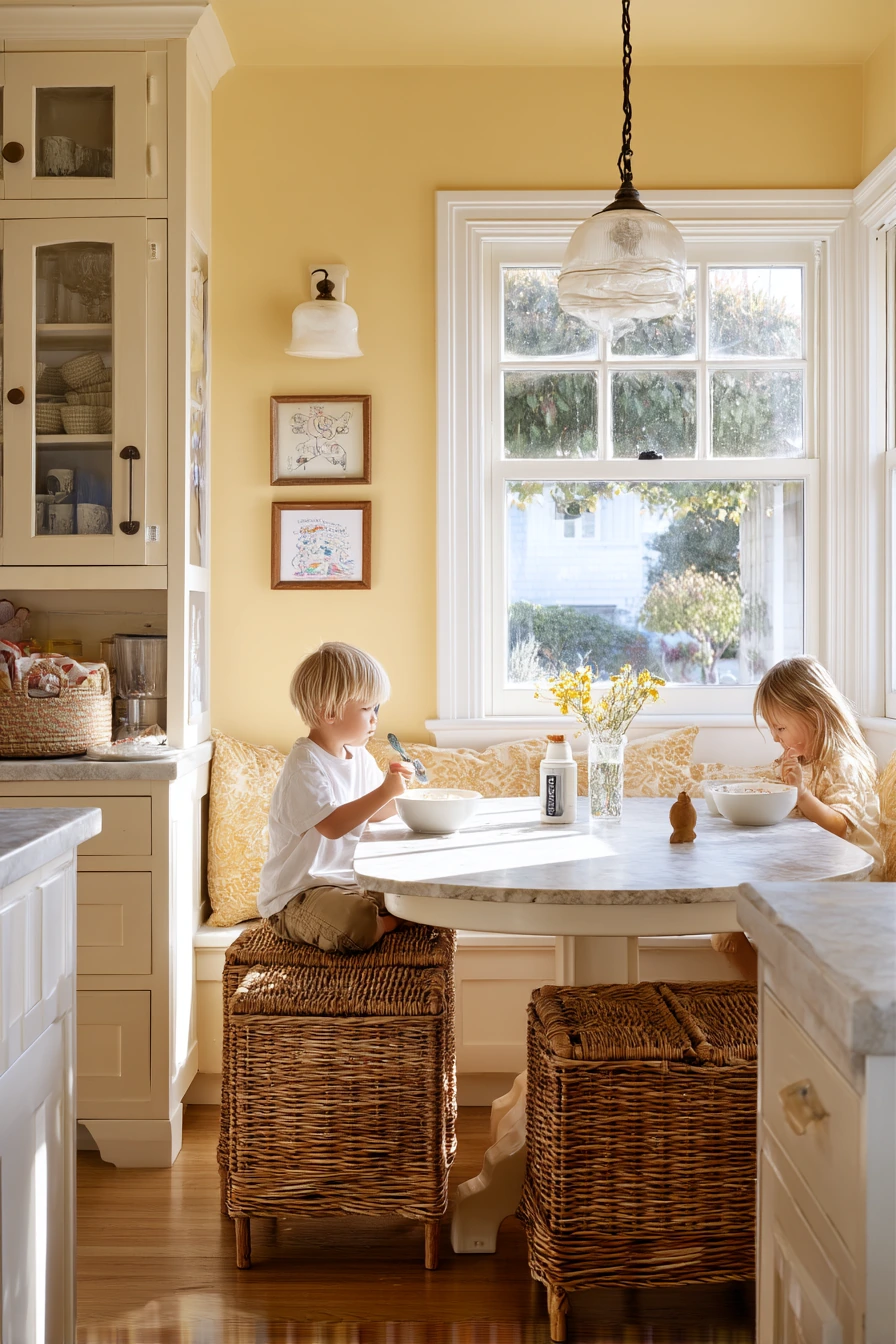
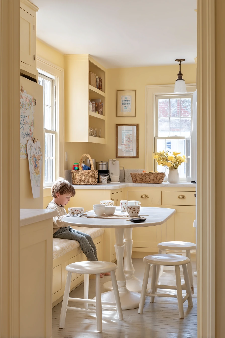
Buttercream yellow paint brings a gentle, sunny feeling that works well in a family kitchen. With white trim, painted wood stools, and a tiny breakfast nook with a banquette, the room feels cheerful without being too bright. Buttercream is softer than primary yellow, so it stays cozy and homey.
This color looks best when it supports everyday mess and movement: cereal bowls on the table, a child’s drawing on the fridge, a phone charging on the counter, and a wicker basket of toys nearby. Natural window light spilling across the table helps the yellow glow. White trim keeps edges crisp and prevents the color from feeling too heavy.
How to style it: use simple neutrals and a few natural textures. Add a light wood table top or a wood tray, plus woven pieces like a basket or placemats. For the banquette, choose durable fabric in cream, tan, or a small stripe. Keep artwork and magnets in one area so the kitchen feels fun but not chaotic.
- Pick a buttercream yellow that is soft, not neon.
- Use bright white trim to keep the space clean and defined.
- Add wicker baskets to corral toys and kitchen extras.
- Choose durable, wipeable fabrics for the breakfast nook seating.
- Balance yellow with natural wood and neutral dishes.
Pro Design Tip: If you worry about yellow looking too strong, use it on the nook or one wall first; you can always expand the color once you see it in your daily light.
Budget Considerations: A banquette can be built-in and expensive; try a bench with storage cubes and a simple cushion to get the same nook function for less.

10 Soft Greige Paint for a Calm Open-Plan Kitchen
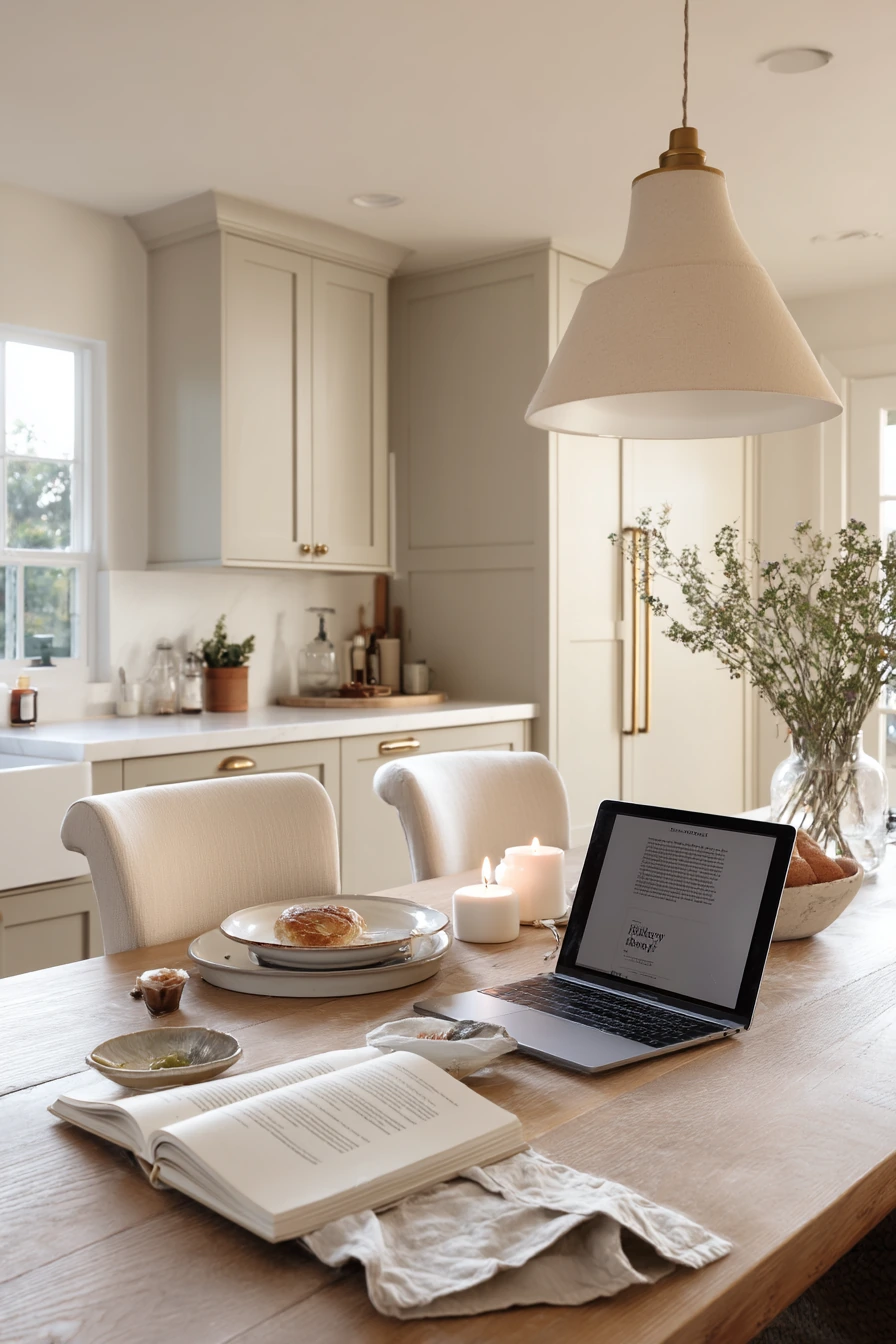
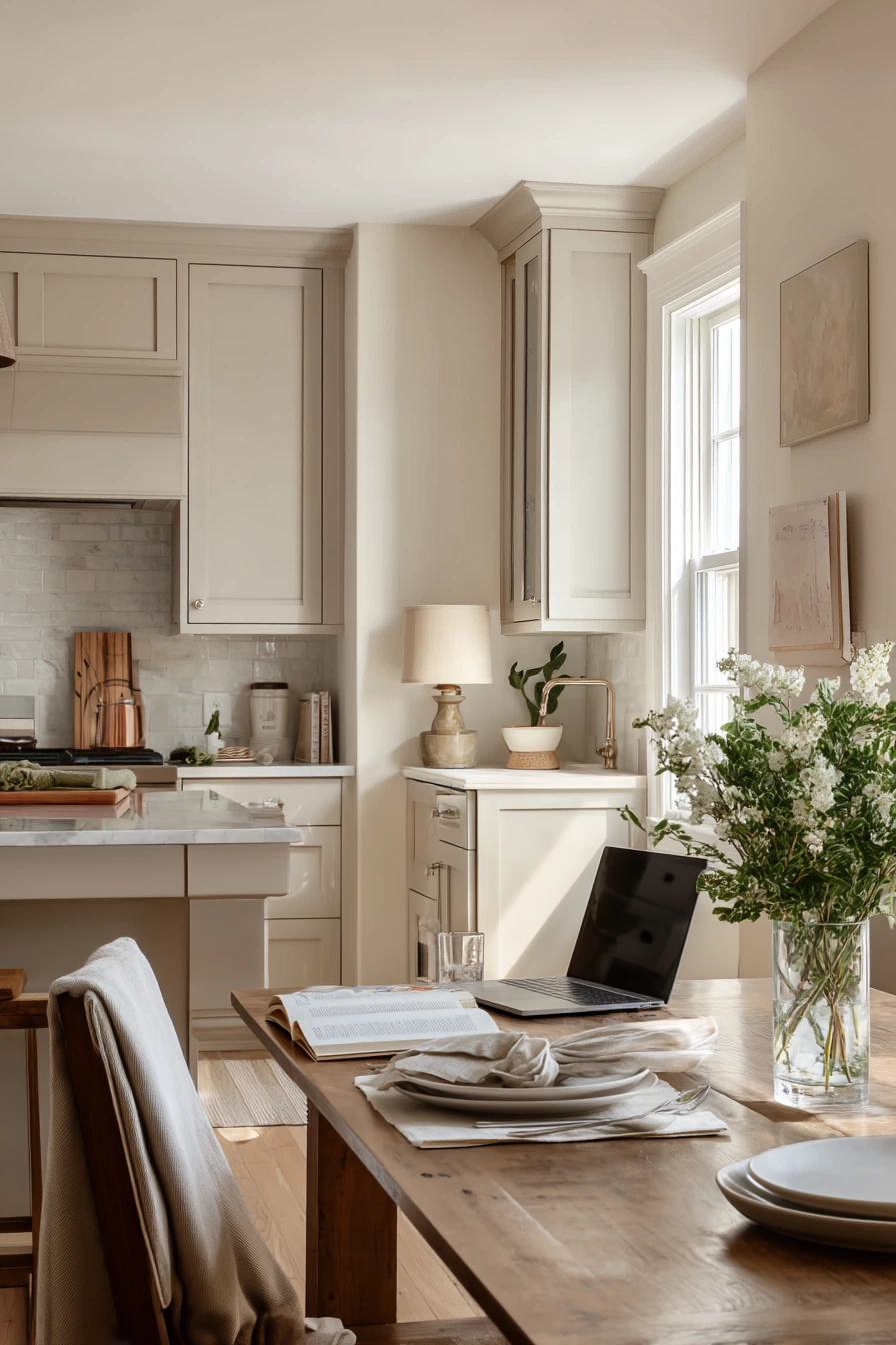
Soft greige is a safe, flexible choice for open-plan kitchens because it connects to nearby living areas without feeling too cool or too warm. With slim shaker cabinets, pale quartz, brushed nickel hardware, and a wood dining table close by, greige creates a calm background for both cooking and relaxing.
This palette supports real evenings: a laptop on the table, a cookbook open to a recipe, candle wax drips, and a slightly rumpled linen napkin beside dinner plates. Greige does not fight with wood tones, and it makes brushed nickel look clean. It also works well in mixed light, like warm lamps with faint dusk coming through the windows.
How to style it: add contrast with a few darker details, like a charcoal bowl or black-framed art, but keep most items warm and simple. Linen, light wood, and soft white dishware pair well with greige. If the room feels flat, bring in texture with woven placemats, a subtle backsplash tile, or a runner with a low-contrast pattern.
- Choose greige that matches your flooring undertone (warm or cool).
- Use brushed nickel for a clean look that fits many styles.
- Add warmth with a wood dining table and linen textiles nearby.
- Keep decor minimal so the open-plan space feels calm.
- Use soft lighting to keep greige from looking dull at night.
Pro Design Tip: In open-plan rooms, test greige on multiple walls; the color can shift when seen next to adjacent rooms, rugs, and upholstery.
Budget Considerations: If quartz is not in the budget, focus on greige paint and lighting updates; under-cabinet LED strips can make budget counters look cleaner and brighter.


These kitchen paint ideas show how color can support real routines, from fast breakfasts to late dinners. Soft sage, navy, warm white, dusty blue, peachy beige, charcoal, clay pink, olive, buttercream, and greige each create a different mood with simple changes.
Before you paint, test samples in your own light, think about the finishes you already have, and plan a few easy styling updates like hardware, rugs, and open-shelf edits. Small choices can make a big difference.
FAQ
1) What is the best paint finish for kitchen walls?
Eggshell or satin is usually best because it wipes clean more easily than flat paint and still looks soft.
2) What paint finish should I use for kitchen cabinets?
A cabinet-grade enamel in satin or semi-gloss is common. Satin hides small flaws better, while semi-gloss wipes very easily.
3) How do I choose a cabinet color that works with butcher block counters?
Start with warm, natural shades like soft sage, dusty blue, or warm white. Test the color next to the wood to make sure it stays warm, not gray.
4) Are dark cabinet colors like navy hard to keep clean?
They can show dust, but they often hide scuffs and stains near the floor. Use a soft microfiber cloth and avoid harsh cleaners that leave streaks.
5) What is a renter-friendly way to update a kitchen without repainting cabinets?
Try peel-and-stick backsplash, removable vinyl wrap on cabinet doors, and a hardware swap. Add a runner rug for quick impact.
6) How can I make a small kitchen look bigger with paint?
Keep the upper area light, use one darker color on lower cabinets or one accent wall, and match trim and walls for fewer visual breaks.
7) How many paint samples should I test before choosing a kitchen color?
At least two to three. View them in morning, afternoon, and night light, and place them near counters, flooring, and backsplash.